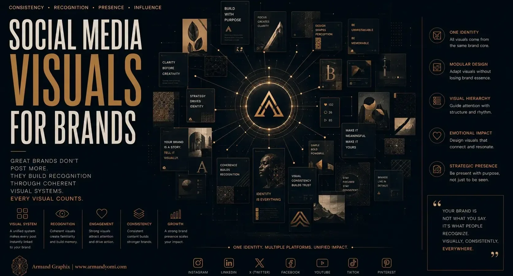
A brand can post every day and still feel invisible. Usually, the problem is not effort. It is visual clarity. Strong social media visuals for brands do more than fill a feed – they create recognition in seconds, communicate value fast, and make people feel that a business knows exactly who it is.
That matters because social platforms are now part storefront, part first impression, and part ongoing brand experience. A potential customer may meet your business through an Instagram carousel, a LinkedIn graphic, a story highlight, or a paid ad before they ever visit your website. If those visuals feel inconsistent, generic, or disconnected from your larger brand story, trust starts to erode before the conversation even begins.
“Random posts create noise.”
Strategic visuals build recognition, trust, and long-term brand equity.
Build a Consistent Brand Presence with us →Why social media visuals for brands matter more than ever
Visual content carries a burden that copy alone cannot. It has to stop the scroll, signal professionalism, and create enough emotional traction to make someone care. For small businesses and growing brands, that is not a cosmetic detail. It is market positioning.
The strongest brands use visual design to reduce friction. Their audience knows what kind of business they are looking at, what quality level to expect, and what tone the brand brings. That recognition compounds over time. A polished visual system makes one post stronger, but it also makes the fiftieth post easier to trust.
There is also a practical side to this. Social content is often repurposed across campaigns, launches, ads, reels, event promotions, and product announcements. When visuals are designed strategically, they create efficiency. When they are improvised each week, they create inconsistency, extra revisions, and weaker performance.
What effective brand visuals actually do
Many businesses think good social design means attractive templates, trendy motion, or a cohesive color palette. Those pieces matter, but they are not the whole picture. Effective visuals perform several jobs at once.
First, they make the brand recognizable. That can come through typography, composition, image treatment, iconography, or a distinctive use of color. Recognition is not about being loud. It is about being identifiable.
Second, they make information easier to absorb. A product announcement, service explanation, testimonial, or event invitation should not feel visually crowded. Good design creates hierarchy. It tells the viewer what to notice first and where to go next.
Third, they reinforce brand positioning. A luxury brand should not look hurried. A wellness brand should not feel harsh. A startup with bold ambitions should not appear visually timid. Your visuals should support the market perception you want, not contradict it.
Finally, they support action. That does not mean every post needs a hard sell. It means the design should help move people toward interest, trust, inquiry, or purchase.
The biggest mistakes brands make with social visuals
One of the most common mistakes is designing for variety instead of recognition. The feed ends up looking creative in isolation but fragmented as a brand system. Every post uses a different style, different fonts, different graphic language, and different tone. The result is visual noise.
Another issue is overdesign. Brands sometimes add too many effects, too much text, or too many visual elements in an effort to look premium. In reality, clutter weakens the message. Strong visuals are usually edited with discipline.
Stock imagery can also create problems when it is used without a clear point of view. Generic photos of smiling teams, laptops, coffee cups, or staged workspaces rarely build distinction. If stock images are necessary, they need to be curated and treated in a way that feels aligned with the brand.
Then there is trend chasing. Trends can be useful when they fit the platform and the audience, but they should not replace brand consistency. A business that reinvents its style every time a new format becomes popular usually ends up feeling less credible, not more current.
How to build social media visuals for brands with strategy behind them
The most effective approach starts before the first post is designed. You need a visual foundation. That includes brand colors, font choices, image direction, graphic motifs, spacing rules, and a clear sense of tone. It also helps to define what your brand should feel like visually. Refined, bold, warm, editorial, minimal, energetic – those words guide design decisions.
From there, content should be organized into a few repeatable categories. For example, a brand may need visuals for education, promotion, social proof, announcements, and brand storytelling. Each category can have its own layout logic while still belonging to the same visual system. This gives you consistency without making every post look identical.
Photography and illustration choices deserve special attention. If your visuals rely on imagery, decide what kind of world your brand lives in. Is it product-focused, people-centered, texture-rich, clean and architectural, culturally expressive, or emotionally intimate? Random image selection weakens the narrative. Intentional art direction strengthens it.
Typography is another major lever. On social media, type often carries the message more directly than imagery. The right font pairing can make a brand feel modern, grounded, elegant, or energetic. The wrong pairing can make premium offers look inexpensive or serious brands feel amateur. Readability matters just as much as personality.
Motion, when used well, can sharpen impact. But it depends on the brand and the platform. A subtle animated text reveal or product movement can increase attention. Constant motion for its own sake can feel distracting. The goal is not to animate everything. The goal is to use movement where it adds clarity or emphasis.
Social media visuals for brands should match the platform
A visual that works on Instagram may underperform on LinkedIn. A static square post may communicate well in one context and feel flat in another. Platform behavior matters.
Instagram tends to reward visual identity, storytelling, and design polish. People expect a stronger aesthetic point of view there. LinkedIn often performs better with clearer information design, stronger hooks, and visuals that support authority. Stories and short-form vertical formats usually need faster pacing and simpler messaging because attention is shorter.
That does not mean your brand should look different everywhere. It means the execution should adapt while the identity remains consistent. Think of it as translation, not reinvention.
The balance between beautiful and effective
There is a tension many founders feel but do not always name. They want social content that looks elevated, but they also want it to perform. The truth is that design and performance are not competing goals. They only conflict when visuals are treated as decoration instead of communication.
A beautiful post that says nothing clearly is weak. A highly informative post with no visual distinction is forgettable. The strongest work sits in the middle. It is visually compelling and strategically readable.
This is where design thinking matters. A brand should ask: what is this post trying to make people understand, feel, or do? Once that is clear, the visual direction becomes sharper. Design that tells your story works best when the story itself is defined.
When brands need a visual refresh
If your content feels inconsistent, if your engagement is flat despite strong offers, or if your social presence no longer reflects your business quality, a visual refresh may be overdue. That does not always mean a full rebrand. Sometimes the issue is the social system itself – outdated templates, weak hierarchy, unclear art direction, or visuals that no longer match your audience.
For startups, a strong visual system can create credibility faster than volume alone. For established businesses, it can help modernize perception without losing recognition. For product-based brands, it can sharpen shelf appeal and digital presentation at the same time. For service businesses, it can make expertise look tangible.
In practice, the best visual systems are not built around what is easiest to post. They are built around what is easiest to remember.
A strong brand does not need every graphic to be loud. It needs every visual touchpoint to feel intentional. When your social content carries the same clarity, emotional tone, and strategic purpose as the rest of your brand, people notice. Not just because it looks good, but because it feels coherent. That is what earns attention that lasts.
“Make every post strengthen your brand”
instead of simply filling your feed.
Create Social Media Visuals That Convert with us →- 9 Brand Storytelling Examples That Work
 Explore 9 brand storytelling examples that show how narrative, design, and strategy work together to build trust, attention, and growth.
 - Calgary Packaging Design for Products That Sell
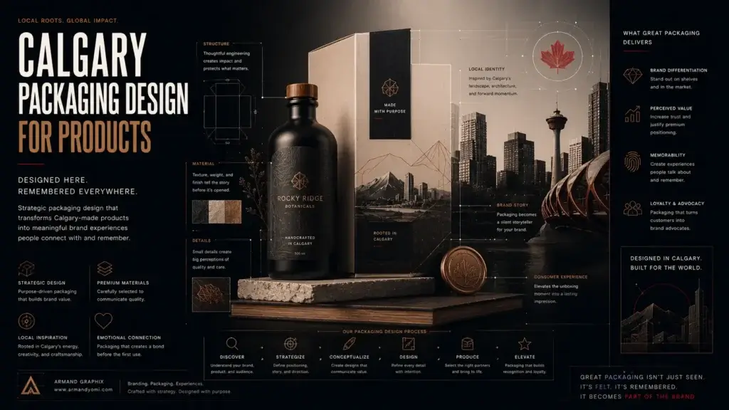 Calgary packaging design for products that builds shelf impact, brand trust, and sales through strategy, storytelling, and smart production choices.
 - Performance Marketing for Startups That Scales
 Performance marketing for startups works best when brand clarity meets data. Learn how to build channels, test faster, and scale with focus.
 - Landing Page Conversion Design That Works
 Landing page conversion design turns attention into action with clearer messaging, stronger visuals, and smarter user paths that sell.
 - Custom Packaging vs Stock Packaging
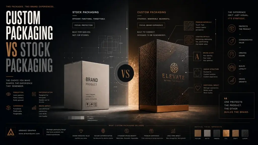 Custom packaging vs stock packaging affects cost, speed, branding, and growth. Learn which option fits your product, budget, and goals best.
 - How to Choose a Web Designer Calgary
 Need a web designer Calgary businesses can trust? Learn what to look for, what to avoid, and how to choose design that drives real growth.