A polished logo can get attention. It cannot carry a weak brand.
That distinction matters if you are figuring out how to build brand identity for a new business or trying to fix one that feels inconsistent, forgettable, or disconnected from growth. Brand identity is not just what people see. It is what they recognize, remember, and trust across every touchpoint – from your website and packaging to your social presence and sales deck.
The strongest identities do two jobs at once. They express something emotionally true about the business, and they make commercial sense in the market. If one side is missing, the brand usually looks good but underperforms, or performs briefly without creating real loyalty.
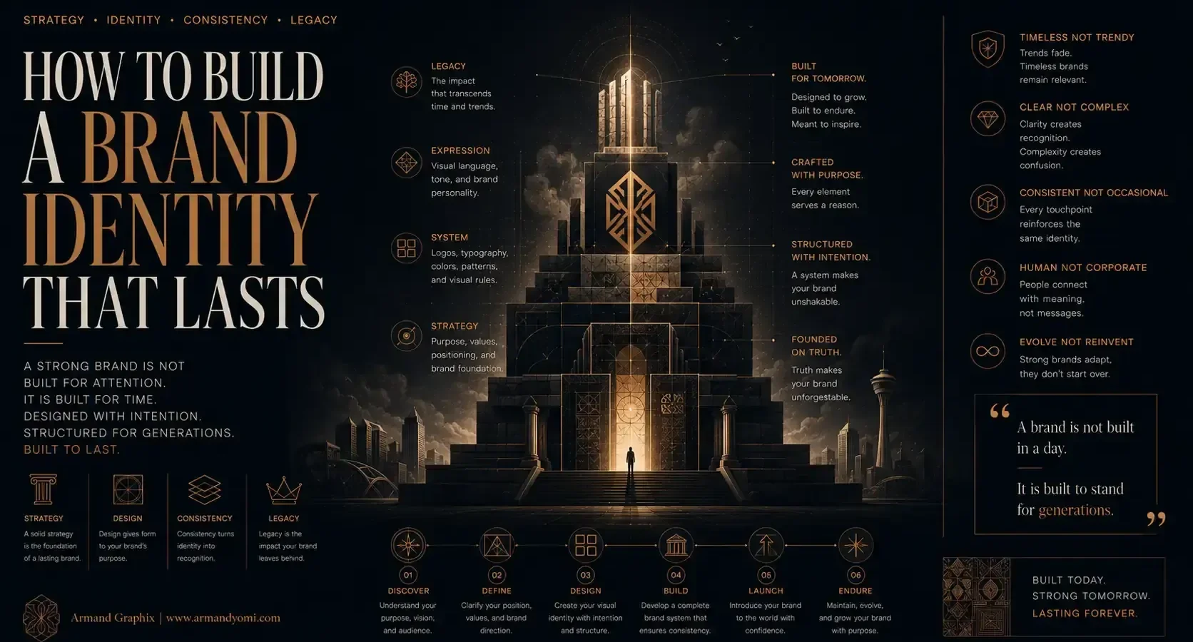
“A lasting brand identity is more than a logo.”
It is a system built to stay relevant, recognizable, and trusted over time.
Build a Brand That Lasts →What brand identity really includes
When people hear brand identity, they often think logo, colors, and fonts. Those elements matter, but they are the visible result of deeper strategic choices. A real identity begins with clarity.
It starts with your position in the market, your audience, your point of view, and the feeling you want to create. From there, the verbal and visual system takes shape. That includes your name, messaging, tone of voice, typography, color palette, image style, design principles, and the way everything appears in motion across digital and physical formats.
This is why two brands can sell similar products yet feel completely different. One might communicate premium restraint. Another might signal warmth, energy, and accessibility. The difference is not decoration. It is strategy translated into design.
How to build brand identity from the inside out
If you want an identity that lasts, do not start by browsing logo inspiration. Start by defining what the brand needs to mean.
Begin with positioning, not aesthetics
A brand identity works best when it answers a simple question: why should this business exist in this market, for this audience, in this specific way?
That means getting clear on who you serve, what problem you solve, what alternatives your audience is comparing you against, and what makes your approach distinct. Distinct does not always mean radically new. Sometimes it means presenting a familiar offer with sharper focus, stronger relevance, or better emotional resonance.
For a startup, this step prevents generic branding. For an established business, it often reveals why the current identity feels flat. If your positioning is vague, the visuals usually become vague too.
Define the story behind the brand
People do not connect with design in isolation. They connect with meaning.
Your brand story should explain the purpose, perspective, and promise behind the business. Not as a dramatic origin tale forced into every page, but as a consistent narrative thread. Why do you do this work? What belief shapes your approach? What kind of transformation do you help create for clients or customers?
This is where many identities either become memorable or disappear into sameness. A brand with a clear narrative creates design decisions that feel intentional. A brand without one often borrows trends and hopes they communicate something deeper.
For founders with multicultural audiences or globally relevant offerings, this part deserves extra care. Story and symbolism do not land the same way in every context. Good identity design considers cultural nuance, not just visual appeal.
Build a verbal identity before refining the visuals
Before finalizing colors and type, shape the language of the brand.
What tone do you use? Sharp and editorial? Warm and conversational? Minimal and premium? Clear verbal identity affects taglines, website copy, ad messaging, packaging text, and even calls to action. It also helps prevent a common problem: a sophisticated visual identity paired with generic or inconsistent messaging.
The best brands sound like themselves as clearly as they look like themselves. That does not mean every sentence follows a script. It means the personality is recognizable.
Designing the visual system
Once strategy and narrative are clear, the visual identity becomes far more precise.
Create a logo that belongs to a system
A logo is important, but it should not be treated like the entire brand. It needs to function within a broader visual language.
That includes typography, spacing, layout behavior, icon style, image treatment, and color relationships. A beautiful logo can still fail if everything around it feels disconnected. On the other hand, a simpler logo can become powerful when supported by a strong, cohesive system.
This is especially important for digital-first brands. Your identity has to work on mobile screens, social graphics, paid ads, email headers, pitch decks, and product pages. A mark that only works in one polished mockup is not enough.
Choose colors and type with meaning
Color and typography shape perception faster than most founders realize. They influence whether the brand feels modern, trustworthy, bold, refined, playful, or premium.
But meaning is contextual. Blue can suggest authority or feel generic. Serif typography can feel elegant or outdated. Minimalism can look premium or simply unfinished. It depends on your audience, category, and execution.
That is why trend-led decisions can become expensive. A palette that looks current today may weaken recognition tomorrow. A better approach is to choose design elements that express the brand’s character while remaining functional across applications.
Develop image direction, not just graphics
Brand identity also lives in photography, illustration, video framing, motion, and content styling. If your website uses polished editorial imagery but your social media shifts into random visuals, the identity starts to fragment.
A clear image direction keeps the brand recognizable even when the logo is absent. It should answer practical questions. Are images bright or moody? Real or highly art-directed? Human-centered or product-focused? Clean and minimal, or layered and expressive?
When that direction is defined, content creation becomes faster and more consistent.
Consistency is what makes identity real
A brand identity is not finished when the files are delivered. It becomes real when it is used consistently across touchpoints.
Apply the identity where customers actually experience it
This sounds obvious, but many businesses invest in branding and then apply it unevenly. The website looks refined. The Instagram feed feels unrelated. The packaging says one thing. The ad creative says another.
Customers do not separate these experiences. They read them as one brand. Every inconsistency creates friction, and friction weakens trust.
That is why practical rollout matters. Your identity should show up clearly in your website design, marketing assets, presentation templates, social graphics, printed materials, signage, and product packaging if relevant. A brand that is consistent across channels feels more established, even if the business is still growing.
Use guidelines without becoming rigid
Brand guidelines help protect consistency, but they should support the brand, not freeze it.
The goal is to create enough structure that collaborators can apply the identity correctly, while leaving room for growth across campaigns, content formats, and evolving business needs. If the system is too loose, the brand drifts. If it is too strict, it becomes difficult to use in the real world.
Good identity design balances discipline and flexibility.
Common mistakes when building a brand identity
One of the biggest mistakes is trying to appeal to everyone. Broad positioning usually leads to bland visuals and forgettable messaging. Clarity attracts better than vagueness.
Another mistake is designing for personal taste instead of audience perception. Founders naturally have preferences, but a brand is not a mood board for the owner’s favorite styles. It is a communication tool built to influence how the right people perceive the business.
There is also the temptation to treat branding as a one-time visual project with no link to marketing. That gap is costly. If the identity is not built with discoverability, conversion, and customer experience in mind, it can look impressive without supporting growth. The strongest brands connect design that tells your story with strategy that grows your brand.
When to refine and when to rebuild
Not every business needs a full rebrand.
Sometimes the foundation is strong, but the execution is scattered. In that case, refining the system, tightening the messaging, and improving consistency may be enough. Other times, the business has outgrown its original identity entirely. Maybe the audience changed, the offer matured, or the brand no longer reflects the quality of the work.
The right move depends on what is broken. If recognition is low but the positioning is still relevant, refinement may work. If the brand no longer reflects who you serve or what sets you apart, rebuilding is often the smarter investment.
This is where strategic outside perspective becomes valuable. It is hard to evaluate your own brand objectively when you are close to the business.
Brand identity should earn attention and trust
If you are serious about how to build brand identity, think beyond the launch moment. The goal is not simply to look professional. It is to create a brand people can recognize quickly, understand clearly, and remember long after the first interaction.
That takes more than design talent. It takes positioning, narrative, consistency, and the discipline to connect creative decisions to business outcomes. At its best, brand identity becomes an advantage – one that shapes perception before you speak and reinforces value every time your audience encounters you.
Build it with intention, and your brand will stop blending in and start carrying its own momentum.
“Stop redesigning every few years.”
Create a brand identity designed for growth, consistency, and long-term impact.
Start Your Brand Identity Project →- 9 Brand Storytelling Examples That Work
 Explore 9 brand storytelling examples that show how narrative, design, and strategy work together to build trust, attention, and growth.
 - Calgary Packaging Design for Products That Sell
 Calgary packaging design for products that builds shelf impact, brand trust, and sales through strategy, storytelling, and smart production choices.
 - Performance Marketing for Startups That Scales
 Performance marketing for startups works best when brand clarity meets data. Learn how to build channels, test faster, and scale with focus.
 - Landing Page Conversion Design That Works
 Landing page conversion design turns attention into action with clearer messaging, stronger visuals, and smarter user paths that sell.
 - Custom Packaging vs Stock Packaging
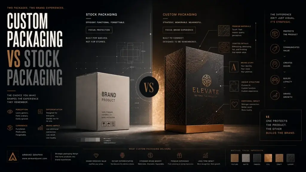 Custom packaging vs stock packaging affects cost, speed, branding, and growth. Learn which option fits your product, budget, and goals best.
 - How to Choose a Web Designer Calgary
 Need a web designer Calgary businesses can trust? Learn what to look for, what to avoid, and how to choose design that drives real growth.