A landing page usually has one job. Yet many pages try to explain everything, impress everyone, and sell all at once. That is where landing page conversion design breaks down. When the page loses focus, the visitor loses momentum.
Good design is not decoration added after the strategy is done. It is the strategy made visible. The layout, headline, spacing, typography, imagery, and call to action all shape whether someone feels confident enough to take the next step. If the page looks polished but the message feels vague, conversions suffer. If the offer is strong but the design creates friction, conversions still suffer.
That tension is why high-performing landing pages are rarely the prettiest pages in a generic sense. They are the clearest. They guide attention, reduce doubt, and make the next action feel obvious.
“Turn Your Landing Page Into a Conversion System”
Discover the design principles that help transform visitors into customers through better structure, messaging, and user experience.
Optimize Your Landing Page →What landing page conversion design really does
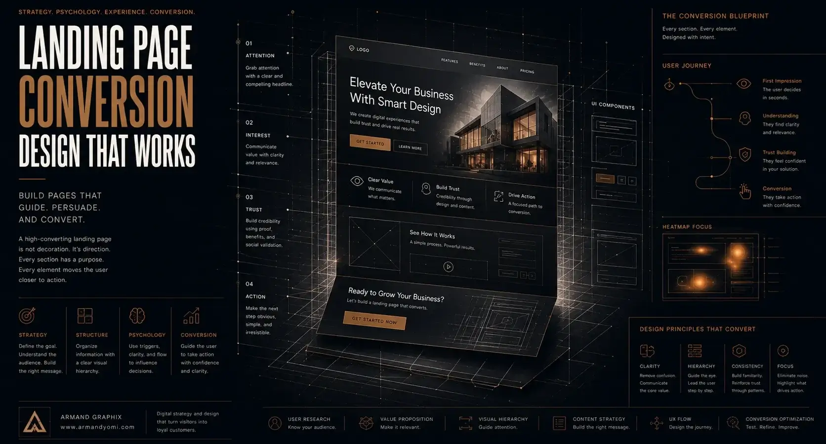
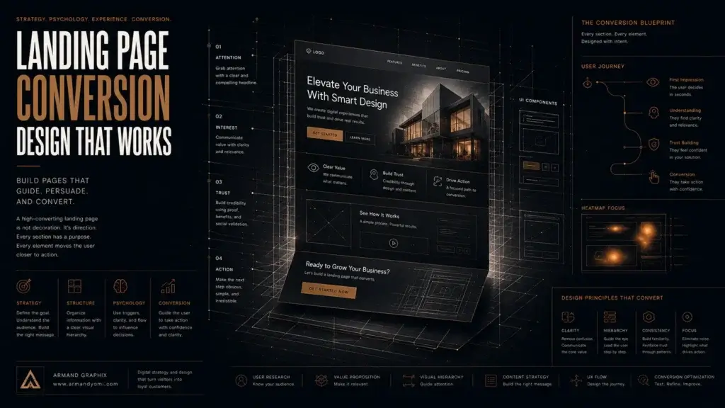
Landing page conversion design is about aligning message, visual hierarchy, and user psychology around one outcome. That outcome might be a purchase, a booked consultation, a form submission, or a demo request. The specific goal changes. The principle does not.
A visitor arrives with limited time and even less patience. In a few seconds, they are asking three questions: Am I in the right place? Is this relevant to me? Can I trust this brand? Your page has to answer all three before it asks for action.
This is where many brands get stuck. They think conversion design means adding brighter buttons or more urgency. Sometimes those tweaks help. More often, the issue sits higher up the page. The value proposition is muddy. The visual order is confusing. The content asks the visitor to work too hard.
A strong landing page feels intentional from the first screen. It does not merely look professional. It behaves like it understands the visitor.
Start with the offer, not the layout
Before choosing sections, colors, or image styles, define the offer with precision. A page cannot convert well if the proposition itself feels generic. “High-quality services” is not an offer. Neither is “We help businesses grow.” Those phrases are broad enough to fit almost anyone, which is exactly why they persuade no one.
A better offer is specific about the audience, the outcome, and the reason to believe. If you help founders launch a new brand identity that looks premium and performs across digital channels, say that clearly. If you are offering a free consultation, explain what the visitor gets from that conversation and why it matters.
Design should amplify that promise. The headline introduces it. The subheading clarifies it. The imagery supports it. The page sections build proof around it. When design and offer move in different directions, trust drops fast.
The first screen carries more weight than most brands realize
Above the fold is not everything, but it sets the tone for everything after it. If the first screen is overloaded, generic, or visually unfocused, many users will never reach your strongest proof further down the page.
The best first screens usually do a few things well. They present a sharp headline with one central idea. They use supporting text to reduce ambiguity, not repeat the headline in softer words. They place one primary call to action where it is easy to find. And they avoid competing elements that split attention.
Visual hierarchy matters here. Bigger is not always better. Contrast, spacing, alignment, and restraint are what make a page easy to scan. If every section is trying to shout, the visitor hears noise.
For design-aware founders, this is often a hard trade-off. They want originality, which makes sense. A distinctive page can strengthen brand memory. But originality cannot come at the expense of clarity. The smartest landing pages know when to be expressive and when to get out of the way.
Messaging should sound like the audience, not the agency
One of the fastest ways to weaken conversion is to write from the company perspective instead of the customer perspective. Visitors care about their problem, their timing, their risk, and their desired outcome. They are not looking for a paragraph about your passion unless it connects directly to what they need.
This does not mean your brand voice should disappear. It means it should be disciplined. Expressive brands still need clean messaging. Sophisticated brands still need direct language. The right words can feel premium and persuasive at the same time.
A practical test is this: if someone reads only the headline, subheading, and button text, would they understand what is being offered and why it matters? If not, the page is asking for too much patience.
Landing page conversion design depends on trust signals
Trust is not built through one testimonial dropped near the footer. It is built through cumulative evidence across the page. That includes social proof, yes, but also consistency, specificity, and visual professionalism.
A page that makes bold promises with no detail feels risky. A page that shows relevant work, clear outcomes, recognizable client types, or concise testimonials feels grounded. If the service is premium, the design quality itself becomes part of the proof. Sloppy spacing, weak typography, or stock imagery that feels disconnected can quietly lower perceived value.
For service businesses, proof often works best when it is contextual. Instead of vague praise, show what changed. Did inquiries improve? Did the brand presentation become more credible? Did the campaign attract better-fit leads? Real proof shortens the distance between interest and action.
Friction hides in small design decisions
Some landing pages fail for obvious reasons. Others lose conversions through smaller moments of hesitation. A form asks for too much information. A mobile layout pushes the call to action too far down. The button label feels passive. The page loads slowly. The text density makes scanning difficult.
None of these issues sound dramatic on their own. Together, they create drag.
That is why landing page conversion design should be treated as a system, not a mood board. Every element either helps the user move forward or creates resistance. This includes things many brands overlook, such as how long the page feels, how clearly sections are separated, and whether the visual rhythm gives the eye a place to rest.
The fix is not always to remove content. Sometimes a longer page converts better because the offer requires more reassurance. Higher-ticket services often need more explanation and more proof. But longer only works when the content is structured well and each section earns its place.
Good design directs attention with intention
Visitors do not read pages in neat top-to-bottom order. They scan, skip, compare, and pause. Design has to guide that behavior.
That means using headings that carry meaning, not filler. It means making key benefits easy to spot without turning the page into a wall of badges and icons. It means choosing visuals that support understanding rather than merely filling space.
In brand-led businesses, this is where story becomes powerful. Design that tells your story can increase conversion when the narrative supports the decision. A founder photo, a product close-up, a brand visual system, or a project snapshot can all add value if they reinforce trust and identity. If they distract from the offer, they become expensive wallpaper.
One of the advantages of a strategic creative approach, the kind Armand Graphix is known for, is that it treats visual identity and performance as partners. A landing page should not have to choose between being beautiful and being useful. It should do both, with discipline.
Testing matters, but only after the fundamentals are right
It is tempting to jump straight into A/B testing headlines, button colors, or section order. Testing is useful. But if the core positioning is weak, optimization becomes expensive guesswork.
Start by getting the fundamentals right: a clear offer, a relevant audience, a strong first screen, persuasive proof, and a low-friction path to action. Once those pieces are in place, testing can reveal valuable patterns. You may find that a more direct headline outperforms a clever one. You may learn that reducing form fields increases lead quality as well as quantity. You may discover that a simpler page converts better on mobile, even if the desktop version feels less dramatic.
The key is to test meaningful variables. Minor cosmetic changes rarely compensate for strategic confusion.
What high-converting pages have in common
They are specific. They respect attention. They make the next step feel safe and worthwhile.
They also understand that conversion is emotional before it is mechanical. People act when they feel clarity, relevance, and trust. Design shapes all three. It frames the message, influences perceived credibility, and affects whether the page feels easy to engage with.
That is why the strongest landing pages are not built by treating copy, layout, and branding as separate tasks. They are built by bringing them into one clear direction. Strategy that grows your brand has to show up on the page as structure, language, and visual confidence.
If your landing page is getting traffic but not enough action, the answer is rarely more noise. Usually, it is better alignment. Sharper messaging. Stronger hierarchy. More relevant proof. Less friction. When the design tells the right story and the story leads to a clear decision, conversion starts to feel less like persuasion and more like momentum.
“Your Website Gets Attention. Your Landing Page Gets Results.”
Learn how strategic landing page design creates clarity, builds trust, and guides users toward meaningful action.
Build a Better Landing Page →- 9 Brand Storytelling Examples That Work
 Explore 9 brand storytelling examples that show how narrative, design, and strategy work together to build trust, attention, and growth.
 - Calgary Packaging Design for Products That Sell
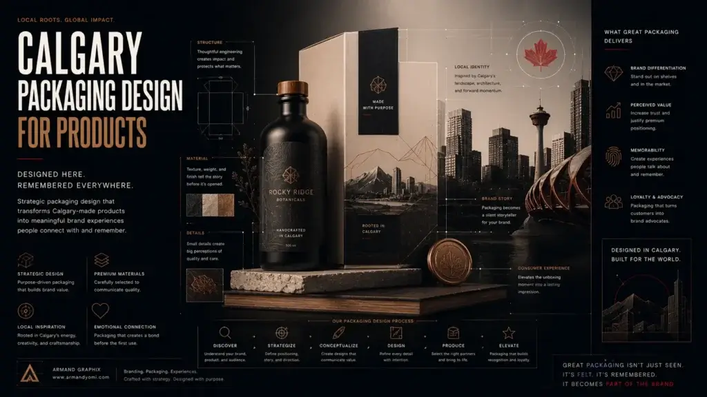 Calgary packaging design for products that builds shelf impact, brand trust, and sales through strategy, storytelling, and smart production choices.
 - Performance Marketing for Startups That Scales
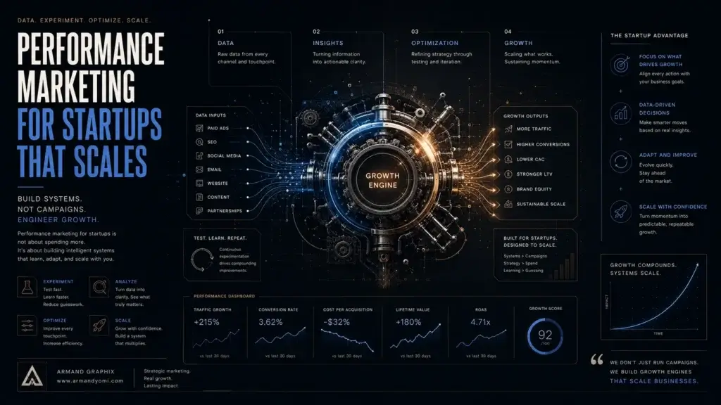 Performance marketing for startups works best when brand clarity meets data. Learn how to build channels, test faster, and scale with focus.
 - Landing Page Conversion Design That Works
 Landing page conversion design turns attention into action with clearer messaging, stronger visuals, and smarter user paths that sell.
 - Custom Packaging vs Stock Packaging
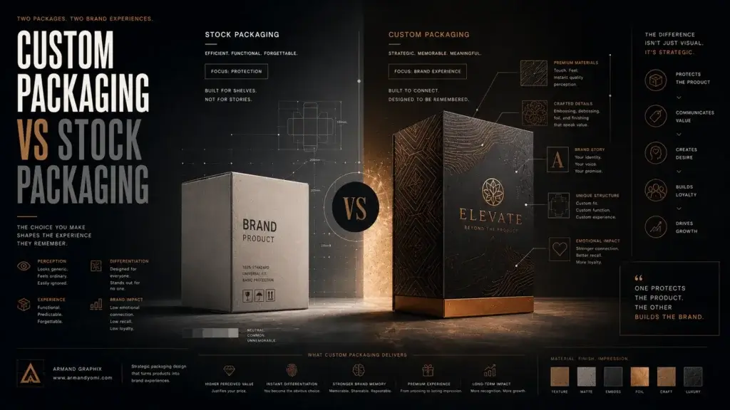 Custom packaging vs stock packaging affects cost, speed, branding, and growth. Learn which option fits your product, budget, and goals best.
 - How to Choose a Web Designer Calgary
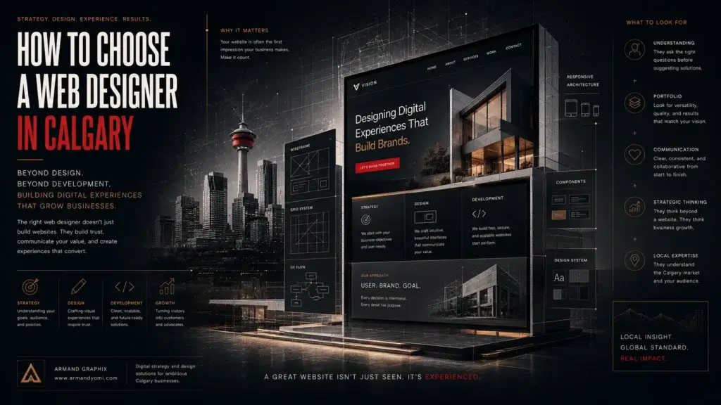 Need a web designer Calgary businesses can trust? Learn what to look for, what to avoid, and how to choose design that drives real growth.