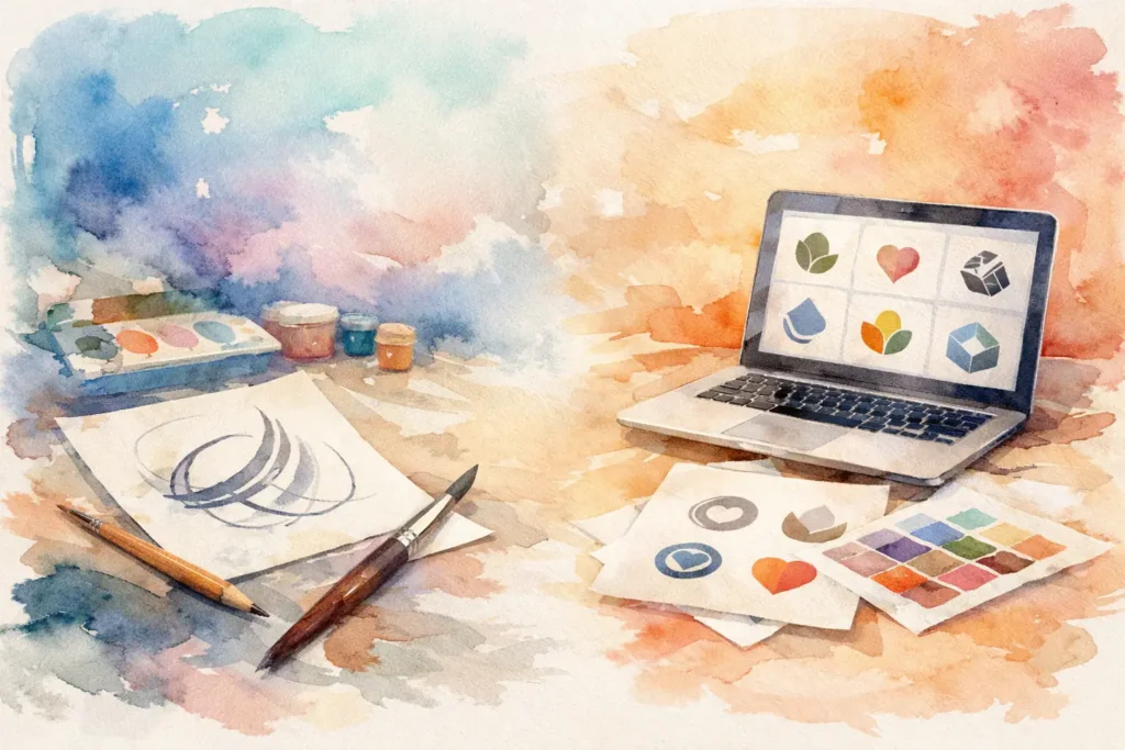
A luxury brand can look inexpensive with the wrong type. A startup with a smart offer can still feel forgettable if its message is poorly set. That is why asking what is typography in graphic design is not a beginner question. It is a brand question, a communication question, and often a business question.
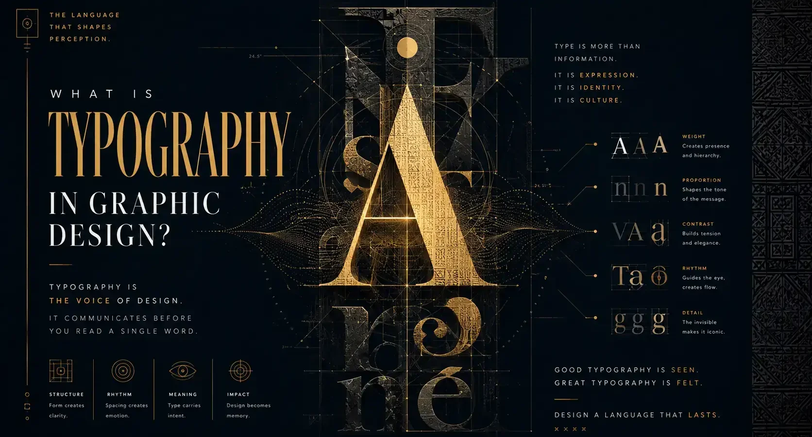
Typography is the art and strategy of arranging type so language becomes visual communication. In graphic design, it goes far beyond picking a nice-looking font. It shapes how people read, what they notice first, what feels credible, and what emotional tone they attach to a brand. The words may carry the message, but typography controls how that message lands.
What is typography in graphic design, really?
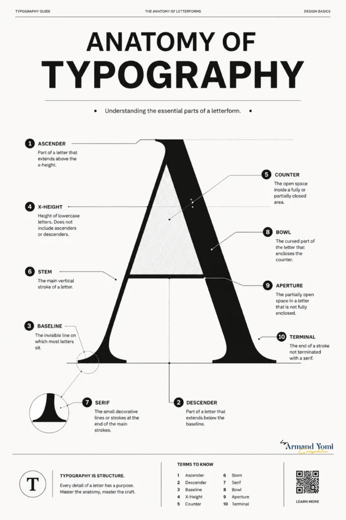
At its core, typography is the use of letterforms to create clarity, mood, hierarchy, and identity. A designer works with typefaces, font sizes, spacing, alignment, line length, weight, and contrast to turn plain text into an experience that feels intentional.
That distinction matters. Typography is not just decoration added after the content is written. It is part of the message itself. The same sentence can feel elegant, urgent, playful, institutional, premium, or approachable depending on how it is set.
For businesses, this is where typography becomes strategic. If your brand says it is modern but uses dated type, there is a disconnect. If your packaging wants to feel premium but the typography looks crowded or generic, customers feel that tension immediately, even if they cannot explain it.
“Typography shapes how audiences read, trust, remember, and emotionally connect with a message.”
In branding, every type choice influences perception before a single word is understood.
Discover Strategic Brand Design →Typography does more than make things look good
Good typography creates order. It tells the reader where to begin, where to pause, and what matters most. On a website, that might mean a strong headline, clean body text, and enough spacing to keep the page readable. On packaging, it might mean balancing legal information, product details, and brand presence without making the design feel cluttered.
It also creates trust. People often judge professionalism before they read a single sentence in full. If the type feels awkward, inconsistent, or hard to read, the brand can appear careless. If it feels composed and deliberate, the brand appears more credible.
Then there is memorability. Logos and color palettes get a lot of attention, but typography often carries a brand’s voice over time. Think about how certain brands feel refined, bold, youthful, or editorial largely because of the way they use type. That consistency becomes part of recognition.
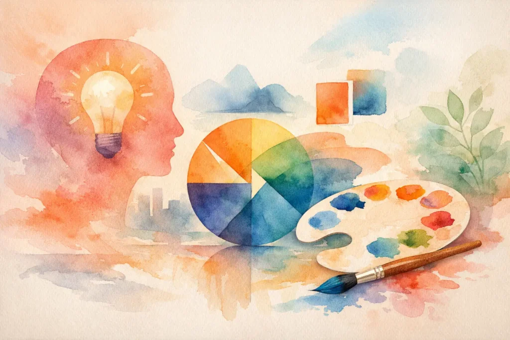
The building blocks of typography
To understand typography in graphic design, it helps to know what designers are actually controlling.
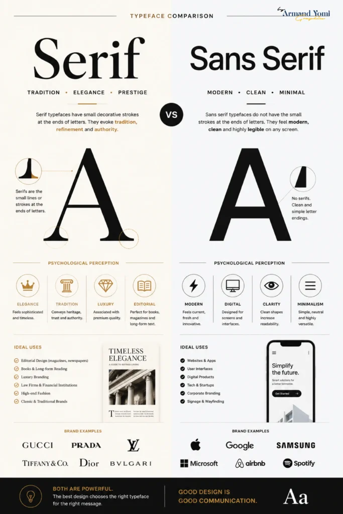
A typeface is the overall design of the letters, such as serif, sans serif, display, or script. A font is a specific version of that typeface, like bold or italic. In everyday conversation people blur those terms, and that is fine, but in design the difference can matter.
Hierarchy is the visual system that ranks information. Headlines should not compete with body copy. Subheads should guide, not distract. Captions, buttons, pull quotes, and navigation all need clear relationships.
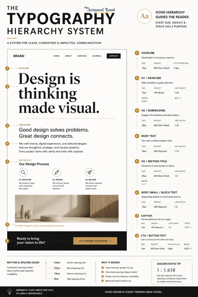
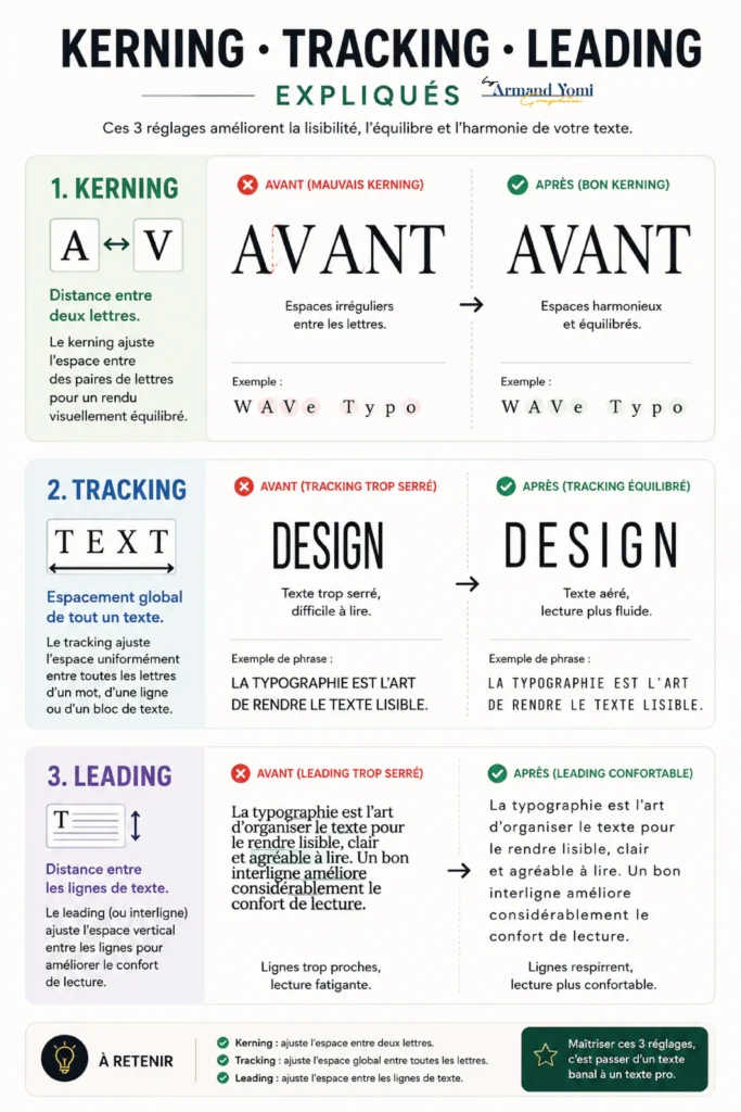
Spacing is one of the biggest quality markers. Designers adjust kerning, which is the space between specific letters, tracking, which is the overall spacing across a word or line, and leading, which is the space between lines of text. Small changes here can make type feel polished or amateur.
Alignment affects rhythm and readability. Left-aligned text usually feels natural and easy to read. Centered text can feel formal or expressive, but it becomes harder to scan in longer passages. Justified text can look elegant in some layouts, though poor handling often creates awkward gaps.
Scale and contrast bring emphasis. Larger type draws attention. Bold weight creates priority. Contrast between headline and body copy helps readers navigate the page without effort.
Why typography matters for branding
Branding is not only about what you say. It is about how consistently and convincingly you say it. Typography is one of the clearest tools for that.
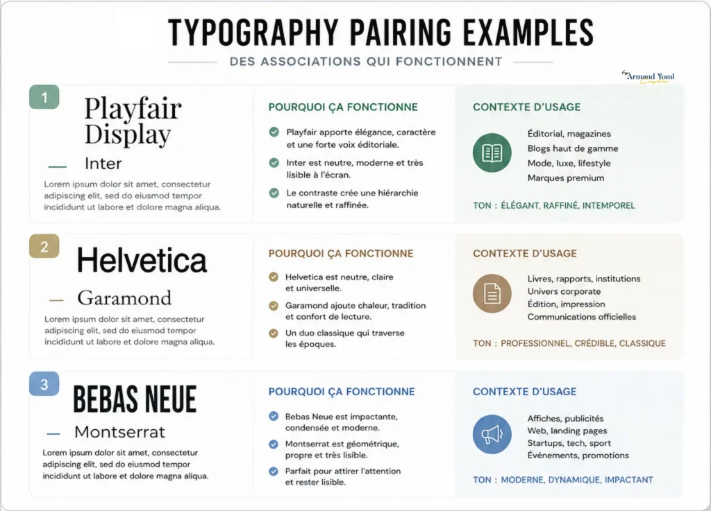
A law firm, a skincare brand, a music festival, and a tech startup should not all sound the same visually. Their typography choices should reflect their audience, offer, and market position. A high-end wellness brand might use refined serif typography with generous space to communicate calm and sophistication. A fast-growing software company might lean on a clean sans serif system that feels efficient and current.
This is where many businesses make expensive mistakes. They choose fonts based on personal taste rather than brand fit. A font can be beautiful and still be wrong. What matters is whether it supports the brand story and works across every touchpoint, from social graphics to pitch decks to packaging.
At Armand Graphix, that connection between story and system is central. Typography should not only look distinctive. It should support how a brand is remembered, trusted, and experienced.
Typography in print versus digital design
The principles stay similar, but the execution changes.
In print, designers have more control over the final environment. A brochure, poster, label, or business card has fixed dimensions and predictable viewing conditions. Typography can be more precise, and subtle details often matter more because the audience may hold the piece in their hands.
In digital design, flexibility matters. Type has to work across screen sizes, browsers, and devices. A headline that feels balanced on desktop may break awkwardly on mobile. Body text needs to remain readable under different lighting conditions and attention spans. Web typography is not only about style. It is about performance, accessibility, and user behavior.
This is why good typography is never just a font selection exercise. It is a system. It must adapt without losing its voice.
Common typography mistakes brands make
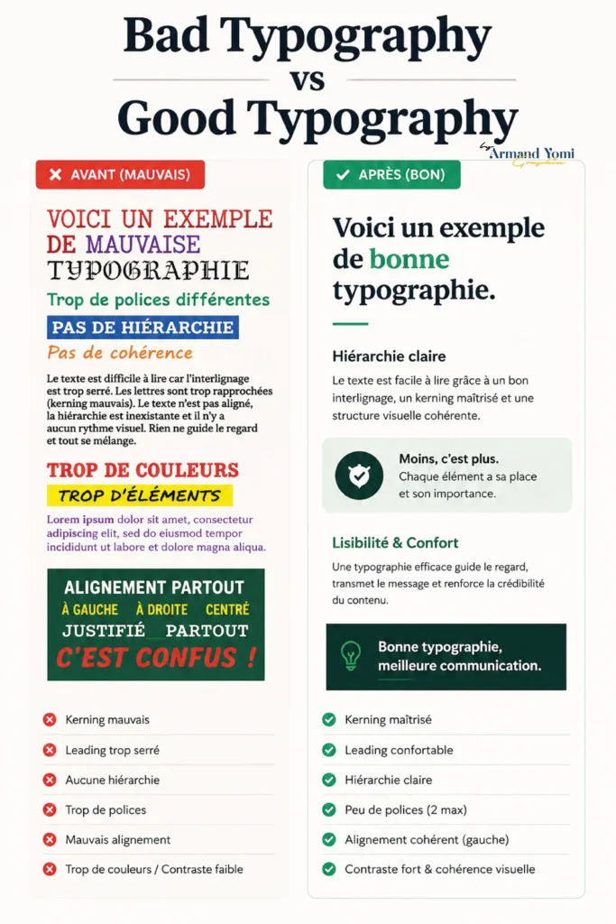
One of the most common issues is using too many typefaces. A brand usually does not need five different personalities competing on one page. Restraint creates clarity.
Another is ignoring readability in pursuit of style. Decorative type can be powerful in a logo or campaign headline, but if every message becomes hard to read, the design starts working against the audience.
Poor spacing is another frequent problem. Crowded type feels rushed and low quality. Too much space can feel disconnected. The right balance creates ease.
There is also the problem of inconsistency. If your website uses one set of styles, your social media another, and your packaging a third, your brand starts to feel fragmented. Consistent typography helps people recognize you faster.
How designers choose the right typography
There is no universal best font. The right choice depends on context.
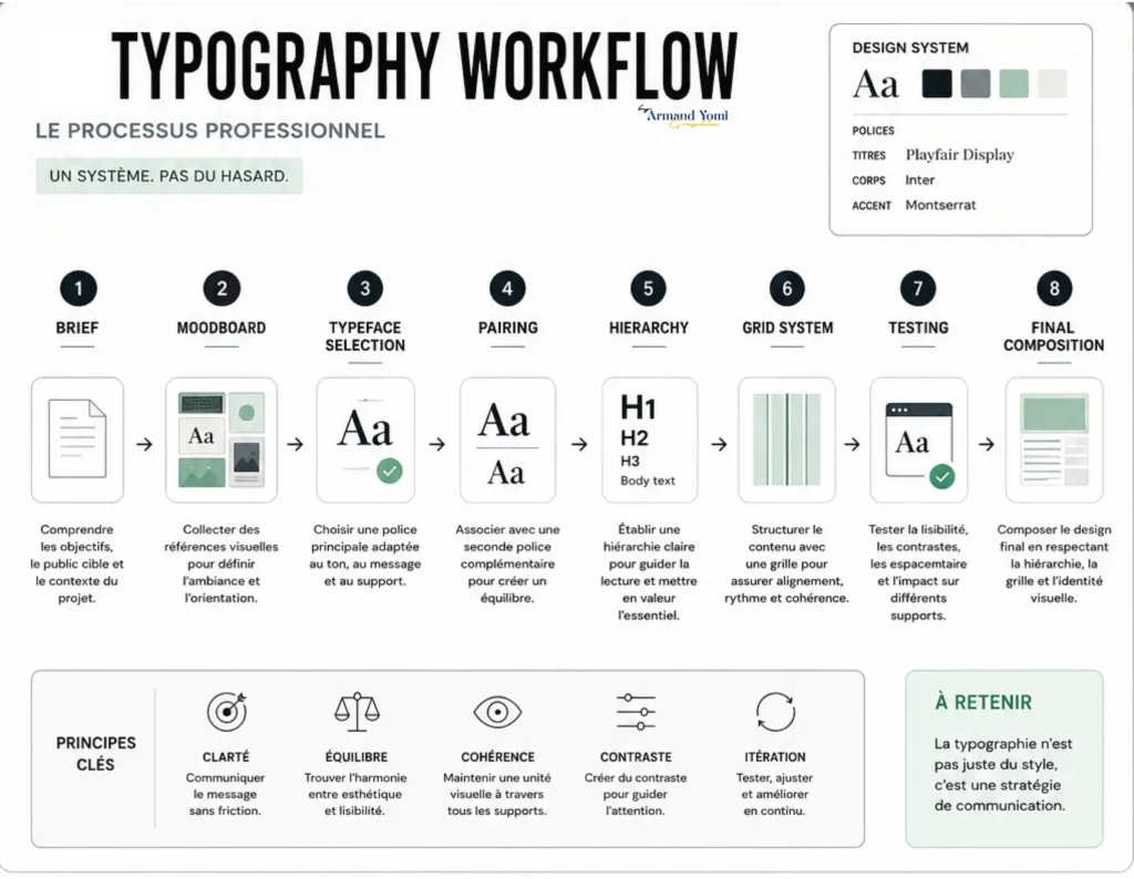
A designer looks at the brand’s personality, audience, offer, competitors, and channels. They ask practical questions. Does this typeface stay readable at small sizes? Does it have enough weights for a flexible hierarchy? Does it support the brand’s tone across web, print, and campaign assets? Does it feel overused in the category, or does it help the brand stand apart?
There are trade-offs. A highly expressive display typeface may create strong first impressions but fail in long-form text. A neutral sans serif may perform well across systems but need more art direction to feel distinctive. A classic serif may communicate authority, though in some categories it can also feel too traditional if not paired carefully.
That is why typography decisions should be made in context, not in isolation. Type has to work with imagery, color, layout, messaging, and user intent.
What is typography in graphic design if not a business tool?
For growing brands, typography is one of the clearest examples of design affecting results. It influences whether a landing page feels easy to trust, whether packaging feels shelf-ready, whether a presentation feels premium, and whether your brand voice feels consistent across channels.
It can also affect conversion indirectly. When information is clearer, people spend less energy decoding and more energy deciding. When a brand feels coherent, it often feels more established. When text becomes easier to scan, users are more likely to stay engaged.
That does not mean typography alone drives growth. Offer, positioning, copy, and marketing all matter. But typography strengthens the delivery of each one.
The best typography feels invisible and unforgettable
That is the paradox. When typography is working well, readers rarely stop to praise the kerning or line height. They simply feel that the brand is polished, clear, and compelling. They trust it more. They remember it longer.
So if you are building a brand, refreshing an identity, or trying to make your marketing feel more intentional, pay attention to your type. Not because typography is a design trend, but because it is one of the clearest ways to make your message look like it belongs to the brand you are trying to become.
The right typography does not just help people read your words. It helps them believe them.
“Typography is one of the most powerful invisible tools in graphic design. When used strategically, it transforms simple communication into brand recognition.”
We help brands build visual systems that communicate clearly, feel distinctive, and remain memorable across digital and physical environments.
Start Your Branding Project →- Custom Logo vs Template: What Fits Your Brand?
 Custom logo vs template: compare cost, speed, ownership, and brand impact to choose an identity that builds your launch, growth, and reputation today.
 - What Is a Visual Identity? Design That Builds Trust
 What is a visual identity? Learn how logos, color, typography, and systems create recognition, trust, and stronger brand growth for ambitious businesses.
 - Graphic Design Services Calgary Businesses Need
 Graphic design services Calgary businesses choose should unite brand story, visual distinction, and marketing goals to build credibility and lasting growth
 - Brand Storytelling for Entrepreneurs That Builds Trust
 Brand storytelling for entrepreneurs turns strategy into connection. Learn how to shape a narrative that earns trust, distinction, and measurable growth.
 - Brand Launch Campaign Checklist That Builds Momentum
 Use this brand launch campaign checklist to align your identity, launch message, channels, and measurement before your first public impression matters.
 - Best Marketing Channels for Launches That Land
 Find the best marketing channels for launches, from email and search to social and partnerships, then build a focused plan that earns attention and action.