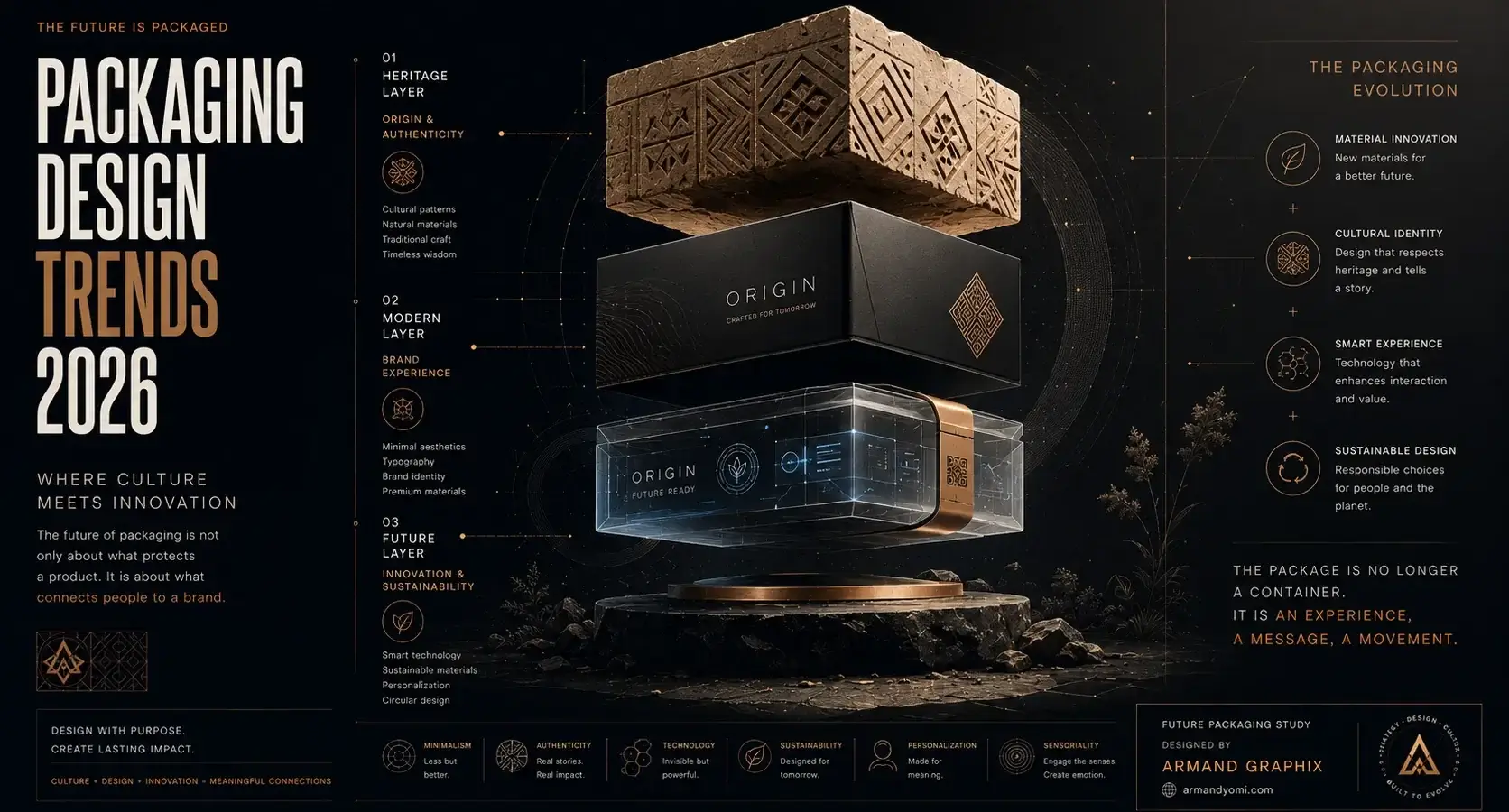
A product can be excellent and still disappear on the shelf. That is the uncomfortable truth behind many launches. In packaging design trends 2026, the brands gaining attention are not simply making things look better. They are building packaging systems that communicate faster, feel more intentional, and turn first impressions into trust.
For founders, product teams, and brand-led businesses, this shift matters. Packaging is no longer a wrapper added at the end of development. It is brand strategy in physical form. It carries your story, your pricing logic, your audience cues, and your retail ambition in a matter of seconds.
The best decision is rarely about freelancer versus agency as a fixed rule. It is about fit, trust, and whether the person or team in front of you can turn your vision into a brand people remember and a business people choose.
“Discover the Packaging Trends Shaping the Future of Brands”
Explore the design movements, materials, and innovations redefining how products connect with consumers in 2026.
Explore 2026 Packaging Trends →Packaging design trends 2026 are getting more strategic
The biggest change is not a single visual style. It is the way packaging is being used. In 2026, design decisions are increasingly shaped by brand positioning, digital behavior, sustainability pressure, and retail performance at the same time.
That means a beautiful pack is not enough on its own. It needs to photograph well for ecommerce, stand out in crowded social feeds, make practical sense in production, and still feel emotionally aligned with the audience. The strongest work is balancing craft with commercial clarity.
This is especially true for smaller brands. Startups and growing businesses do not always have the budget for endless product education. Packaging has to do more of the selling. It has to help shoppers understand what the product is, who it is for, and why it deserves attention.
The return of bold simplicity
Minimalism is not disappearing, but it is changing. The flat, generic version of minimal packaging that dominated the last few years is losing ground. In its place, brands are using cleaner structures with more character.
Think fewer visual elements, but stronger ones. A confident typographic hierarchy. One memorable color field. A distinct logo lockup. A label layout with enough restraint to feel premium, but enough personality to avoid blending in with every other “modern” brand.
This is a useful direction for founders who want longevity. Trend-heavy packaging can generate short-term buzz, but bold simplicity travels better across product lines, ad creative, and retail environments. It gives a brand room to scale without redesigning every six months.
Why simple works now
Consumers are seeing more products, more ads, and more visual noise than ever. Packaging that gets to the point often wins. Clear structure reduces friction. It helps the eye find the product name, the benefit, and the reason to care.
The trade-off is that simple design is harder than it looks. When there are fewer elements, each one carries more responsibility. Weak typography, vague messaging, or an undecided color palette becomes more obvious.
Story-led packaging is getting sharper
Brands have spent years talking about storytelling. In 2026, the difference is that the story on packaging is becoming more focused and more disciplined.
Instead of filling every panel with brand philosophy, strong packaging is telling a tighter story. It might highlight origin, craftsmanship, community, ingredient integrity, or a cultural point of view. But it does so with precision. Every line earns its place.
This matters because audiences are skeptical of vague branding language. They respond better to packaging that feels rooted in something specific. A distinct founder perspective. A meaningful visual reference. Naming and copy that sound human rather than manufactured.
For multicultural brands or businesses speaking to diverse audiences, this opens real creative territory. Cross-cultural design cues, when handled with respect and intelligence, can create packaging that feels rich rather than generic. The key is authenticity. Borrowed aesthetics without context tend to look shallow fast.
Packaging design trends 2026 favor expressive typography
Typography is carrying more of the brand load. That is partly because brands want stronger recognition without overcomplicating layouts. It is also because type can express mood quickly, from refined and editorial to playful and disruptive.
In 2026, expect to see more custom wordmarks, more unexpected type pairings, and more layouts where typography is the hero rather than a supporting detail. Serif type is still strong in premium and wellness categories, but sans serif systems remain dominant where clarity and modernity matter most.
What is changing is the confidence level. Type is getting larger. Spacing is becoming more deliberate. Product names are being treated as assets, not placeholders.
The business case for better type
Good typography improves recall. It also improves navigation across a line of products. If a customer can quickly identify flavor, format, or benefit, the shopping experience gets easier. That can support repeat purchase just as much as visual appeal supports trial.
For businesses with multiple SKUs, typography is one of the smartest places to invest. It creates consistency without forcing every package into the same visual box.
Sustainable packaging is moving past the usual signals
Sustainability is still central, but the design language around it is maturing. Shoppers no longer automatically associate kraft paper textures, muted greens, and “eco” styling with credibility. In some categories, those shortcuts are starting to feel performative.
The stronger approach in 2026 is honesty. If the material choice is more sustainable, say how. If the package reduces waste, make that legible. If the product is not perfect but is improving, transparency often builds more trust than polished claims.
Visually, this creates more range. Sustainable packaging can still be bright, premium, or highly designed. It does not need to look rustic to feel responsible.
That said, material and structural choices have trade-offs. A more sustainable substrate may affect print quality. A refill system may sound appealing but create friction for first-time users. The right answer depends on your category, margins, and customer behavior.
Structural design is becoming part of the brand story
Flat label design gets most of the attention online, but structure is becoming a bigger differentiator. Shape, opening experience, portability, refillability, and shelf efficiency are all influencing perception.
This is one of the most interesting packaging design trends 2026 because it bridges branding and product experience. A thoughtful structure can make a brand feel premium before the product is even used. It can also solve practical issues that customers remember.
For example, easier dispensing, better stackability, or clearer resealing can become a brand advantage. These are not glamorous details, but they affect everyday satisfaction. In categories with heavy competition, that kind of functionality can quietly build loyalty.
The caution here is cost. Custom structures can elevate a brand, but they can also strain production budgets and complicate logistics. Strategic packaging design means knowing when a structural move creates real value and when a smart graphic system can do enough on its own.
Digital-first packaging is shaping physical design
Packaging no longer lives only in stores. It appears in unboxing videos, product pages, paid social, creator content, and customer photos. That visibility is changing how brands approach color, contrast, and composition.
Designers are paying closer attention to how packaging reads on a phone screen. Does the logo hold up in a thumbnail? Does the key benefit remain visible in a cropped image? Does the package feel recognizable when seen out of context?
This does not mean every package should be loud. It means the design should be intentional across environments. Some brands will benefit from high-contrast color systems. Others may win with a quieter premium look that photographs beautifully under soft light. It depends on audience, category norms, and price point.
Limited-edition thinking is influencing core packaging
Another shift in 2026 is the crossover between campaign design and evergreen packaging. Brands have learned from limited drops, collaborations, and seasonal releases that people respond to packaging with energy and collectibility.
As a result, even core packaging is becoming more expressive. Not chaotic, but more willing to take a stance. More brands are building flexible visual systems that allow variation while preserving recognition.
This is useful for growing businesses because it creates room for storytelling over time. You can launch with a strong master brand, then introduce special runs, regional references, or audience-specific editions without starting from scratch.
At Armand Graphix, this is where strategy and design need to work together. A flexible packaging system should still feel like one brand, not a series of disconnected experiments.
What brands should do next
If you are planning a launch or a packaging refresh, resist the urge to chase trends as surface decoration. The better question is which of these shifts supports your brand story and your market goals.
Start with clarity. What should a customer understand in three seconds? Then look at your packaging through multiple lenses: shelf impact, ecommerce visibility, production reality, and brand distinctiveness. If one of those areas is weak, the design will feel less effective no matter how polished it looks.
The brands that stand out in 2026 will not be the ones using every new visual cue. They will be the ones making sharper choices. Better materials where they matter. Better typography where recognition matters. Better storytelling where trust matters.
Packaging earns its value when it does more than decorate the product. It should make the brand easier to believe in.
“Your Packaging Is More Than a Box. It’s a Brand Experience.”
Learn how strategic packaging design creates stronger emotional connections and memorable customer experiences.
Transform Your Packaging Design →- 9 Brand Storytelling Examples That Work
 Explore 9 brand storytelling examples that show how narrative, design, and strategy work together to build trust, attention, and growth.
 - Calgary Packaging Design for Products That Sell
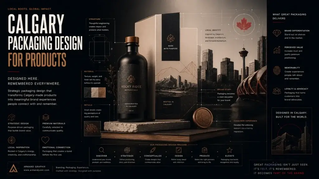 Calgary packaging design for products that builds shelf impact, brand trust, and sales through strategy, storytelling, and smart production choices.
 - Performance Marketing for Startups That Scales
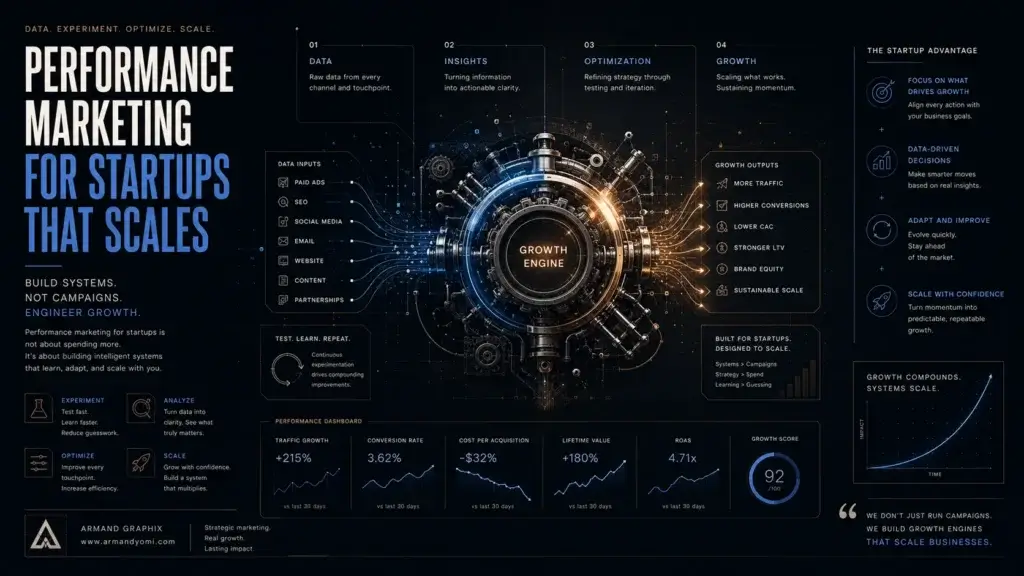 Performance marketing for startups works best when brand clarity meets data. Learn how to build channels, test faster, and scale with focus.
 - Landing Page Conversion Design That Works
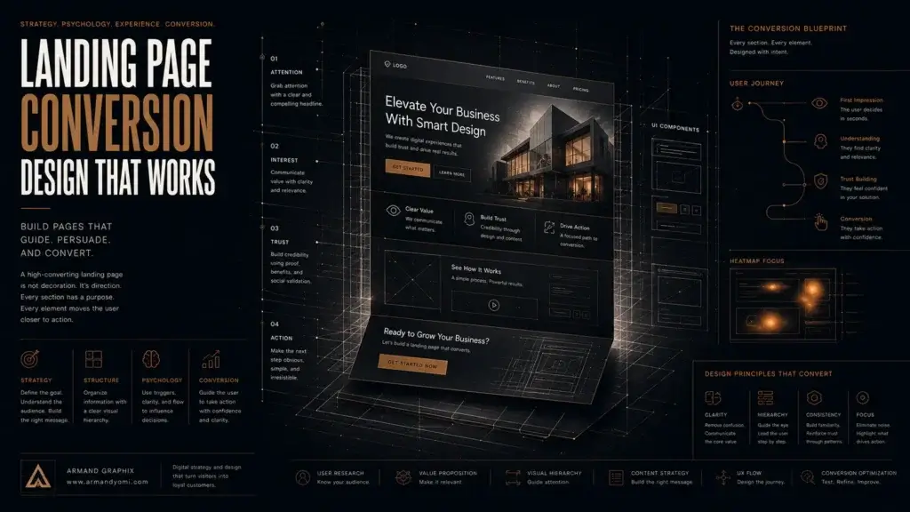 Landing page conversion design turns attention into action with clearer messaging, stronger visuals, and smarter user paths that sell.
 - Custom Packaging vs Stock Packaging
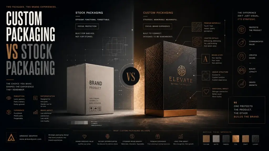 Custom packaging vs stock packaging affects cost, speed, branding, and growth. Learn which option fits your product, budget, and goals best.
 - How to Choose a Web Designer Calgary
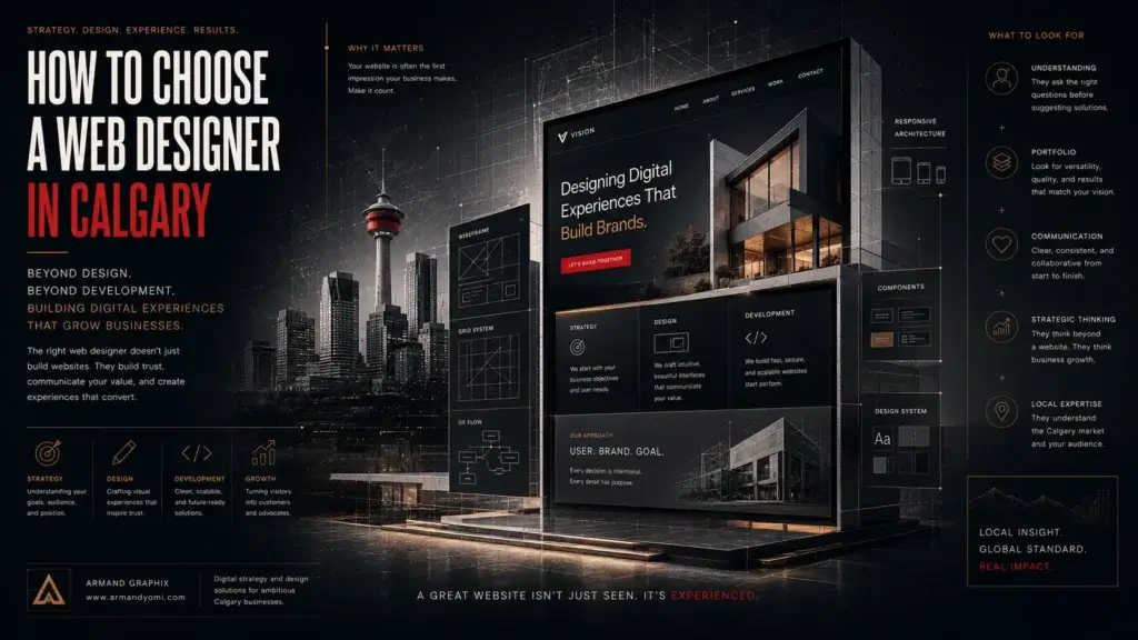 Need a web designer Calgary businesses can trust? Learn what to look for, what to avoid, and how to choose design that drives real growth.