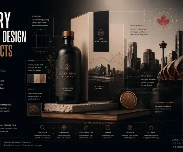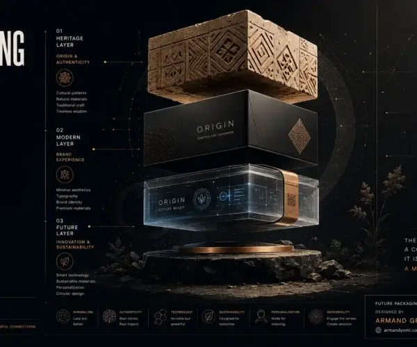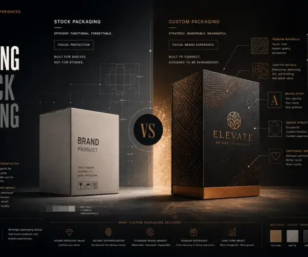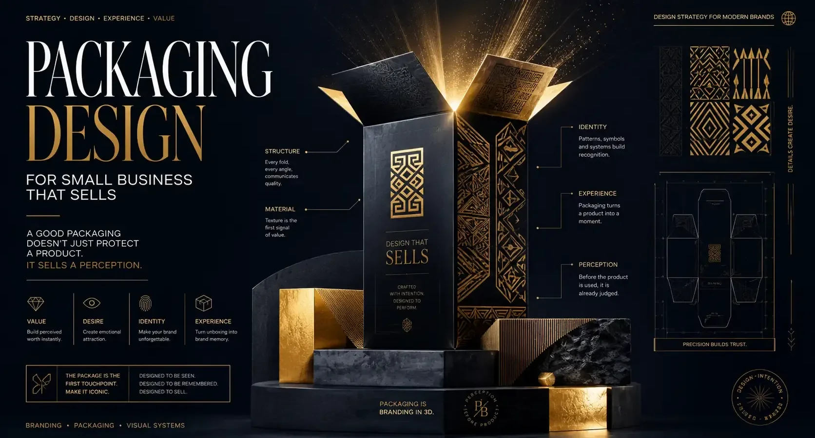
A customer picks up your product for three seconds before deciding whether it feels worth their money. That is the real pressure point of packaging design for small business. You are not just wrapping an item. You are shaping perception at shelf level, on a doorstep, in an unboxing video, and in the customer’s memory long after the purchase.
For small brands, packaging has to work harder than it does for established companies. You usually have less space, less budget, and less brand recognition. Yet the expectation is the same. The product should look credible, feel intentional, and communicate value immediately. Good packaging closes that gap.
Why packaging design for small business matters more than most founders think
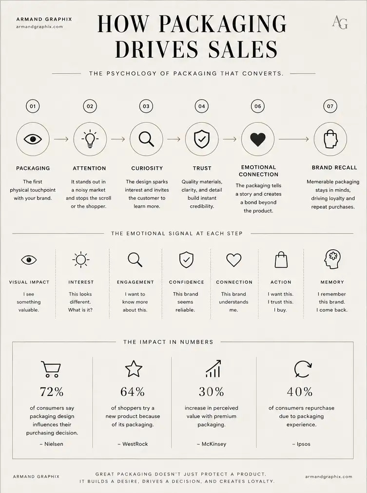
Small businesses often treat packaging as the last step. Product first, logo next, box later. That order is understandable, but it creates expensive problems. When packaging is rushed, the product may still be good, but the brand feels unfinished.
Packaging is one of the few brand assets that lives at the exact point of purchase and the point of experience. It influences whether someone notices you, whether they trust you, and whether they share you. A clean label, a smart structure, and a clear message can elevate a modest product. Poor packaging can make a great product look generic.
This is especially true for businesses entering retail, launching e-commerce products, or competing in visually crowded categories like beauty, food, wellness, and lifestyle goods. In those spaces, packaging is not decoration. It is positioning.
What effective packaging actually needs to do
A strong package is doing several jobs at once. It protects the product, yes, but that is only the baseline. It also signals who the product is for, how premium it is, what makes it different, and whether the brand can be trusted.
The best packaging makes those messages feel immediate rather than forced. A founder should not need a paragraph to explain why the brand matters if the packaging already communicates the essence. That is where design strategy matters. Typography, color, materials, hierarchy, and structure all contribute to that first impression.
There is also a practical layer that many businesses overlook. Packaging needs to survive shipping, fit production realities, meet legal labeling needs, and stay consistent across sizes or product variants. Beautiful design that fails in manufacturing is not good design. Neither is packaging that looks polished online but arrives damaged in the mail.
“Is your packaging selling or just containing ?”
Your product might be good, but does it look worth buying ?
Upgrade your packaging strategy →Start with brand story, not just style
The strongest packaging design for small business usually begins with a brand question, not a visual one. What should people feel when they see this product? What world does the brand belong to? What kind of customer is it trying to attract?
A wellness product aimed at busy professionals needs a different visual language than a handmade food brand built around warmth and tradition. A minimalist look can feel premium in one category and cold in another. Bold color can feel energetic or cheap depending on execution. Context matters.
This is where many founders get trapped by trends. They see a clean monochrome label or a playful handwritten type style and assume that is the right answer. Sometimes it is. Often it is borrowed confidence. Good packaging is not about looking current. It is about looking right for your brand, your customer, and your market.
At Armand Graphix, this is where design and strategy meet. Packaging should tell your story, but it should also compete effectively. Those two goals are not separate.
The visual elements that shape perception
Typography carries more weight than many small businesses realize. The wrong type choice can make a premium product feel amateur or make an approachable product feel distant. Type should support the brand voice and improve readability, especially when space is limited.
Color has a similar influence. It creates recognition fast, but it also triggers assumptions. Deep neutrals often suggest sophistication. Bright palettes can communicate playfulness, youth, or accessibility. Earth tones may imply natural ingredients or grounded craftsmanship. None of these are fixed rules, but they are useful signals.
Material choice adds another layer. Matte finishes, textured papers, foil accents, clear containers, rigid boxes, or simple recyclable stock all tell different stories. A small business does not need the most expensive material to look premium. It needs the right one. Sometimes restraint feels more elevated than excess.
Then there is hierarchy. What should the customer notice first? The brand name, the product type, the flavor, the benefit, or the ingredient claim? If everything shouts, nothing speaks clearly. Smart hierarchy creates confidence because it removes friction.
Budget constraints are real – but bad shortcuts cost more
Small businesses do not have the luxury of waste. Every packaging choice has a budget implication, from print method to box dimensions to minimum order quantities. That is why packaging design should be strategic early, not corrected later.
The cheapest route upfront is not always the most affordable over time. If you print packaging that does not scale well, lacks consistency, or requires redesign after your first retail meeting, you pay twice. The same applies when founders choose packaging based only on unit cost and ignore customer perception.
That said, not every brand needs custom rigid boxes and layered finishes. Sometimes a well-designed label system on standard packaging is the smartest move. Sometimes a simpler mailer with strong typography and one signature brand color creates a sharper identity than an overdesigned solution. It depends on your category, margin, shipping model, and audience expectations.
Practical design is not lesser design. It is disciplined design.
Packaging for retail and packaging for e-commerce are not the same
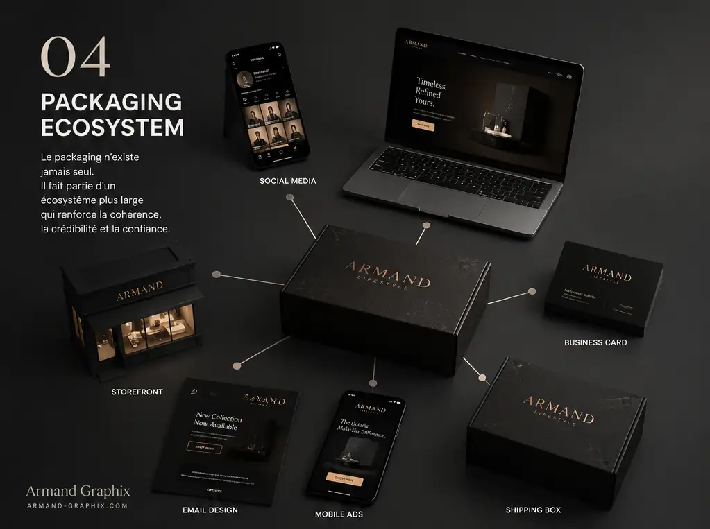
A product selling on a shelf has to win in a crowded physical environment. It competes side by side, often in seconds. That means visibility, differentiation, and quick readability matter a lot.
An e-commerce product faces a different test. Customers may first encounter it through product photography, paid ads, or social content. In that case, packaging has to perform on screen before it performs in hand. Clean shapes, strong contrast, and visual clarity become more important. Then the unboxing experience takes over. A thoughtful insert, a branded interior, or a refined opening sequence can turn a transaction into a brand moment.
Some small businesses need packaging that can do both. That is where flexibility matters. The design must hold up in thumbnails, on shelves, and in shipping. It also has to survive photography, handling, and customer scrutiny. This is why packaging should never be developed in isolation from marketing.
Common mistakes that weaken small brands
One of the biggest mistakes is trying to say too much. Founders often want to include every benefit, ingredient, claim, and selling point on the front panel. The result is clutter. Clutter makes products look uncertain.
Another mistake is inconsistency. If your logo, website, social media, and packaging all feel like they belong to different companies, trust drops. Brand cohesion matters because customers read it as professionalism.
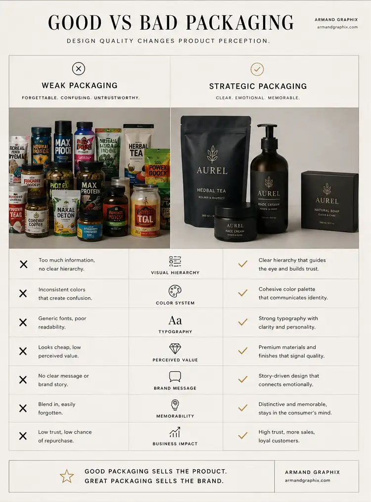
There is also the issue of imitation. Many small businesses model their packaging too closely on category leaders. That may feel safe, but it usually makes the product easier to overlook. Familiarity can help, but sameness rarely builds recall.
And finally, many brands skip testing. A package may look strong on a designer’s screen but feel different in real light, real scale, and real hands. Print samples, mockups, and prototype reviews reveal issues before they become expensive.
How to know your packaging is working
Good packaging earns attention, but great packaging also supports growth. You can often see its impact in better product photography, stronger shelf presence, more confident pricing, and improved customer response. People mention it. Retail buyers notice it. Customers keep it on their counters. That is a signal.
It is also worth watching the less obvious indicators. Are customers confused about what the product is? Do they misread variants? Does the packaging get damaged in transit? Are you spending too much time explaining the brand in person because the packaging does not carry enough of that message on its own? These are design problems, not just operational ones.
The goal is not packaging that looks expensive. The goal is packaging that makes the brand feel clear, credible, and worth choosing.
For a small business, that can change everything. When the product looks like it belongs in the market, customers treat it differently. They trust it faster. They remember it longer. And they are far more likely to come back.
The smartest packaging does not try to impress everyone. It speaks clearly to the right customer, reflects the brand with confidence, and gives the product a stronger chance to sell before a single word is spoken.
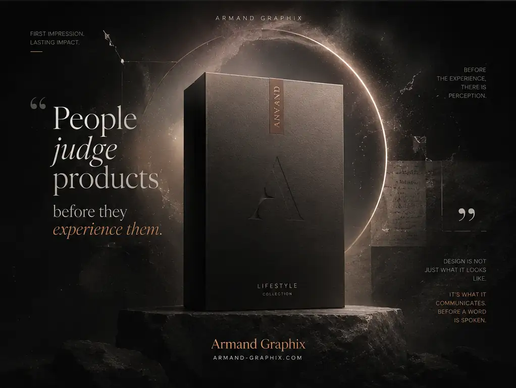
“Great products don’t win shelves. Great packaging does.”
Let’s design packaging that makes people stop, look, and buy.
Start a packaging project →- WordPress Versus Custom Websites for Growing Brands
 WordPress versus custom websites: compare cost, speed, control, SEO, and growth to choose a site that supports your brand and business goals clearly.
 - What Does Brand Strategy Include for Growth?
 What does brand strategy include? Learn the research, positioning, identity, messaging, and marketing choices that turn a business into a distinct brand.
 - Packaging Design Guide for Retail Brands
 A packaging design guide for retail brands: build shelf impact, meet production realities, and turn a first glance into a confident purchase decision.
 - Multicultural Branding Trends 2026 for Modern Brands
 Multicultural branding trends 2026 will reward brands that pair cultural intelligence, inclusive design, and local relevance with measurable, real growth.
 - Custom Logo vs Template: What Fits Your Brand?
 Custom logo vs template: compare cost, speed, ownership, and brand impact to choose an identity that builds your launch, growth, and reputation today.
 - What Is a Visual Identity? Design That Builds Trust
 What is a visual identity? Learn how logos, color, typography, and systems create recognition, trust, and stronger brand growth for ambitious businesses.