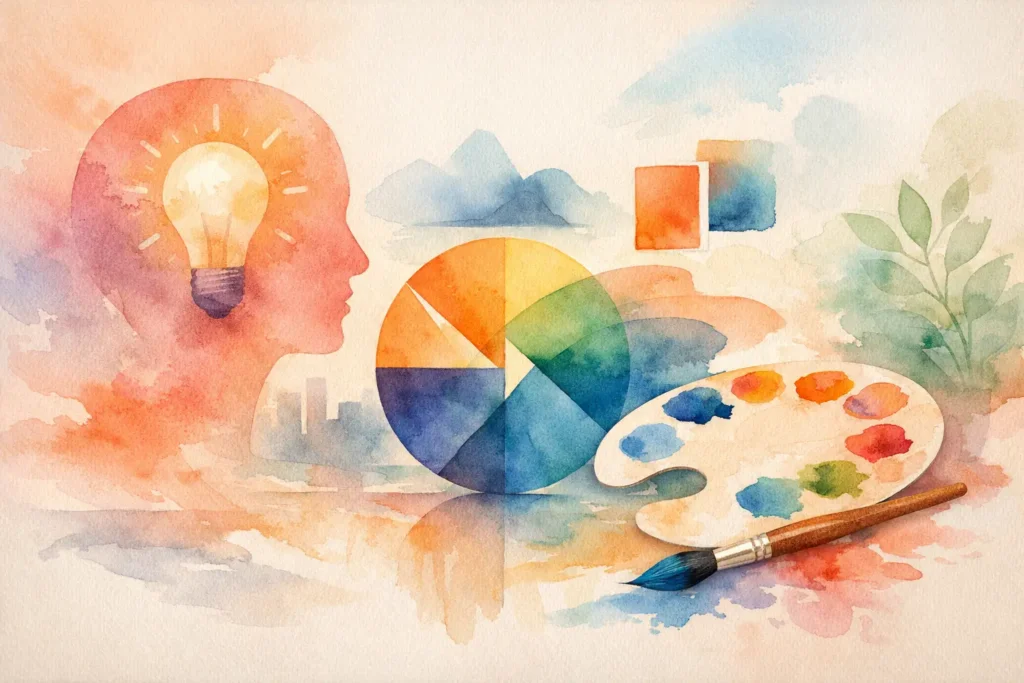
A single word can carry an entire brand – if the typography is doing its job.
That is the real answer behind what is typography logo design. It is the practice of building a logo primarily through letterforms, type selection, spacing, structure, and custom lettering rather than relying on an icon or symbol to do the heavy lifting. In other words, the brand name itself becomes the visual identity.
For founders, small businesses, and growing brands, this matters more than it may seem. A typography-based logo does not just tell people what your business is called. It shapes how your brand feels before anyone reads your website copy, sees your packaging, or clicks an ad.
What is typography logo design in practical terms?
Typography logo design is a logo approach where type is the main design element. That could mean a clean wordmark, a monogram, a custom lettermark, or a fully hand-crafted typographic system built around the brand name.
The key idea is that the personality of the brand is expressed through the letters themselves. The font style, proportions, spacing, line weight, curves, and alignment all communicate something. A luxury skincare brand, a tech startup, and a neighborhood coffee shop might all use typography logos, but the design choices should feel completely different because the brand stories are different.
This is where many businesses get it wrong. They assume typography logo design simply means typing their business name in a nice font. That is not logo design. That is text formatting. Real typography logo design is intentional. It considers brand positioning, audience perception, scalability, and distinctiveness.
Why brands choose typography over symbol-heavy logos
Not every business needs a mascot, abstract mark, or decorative emblem. In many cases, typography creates a stronger and more flexible identity.
A type-led logo is often easier to recognize early in a brand’s life because it keeps the name front and center. If your business is still building awareness, making people remember the name is usually more valuable than asking them to decode a symbol with no context.
Typography also gives you precision. With the right design direction, type can feel refined, bold, playful, modern, heritage-driven, artistic, or corporate without adding visual noise. That makes it especially effective for brands that want clarity and confidence.
There is also a strategic advantage. Typography logos often adapt well across websites, social profiles, packaging, presentations, signage, and paid campaigns. When the type system is well built, it becomes easier to keep the brand consistent across touchpoints.
That said, it depends on the brand. Some businesses benefit from pairing typography with a secondary symbol, especially if they need an app icon, social avatar, or product mark that works in tiny spaces. The strongest identity systems usually think beyond the logo alone.
“Typography is not only a visual system, it is a branding language shaping perception, memory, and trust.”
A 30-minute branding audit identifies your most critical weak points, and the high-impact corrections to prioritize first.
Request my free branding audit →The main types of typography logo design
Typography logos are not all built the same way. The structure depends on the brand name, the market, and how the identity needs to function.
Wordmarks
A wordmark uses the full brand name as the logo. This is one of the clearest forms of typography logo design because the name is the identity. It works especially well for brands with distinctive names or businesses that want maximum recognition.
The challenge is balance. A short brand name can feel elegant and memorable, while a long name may need more thoughtful hierarchy, spacing, or simplification to remain usable.
Lettermarks and monograms
A lettermark reduces the brand to initials. A monogram usually combines those initials into a tighter visual form. This approach can be helpful when the full business name is long or when the brand needs a compact mark for small applications.
The trade-off is that initials are harder to own unless the design is highly distinctive. A lettermark can look polished, but if the typography is generic, it may not leave much of an impression.
Custom lettering
Custom lettering goes beyond selecting a font. The letterforms are drawn or heavily modified to create something original. This is often where typography logo design becomes most expressive.
For brand-led businesses, custom typography can carry a lot of emotional weight. It can feel more premium, more ownable, and more aligned with a specific story. It also takes more skill to get right. Custom does not automatically mean better. It has to remain readable, versatile, and commercially useful.
What makes a typography logo effective?
A strong typography logo is not judged by style alone. It is judged by performance.
First, it needs clarity. If people cannot read the name quickly, the logo is creating friction instead of recognition. This is a common problem with overly trendy scripts or decorative type choices that look attractive in isolation but fail in real-world use.
Second, it needs distinctiveness. A logo should not look like ten other brands in the same industry. That does not mean forcing something unusual for the sake of novelty. It means making deliberate typographic choices that support a unique position.
Third, it needs alignment with brand strategy. The typography should match the promise behind the business. If your brand is positioned as high-end and detail-driven, the logo should not feel casual or careless. If your brand is energetic and youth-focused, the typography should not feel stiff and distant.
Fourth, it needs flexibility. A typography logo has to work on a business card, on a mobile screen, on packaging, and in social media headers. Good design is not only about how the logo looks in a presentation mockup. It is about how it behaves when the brand starts moving.
How typography communicates brand personality
Typography is one of the fastest ways to shape perception.
Serif type often suggests heritage, trust, editorial elegance, or sophistication. Sans serif type can feel modern, minimal, accessible, or direct. Script typography may feel personal, expressive, or luxurious, but it can also become hard to scale. Bold geometric forms can signal innovation and strength, while softer rounded forms may feel friendly and approachable.
None of these associations are fixed rules. Context changes everything. A serif can feel contemporary. A sans serif can feel cold. A script can feel cheap if it is poorly chosen. That is why typography logo design should always be rooted in strategy, not assumptions.
This is especially true for businesses serving diverse audiences or cross-cultural markets. Type choices do not exist in a vacuum. They carry aesthetic and emotional signals that can shift across industries, regions, and customer expectations. A smart logo designer pays attention to that.
Common mistakes businesses make
The most common mistake is choosing a font based on personal taste alone. A founder might say, “I like this one,” but liking a typeface is not the same as it being right for the brand.
Another mistake is relying on trendy fonts that are everywhere. What feels current now can make a new brand look dated surprisingly fast. Distinctive branding usually comes from disciplined refinement, not trend chasing.
Businesses also underestimate spacing. Kerning, alignment, and proportion can completely change how professional a logo feels. Even a strong typeface can look weak if the spacing is off.
Then there is the issue of overcomplication. Effects, distortions, excessive flourishes, and forced symbolism often reduce impact. Typography logos tend to work best when every adjustment has a clear purpose.
When typography logo design is the right choice
Typography logo design is often the right fit when your brand name deserves visibility, when clarity matters, and when you want the identity to feel polished without becoming overly decorative.
It works especially well for consultants, agencies, fashion labels, beauty brands, editorial brands, service businesses, and product companies that want a clean, ownable presence. It is also a smart option when you want a strong foundation for a larger visual identity system, including brand typography, web design, packaging, and marketing materials.
Still, it is not always the perfect solution on its own. If your brand operates in icon-heavy environments, like app marketplaces or social-first spaces, you may need a supporting mark alongside the typographic logo. That does not weaken the identity. It strengthens usability.
Typography logo design is not just style
The best typography logos do more than look good. They create recognition, signal quality, and support business growth. They make your brand easier to remember and easier to trust.
That is why typography logo design sits at the intersection of craft and strategy. It is about letterforms, yes, but it is also about positioning, audience perception, and how your brand shows up across every touchpoint. For businesses building with intention, that combination matters.
If your logo is just text, it should not feel like just text. It should feel like a brand speaking clearly for the first time.
“Building a brand requires more than visuals. It requires systems, perception, and cultural intelligence.”
A 30-minute branding audit identifies your most critical weak points, and the high-impact corrections to prioritize first.
Request my free branding audit →- What Is a Visual Identity? Design That Builds Trust
 What is a visual identity? Learn how logos, color, typography, and systems create recognition, trust, and stronger brand growth for ambitious businesses.
 - Graphic Design Services Calgary Businesses Need
 Graphic design services Calgary businesses choose should unite brand story, visual distinction, and marketing goals to build credibility and lasting growth
 - Brand Storytelling for Entrepreneurs That Builds Trust
 Brand storytelling for entrepreneurs turns strategy into connection. Learn how to shape a narrative that earns trust, distinction, and measurable growth.
 - Brand Launch Campaign Checklist That Builds Momentum
 Use this brand launch campaign checklist to align your identity, launch message, channels, and measurement before your first public impression matters.
 - Best Marketing Channels for Launches That Land
 Find the best marketing channels for launches, from email and search to social and partnerships, then build a focused plan that earns attention and action.
 - The Complete Guide to Brand Messaging That Works
 This complete guide to brand messaging helps founders build a clear voice, sharper positioning, and consistent content that earns attention and trust daily.