A logo can get attention. A system earns recognition.
That distinction matters more than most growing brands realize. Founders often invest in a mark, a color palette, and a website, then wonder why their brand still feels inconsistent across social media, packaging, presentations, ads, and customer touchpoints. The gap is usually not talent or effort. It is structure. Branding and identity systems give a business the visual and verbal logic it needs to show up clearly, repeatedly, and with purpose.
For startups, small businesses, and founder-led brands, this is not just a design conversation. It is a growth decision. When your identity is built as a system, your brand becomes easier to recognize, easier to trust, and easier to scale.
What branding and identity systems actually do
A brand identity is often misunderstood as a set of assets. In practice, it is a decision-making framework. It defines how a brand looks, feels, and communicates across different formats and moments. The strongest systems do not just create consistency. They create coherence.
That means your typography works on a website and a product label. Your imagery direction supports the same emotional message in a pitch deck and a social campaign. Your tone of voice sounds like the same brand whether a customer is reading a homepage headline or a packaging insert.
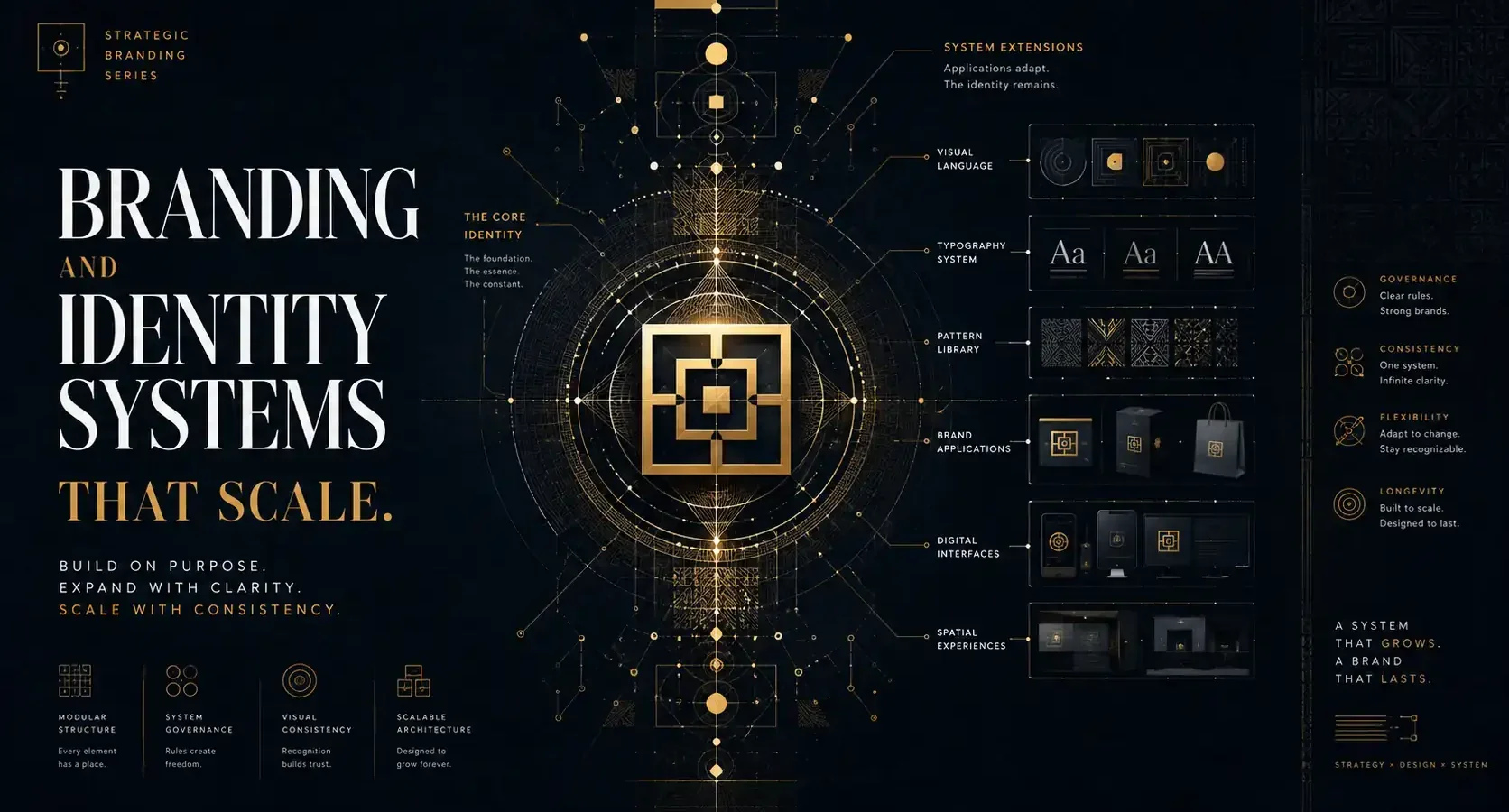
A useful system connects three layers. First, there is strategy – the positioning, values, audience insight, and brand story behind the visuals. Next comes identity – logo architecture, type, color, layout behavior, imagery, iconography, and messaging principles. Finally, there is application – the way the system performs in real environments such as web, print, retail, events, ads, and social content.
If one of those layers is weak, the brand starts to drift. It may still look attractive, but it becomes harder to manage and less effective in the market.
Why many brands look polished but still feel unclear
This is where the trade-off becomes visible. A visually impressive identity can still fail if it was designed for presentation rather than use.
Many brands launch with a beautiful logo suite and a few curated mockups, but no clear rules for extension. What happens when a new campaign needs its own graphic language? How should sub-brands relate to the parent brand? What type hierarchy should be used for product packaging, email headers, or paid social ads? If those decisions are reinvented every time, the brand loses consistency and the team loses time.
Clarity is not the same as sameness. A strong identity system allows variation without confusion. It creates room for creativity while protecting recognition. That balance is what separates a brand that looks good once from a brand that performs well over time.
The core parts of an effective identity system
The best systems are built for real use, not just approval meetings. They usually begin with the fundamentals, but they do not stop there.
A logo system should account for different sizes, contexts, and orientations. A single primary logo is rarely enough. Most brands need a family of marks that work across web headers, social avatars, packaging, signage, and branded documents.
Typography often does more heavy lifting than the logo itself. It shapes tone, legibility, hierarchy, and personality. A well-chosen type system gives a brand discipline. It tells you how to organize information, how to create emphasis, and how to maintain a recognizable visual rhythm across channels.
Color is equally strategic. Beyond aesthetics, it influences recall, mood, and usability. A distinctive palette can help a brand stand apart, but it also needs to function in digital accessibility, print reproduction, and product environments. The right palette is not always the boldest one. It is the one that remains true under pressure.
Then there is layout behavior – often overlooked, often critical. Grid logic, spacing rules, container styles, and image treatment are what make brand materials feel related even when the content changes. Without them, every touchpoint starts to look like it came from a different business.
Verbal identity deserves the same attention. Messaging pillars, headline style, naming logic, and brand voice guidelines help ensure the brand sounds as intentional as it looks. This is especially important for companies that rely on storytelling, founder presence, or high-trust buying decisions.
Branding and identity systems are built for growth
The real value of branding and identity systems appears when a business starts moving faster.
At launch, a founder may be able to personally review every social post, flyer, or landing page. As the brand grows, that level of control disappears. New collaborators join. Marketing channels expand. Campaign timelines shorten. More content gets produced by more people. Without a system, quality drops and brand equity gets diluted.
With a system in place, execution becomes faster and more confident. Designers know how to build. Marketers know how to adapt. Partners know how to represent the brand. That operational advantage is easy to underestimate, but it has direct business impact.
Brands with clear systems often spend less time correcting inconsistencies and more time building momentum. Their launches feel more coordinated. Their customer experience feels more intentional. Their visibility compounds because recognition compounds.
That is also why identity should not be separated from marketing reality. A brand that looks refined but cannot translate into search visuals, ad creative, landing pages, retail packaging, or event materials is only partially doing its job. Design has to perform where the audience actually meets it.
When a business needs a system, not just a refresh
Not every brand needs a full rebuild. Sometimes a visual update is enough. Other times, the deeper issue is structural.
If your materials keep looking inconsistent, if every new designer interprets the brand differently, or if your website, packaging, and social channels feel disconnected, the problem is probably not a missing asset. It is a missing system.
The same is true if your business is entering a new stage. A startup preparing for investor conversations, a product brand moving into retail, or a service business expanding into paid acquisition will often outgrow its original identity. What worked at a small scale may not hold up across more touchpoints, more audiences, and higher expectations.
This is where strategic design becomes practical. You are not investing in more decoration. You are investing in alignment.
What a good system looks like in practice
A good identity system feels clear to the team using it and invisible to the audience experiencing it. Customers should not notice the rules. They should notice the confidence.
In practice, that might mean a brand can launch a campaign, update its website, design event signage, publish social content, and package a new product line without losing its character. The details may change, but the brand still feels unmistakable.
It also means the system reflects the business honestly. Not every brand should be minimal. Not every brand should be loud. Cultural context, audience behavior, price point, and category expectations all matter. A boutique wellness brand, a technology startup, and a community-focused restaurant should not be built from the same visual assumptions.
This is one reason intercultural design thinking matters. Brands often speak to more than one audience at once – local and global, premium and accessible, traditional and contemporary. A smart identity system can hold those tensions without becoming generic.
At Armand Graphix, that balance between story, aesthetics, and market performance is what makes brand design more than a visual exercise. It turns identity into a tool the business can actually use.
The risk of treating identity as decoration
When branding is approached as surface styling, it usually ages quickly. Trends change. Platforms evolve. Internal teams reinterpret the original intent. Before long, the brand starts reacting instead of leading.
A system-based approach creates more resilience. It gives the brand principles rather than shortcuts. That does not make it rigid. It makes it adaptable.
And that adaptability matters. Businesses evolve. Offers shift. Audiences broaden. New formats emerge. The goal is not to freeze a brand in time. It is to build an identity that can stretch without losing itself.
That is the difference between branding that simply looks finished and branding that is ready to work.
If your brand is preparing for bigger visibility, stronger recognition, or more disciplined growth, the right question is not whether the logo looks good. It is whether the whole identity can carry your story consistently wherever your audience finds you next.
- What Is a Visual Identity? Design That Builds Trust
 What is a visual identity? Learn how logos, color, typography, and systems create recognition, trust, and stronger brand growth for ambitious businesses.
 - Graphic Design Services Calgary Businesses Need
 Graphic design services Calgary businesses choose should unite brand story, visual distinction, and marketing goals to build credibility and lasting growth
 - Brand Storytelling for Entrepreneurs That Builds Trust
 Brand storytelling for entrepreneurs turns strategy into connection. Learn how to shape a narrative that earns trust, distinction, and measurable growth.
 - Brand Launch Campaign Checklist That Builds Momentum
 Use this brand launch campaign checklist to align your identity, launch message, channels, and measurement before your first public impression matters.
 - Best Marketing Channels for Launches That Land
 Find the best marketing channels for launches, from email and search to social and partnerships, then build a focused plan that earns attention and action.
 - The Complete Guide to Brand Messaging That Works
 This complete guide to brand messaging helps founders build a clear voice, sharper positioning, and consistent content that earns attention and trust daily.