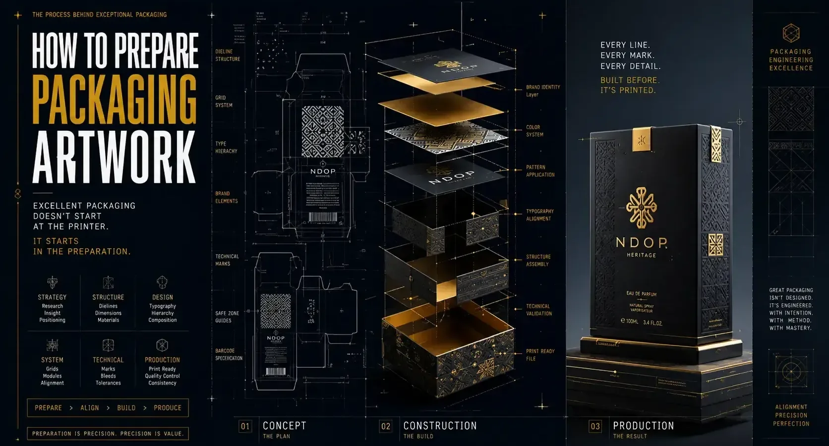
A packaging design can look flawless on screen and still fail the moment it reaches print. Text gets clipped near a fold. Colors shift. A barcode won’t scan. Legal copy is missing. If you’re figuring out how to prepare packaging artwork, the real job is not just making it look good. It’s making sure it survives production, protects your brand story, and performs where it counts – on the shelf, in transit, and in your customer’s hands.
Packaging artwork sits at the intersection of design, manufacturing, and marketing. That is why the strongest results come from treating it as a system, not a final decoration added at the end. Good artwork preparation reduces print errors, avoids production delays, and gives your product a more confident retail presence.
“Make Sure Your Packaging Is Print-Ready”
Avoid costly production errors by preparing artwork files correctly before they reach the printer.
Get Professional Packaging Support →What packaging artwork really includes
Packaging artwork is more than the front panel graphic. It includes every visual and technical element required to print and produce the package accurately. That means logos, product names, imagery, typography, ingredient lists, usage instructions, warnings, dielines, barcodes, regulatory details, and print specifications.
This is where many growing brands run into trouble. They approve a beautiful concept, then discover too late that the printer needs a very different file structure than the one used for presentation mockups. A mockup sells the vision. Production artwork delivers the reality.
Start with the packaging format, not the visuals
Before you build the artwork, confirm the exact packaging structure. Is it a folding carton, pouch, label, rigid box, sleeve, or corrugated shipper? Each format has different panel behavior, print limitations, and finishing requirements.
You also need the final dieline from the manufacturer or printer. Not an estimate. Not a rough sketch. The actual production dieline. This file defines trim lines, folds, glue areas, bleed zones, safe areas, and sometimes no-print regions. If you design before this step is locked, you risk rebuilding everything later.
A strong visual system still matters, but structure comes first. Design that tells your story has to fit the physical object telling it.
How to prepare packaging artwork without costly revisions
The cleanest process starts by gathering all inputs before design production begins. That includes the approved brand assets, final copy, legal text, UPC or EAN barcode, product dimensions, material specs, and printer requirements. If one of those pieces is still shifting, the artwork file is not ready for final setup.
Work in the correct document size from the start, using the supplied dieline as a locked reference layer. Keep bleed in place according to printer specs, usually around 0.125 inches, though it depends on the vendor and package type. Build all critical content inside the safe zone so folds and trims do not compromise readability.
It also helps to separate design layers logically. Keep the dieline on its own non-printing layer. Organize backgrounds, imagery, text, varnish, foil, embossing, and spot finishes separately. That makes revisions faster and reduces confusion when files move between designer, printer, and production team.
Set up color for print, not for the screen
One of the biggest mistakes in packaging is approving color visually on a laptop and expecting it to print the same way. Screen color is RGB. Most packaging print production is CMYK or spot color. Those systems behave differently.
If brand color is critical, especially for consumer products competing on crowded shelves, ask whether spot colors are necessary. CMYK is often more cost-effective, but some hues simply will not reproduce consistently without a Pantone match or another controlled spot process. Metallics, fluorescents, and some saturated tones are especially sensitive.
Material matters too. A matte uncoated carton absorbs ink differently than a glossy pressure-sensitive label. Transparent packaging introduces another layer of complexity because the product itself affects perceived color. This is one of those it depends moments. The right choice is not always the most vibrant one on screen. It is the one that holds up in production and aligns with budget.
Typography needs production discipline
Packaging often carries more information in less space than almost any other branded asset. That makes typography one of the most strategic parts of the file.
Choose type sizes that remain legible at actual package scale, not enlarged on your monitor. Fine serif details, ultra-light weights, and compressed tracking may look elegant in presentation and become unreadable in print. Reverse type on dark backgrounds deserves special caution, especially at small sizes.
Convert fonts to outlines only when the file is final and the printer requests it. Before that stage, keep editable source files organized. And watch hierarchy closely. The product name, key differentiator, and essential information should read in seconds. Shelf impact is not just about style. It is about visual prioritization.
Images, barcodes, and technical assets must be production-ready
Raster images should be high resolution at final size, typically 300 DPI for print. Enlarging web graphics almost always creates soft or pixelated results. If product photography is part of the packaging, retouch it with print output in mind. Shadows, contrast, and skin tones can shift once converted from RGB.
Barcodes need even more care. Use the correct format for your market and retailer requirements. Maintain proper quiet zones around the code, avoid placing it over busy backgrounds, and do not distort the proportions. A barcode that looks fine but fails to scan creates a much bigger problem than a minor design compromise.
Icons, certification marks, and regulatory symbols should also be verified. Use approved versions, and make sure they meet minimum size requirements where applicable.
Compliance copy is part of the design process
Many founders treat legal and regulatory copy as a late-stage add-on. That approach usually creates cramped layouts and rushed edits. If your product falls into a regulated category such as food, supplements, cosmetics, or health-related goods, compliance content should be considered early.
Requirements vary by product and market. Ingredient panels, net quantity, warnings, storage instructions, contact details, and country-of-origin statements may all need placement. Some categories also require very specific formatting rules.
Even outside regulated sectors, clarity matters. If customers cannot quickly identify what the product is, how to use it, or why it is different, the design is underperforming. Strategy that grows your brand has to live inside the details, not just the hero panel.
Use finishing effects with restraint and intention
Foil, embossing, spot UV, soft-touch coatings, and specialty varnishes can elevate packaging fast. They can also complicate production fast. Every special finish adds setup requirements, alignment tolerances, and cost.
That does not mean avoid them. It means use them where they strengthen the brand message. A premium product may benefit from subtle foil on the logo. A tactile coating may support a luxury or wellness positioning. But if every panel is competing for attention, the result can feel noisy rather than refined.
From a file prep standpoint, each finish usually needs its own clearly named spot-color layer with vector shapes built exactly to printer specifications. Decorative intent is not enough. Precision matters.
Preflight the artwork like a production partner
Knowing how to prepare packaging artwork means knowing how to check it before anyone hits print. A good preflight process catches problems while they are still inexpensive.
Review the file at 100 percent scale. Check spelling, panel alignment, dieline fit, bleed, image resolution, barcode placement, and color mode. Confirm that all linked files are included or embedded based on printer preference. Remove unused swatches and hidden objects that could create output issues.
Then print a physical proof, even if it is only a desk mockup. Fold it. Hold it. Read it at arm’s length. This simple step reveals issues that screens hide, especially around panel transitions and information hierarchy.
If the product will appear in retail, compare the mockup against likely competitors. Does the package communicate quickly? Does it feel credible? Does it reflect the brand promise, or just decorate the surface?
Final file delivery depends on the printer
There is no single perfect export setting for every packaging project. Some printers want editable AI files with linked assets. Others want press-ready PDFs built to a specific preset. Some need separate files for each SKU variation. Others use automated workflows that require naming conventions and layer structures.
Ask for a file specification sheet before final export. That small step saves time and avoids assumptions. At Armand Graphix, this is where creative direction and production discipline meet. Strong packaging does not happen by accident. It is built through alignment between story, system, and execution.
The smartest packaging artwork is not the file that simply passes to print. It is the one that protects your brand at every stage – from approval to production to first impression. If you prepare it with that level of care, your packaging stops being just a container and starts acting like a business asset.
“Turn Great Design Into a Product People Notice”
From dielines to final artwork, create packaging that looks professional on screen and performs flawlessly in production.
Start Your Packaging Project →- 9 Brand Storytelling Examples That Work
 Explore 9 brand storytelling examples that show how narrative, design, and strategy work together to build trust, attention, and growth.
 - Calgary Packaging Design for Products That Sell
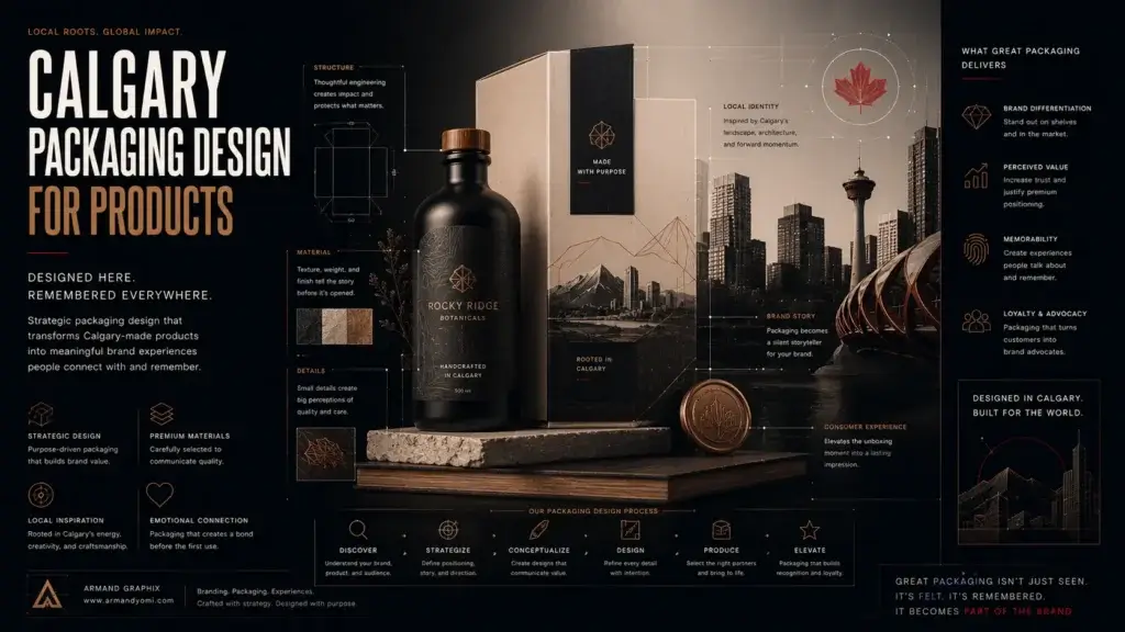 Calgary packaging design for products that builds shelf impact, brand trust, and sales through strategy, storytelling, and smart production choices.
 - Performance Marketing for Startups That Scales
 Performance marketing for startups works best when brand clarity meets data. Learn how to build channels, test faster, and scale with focus.
 - Landing Page Conversion Design That Works
 Landing page conversion design turns attention into action with clearer messaging, stronger visuals, and smarter user paths that sell.
 - Custom Packaging vs Stock Packaging
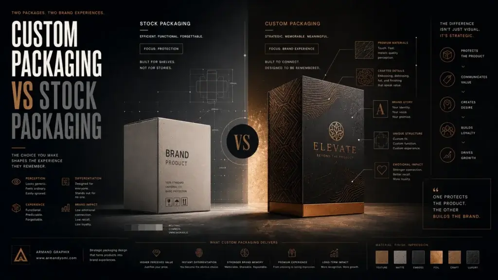 Custom packaging vs stock packaging affects cost, speed, branding, and growth. Learn which option fits your product, budget, and goals best.
 - How to Choose a Web Designer Calgary
 Need a web designer Calgary businesses can trust? Learn what to look for, what to avoid, and how to choose design that drives real growth.