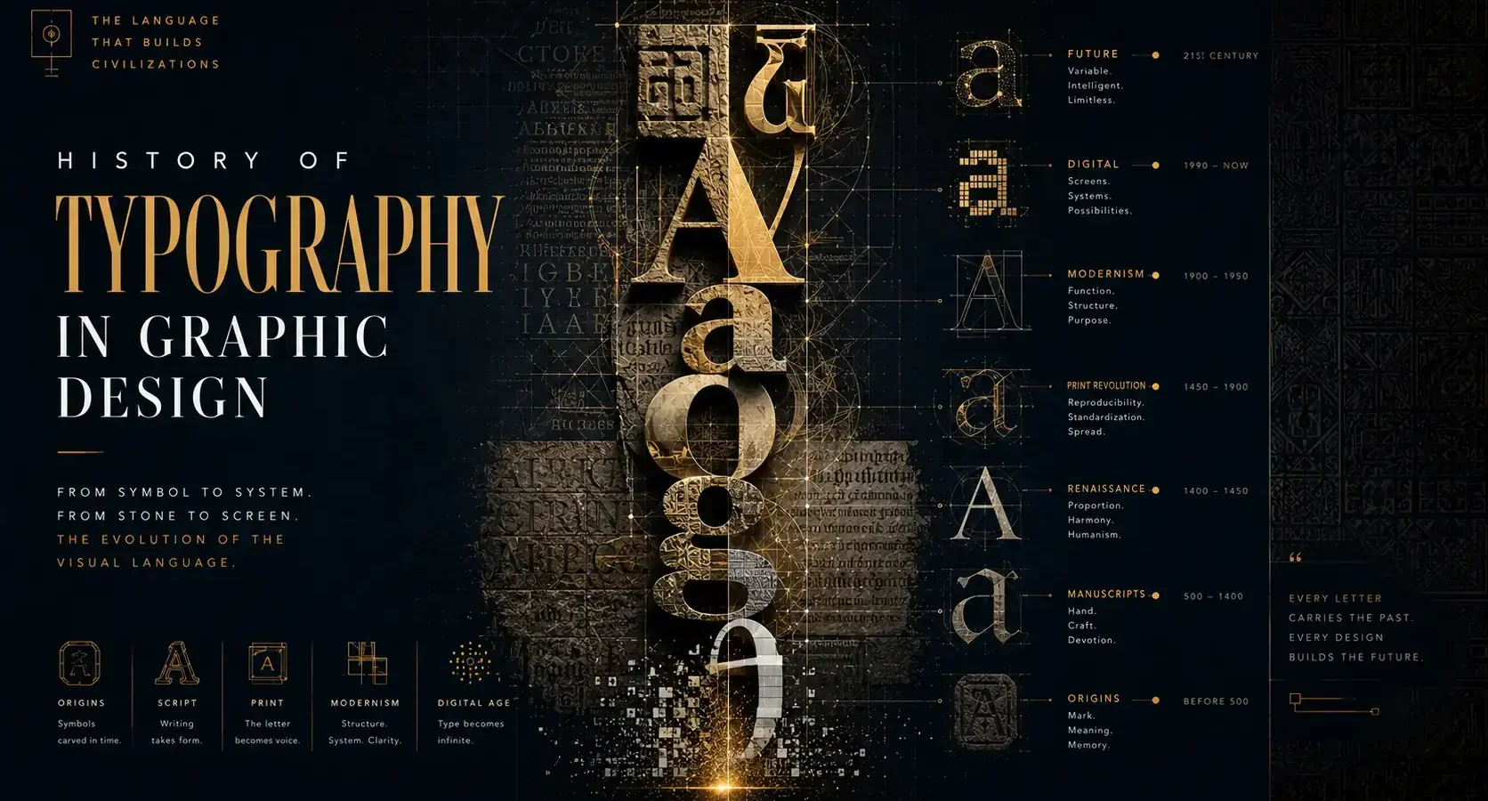
The quickest way to tell whether a brand feels established, disruptive, elegant, or disposable often comes down to type before anything else. That is why the history of typography in graphic design matters far beyond design schools or print studios. It explains how letterforms became one of the most powerful tools for shaping trust, emotion, and recognition.
Typography is not just the styling of words. It is the visual behavior of language. Every era has used it to reflect its technology, values, and power structures. When you understand that lineage, you stop treating fonts as decoration and start seeing them as strategic assets.
Why the history of typography in graphic design still matters
For modern brands, typography does two jobs at once. It carries information, and it signals identity. A luxury packaging system, a startup website, a political poster, and a neighborhood café menu may all use the same alphabet, but they do not speak with the same voice.
That voice was not invented overnight. It was shaped over centuries of printing, industrial production, modernist thinking, and digital experimentation. The history of typography in graphic design is really the history of how communication became visual strategy.
“Building a brand requires more than visuals. It requires systems, perception, and cultural intelligence.”
A 30-minute branding audit identifies your most critical weak points, and the high-impact corrections to prioritize first.
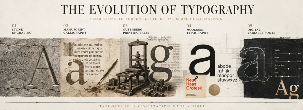
Request my free branding audit →Before graphic design had a name
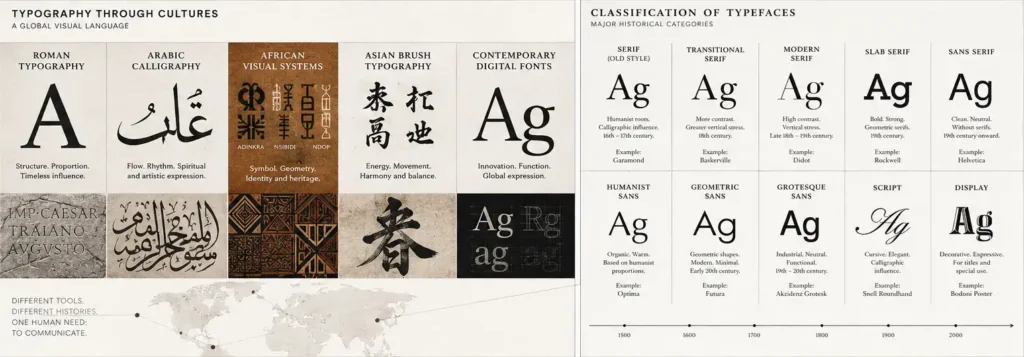
Long before graphic design existed as a profession, scribes and calligraphers were already making decisions about spacing, rhythm, hierarchy, and legibility. In handwritten manuscripts, letterforms carried religious, political, and cultural authority. Form and meaning were inseparable.
These early systems were slow to produce, highly skilled, and often reserved for institutions with power. That mattered. Typography has always been tied to access. Who gets to read, who gets to publish, and who gets to be seen have all been influenced by the way text is made and distributed.
Gutenberg and the print revolution
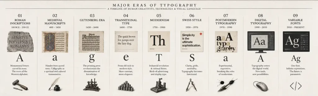
The turning point came in the 15th century with Johannes Gutenberg and movable type in Europe. Printing transformed written communication from a labor-intensive craft into a repeatable system. This was not just a technical upgrade. It changed how ideas traveled.
Early typefaces were modeled after blackletter scripts because readers trusted forms that resembled manuscripts. That detail reveals a pattern we still see today. New technology often borrows the visual language of the old until audiences are ready for something different.
As printing spread, so did the need for clarity, consistency, and efficiency. Printers became early typographic decision-makers, balancing readability with cost and aesthetics. In practical terms, this was the beginning of design systems.
The rise of Roman type and humanist influence
By the Renaissance, printers in Italy and elsewhere began moving away from dense blackletter styles toward Roman and italic type. These letterforms felt more open, proportionate, and readable. They were influenced by classical inscription, humanist scholarship, and a growing interest in rational order.
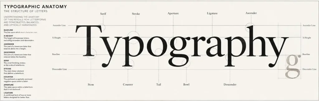
This shift matters because it shows typography becoming culturally coded. Roman types suggested clarity, intellect, and refinement. Italics introduced contrast and emphasis. Designers today still rely on those same ideas when building hierarchy and tone.
Type was no longer just a way to reproduce text. It became a tool for shaping the reader’s experience.
The Enlightenment and typographic precision
As printing matured, type design became more systematic. Designers such as Baskerville, Bodoni, and Didot pushed letterforms toward sharper contrast, cleaner construction, and more deliberate elegance. Their work reflected broader cultural values – reason, precision, order, and progress.
These typefaces still carry those associations. A high-contrast serif can feel editorial, premium, or formal because it inherited that visual DNA. But there is always a trade-off. What feels sophisticated in a fashion brand may feel too rigid for a community nonprofit or too delicate for a mobile interface.
That is one of the clearest lessons from typographic history. Style is never neutral. Every typographic choice arrives with context.
Industrialization changed everything
The 19th century introduced a very different typographic world. Industrialization created mass advertising, faster printing methods, and fierce competition for attention. Posters, shop signs, newspapers, and packaging demanded bolder voices.
This period gave rise to display typefaces with exaggerated weight, ornament, shadow, width, and personality. Sans serifs also began gaining traction, though they were initially viewed as unconventional. Typography became louder because the marketplace became louder.
From a branding perspective, this was a major shift. Type was no longer serving books alone. It had to sell, persuade, and compete in public space. That commercial pressure is familiar to any business trying to stand out today.
Modernism and the search for clarity
In the early 20th century, design entered a more self-aware phase. Movements like Bauhaus, Constructivism, and later Swiss design treated typography as a system of visual communication, not just surface style. Function, structure, and readability moved to the center.
Sans serif typefaces became symbols of modernity. Grids brought order. Asymmetrical layouts broke from older traditions. The goal was often clarity, universality, and reduction.
This was a powerful evolution for graphic design because typography became central to how information was organized. Posters, corporate identities, transit systems, and editorial layouts all benefited from typographic discipline. When brands today want to appear clean, credible, and future-facing, they are often borrowing from modernist logic whether they realize it or not.
Still, modernism had limits. Its pursuit of universality sometimes flattened local nuance and cultural character. That is where strategy matters. A brand needs clarity, but it also needs distinction.
“Typography has never been only about letters. It has always been about power, identity, memory, and perception. Today, the strongest brands build recognition through carefully engineered visual language systems.”
Explore Branding Systems →Postmodern typography broke the grid
By the late 20th century, many designers pushed back against the strict rationalism of modernism. Postmodern typography embraced experimentation, fragmentation, layering, and visual tension. Designers began asking whether clarity was always the highest goal, or whether expression could carry meaning in ways order could not.
This period expanded what typography could do emotionally. Type could be raw, playful, disruptive, ironic, or intentionally difficult. In music, fashion, and youth culture especially, that energy reshaped visual language.
The lesson here is not that readability stopped mattering. It is that communication depends on audience and context. A finance firm and a streetwear label should not sound the same typographically. Good design is not about following one historical rule. It is about choosing the right one for the message.
Digital tools democratized type
Desktop publishing and digital font technology transformed typography again in the 1980s and 1990s. Suddenly, access widened. Designers no longer needed a traditional typesetting studio to experiment, produce layouts, or distribute work.
This democratization was liberating, but it also created noise. More fonts became available, more voices entered the field, and not all typographic decisions improved communication. The software made typography easier to use, but not easier to master.
That tension still defines design today. Access is broad, but discernment is what creates brand value.
Typography in contemporary brand systems
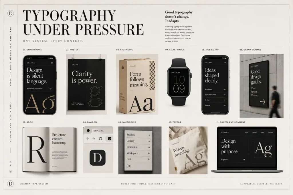
Today, typography sits at the core of brand identity across print, packaging, web, social media, motion, and product interfaces. It must perform across screens, languages, devices, and attention spans. A type system now needs both personality and utility.
That changes the designer’s role. Choosing a typeface is no longer enough. You need to think about licensing, accessibility, responsive behavior, hierarchy, cultural resonance, and brand consistency. A serif might communicate heritage beautifully on packaging but feel less effective in a dense app interface. A geometric sans serif may feel clean on a website but generic if the brand story lacks warmth.
This is where history becomes practical. When you know where typographic styles come from, you can use them with intention instead of imitation. At Armand Graphix, that kind of decision-making matters because design that tells your story should also support how your brand is received, remembered, and trusted.
What businesses can learn from typographic history
The biggest takeaway is simple. Typography is never just visual polish. It is a business signal. It shapes first impressions, reinforces positioning, and affects how confidently people read your brand.
A heritage-inspired serif can suggest credibility, but only if it fits the product and audience. A minimalist sans serif can feel contemporary, but it may also blur into a crowded market. Expressive display type can create memorability, though it often needs restraint in longer reading environments. It depends on what the brand needs to say and where it needs to say it.
That is why the history of typography in graphic design remains useful. It teaches pattern recognition. It helps brands understand why certain type choices feel premium, rebellious, institutional, intimate, or forward-looking. More importantly, it helps avoid superficial trend-chasing.
Typography has evolved with religion, empire, industry, media, commerce, and code. Through all of that change, one truth has stayed remarkably consistent: the shapes of letters shape the way people feel about what they read. If your brand wants to communicate with more clarity and more character, type is not a finishing touch. It is part of the story from the very beginning.
“Great typography does not decorate a brand. It gives it rhythm, authority, personality, and permanence.”
At Armand Graphix Studio, we design branding systems where typography becomes a strategic asset not just a stylistic choice.
Request a Brand Consultation →- What Is a Visual Identity? Design That Builds Trust
 What is a visual identity? Learn how logos, color, typography, and systems create recognition, trust, and stronger brand growth for ambitious businesses.
 - Graphic Design Services Calgary Businesses Need
 Graphic design services Calgary businesses choose should unite brand story, visual distinction, and marketing goals to build credibility and lasting growth
 - Brand Storytelling for Entrepreneurs That Builds Trust
 Brand storytelling for entrepreneurs turns strategy into connection. Learn how to shape a narrative that earns trust, distinction, and measurable growth.
 - Brand Launch Campaign Checklist That Builds Momentum
 Use this brand launch campaign checklist to align your identity, launch message, channels, and measurement before your first public impression matters.
 - Best Marketing Channels for Launches That Land
 Find the best marketing channels for launches, from email and search to social and partnerships, then build a focused plan that earns attention and action.
 - The Complete Guide to Brand Messaging That Works
 This complete guide to brand messaging helps founders build a clear voice, sharper positioning, and consistent content that earns attention and trust daily.