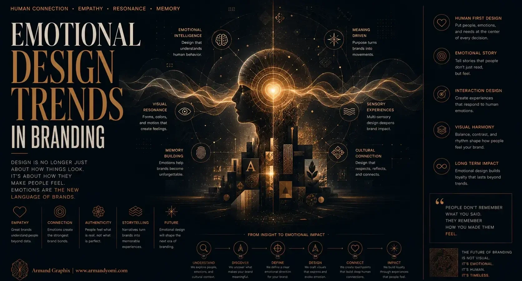
A polished logo is no longer enough. Brands are being judged by how they make people feel within seconds – on a package, a landing page, a social post, or a checkout screen. That is why emotional design trends in branding matter right now. They shape first impressions, influence recall, and often determine whether a brand feels disposable or worth trusting.
For founders and growing businesses, this shift is practical, not theoretical. Emotion is what turns a visual identity into a presence. It is what helps a new brand look credible, a premium brand feel desirable, and a purpose-driven brand seem sincere rather than performative. Good branding still needs clarity and consistency. But the brands gaining traction are adding another layer: feeling with intent.
“Build a Brand People Feel, Not Just See”
Discover how emotional design strengthens recognition, trust, and long-term brand loyalty in an increasingly crowded market.
Explore Emotional Branding →Why emotional design trends in branding are accelerating
The digital environment has made attention shorter and comparison easier. Customers can scan five competitors in a minute. When products look similar and services make the same promises, emotional distinction becomes a real market advantage.
At the same time, audiences have become more visually literate. They notice when branding feels generic, overproduced, or detached from the actual story of the business. They respond better to identities that show character. Not chaos, not trend-chasing – character. The strongest brands are using design to signal values, mood, and point of view before a single line of copy is read.
There is also a broader cultural shift behind this. People want brands that feel human. That does not mean every business needs to sound casual or sentimental. It means the design system should carry emotional cues that fit the brand’s promise. A wellness company might need calm and reassurance. A tech startup may need optimism and control. A luxury product may need restraint and intimacy. Emotion works best when it is aligned with positioning.
The move from polished perfection to emotional texture
One of the clearest trends is the rejection of sterile brand systems. For years, many identities leaned heavily on flat minimalism, neutral palettes, and ultra-clean interfaces. That style still has value, especially when simplicity supports usability. But on its own, it can flatten personality.
Brands are now reintroducing texture, depth, and imperfection in more deliberate ways. Grain, tactile packaging finishes, layered typography, natural photography, and hand-touched graphic elements all help create a more felt experience. These choices suggest presence. They make a brand seem made, not generated.
The trade-off is subtlety. Texture can add warmth, but too much can quickly feel messy or nostalgic for the sake of it. A brand still needs discipline. The question is not whether to add emotion, but which emotional signals actually strengthen recognition and trust.
Color is becoming more emotionally precise
Color has always carried emotional weight, but current branding uses it with sharper strategic intent. Instead of defaulting to category norms, brands are choosing palettes that create a more distinctive psychological response.
Muted earth tones can communicate grounding and authenticity. High-contrast brights can project momentum and cultural relevance. Deep, restrained palettes can signal exclusivity. The key difference now is that color is being treated less as decoration and more as positioning.
This is especially important for newer brands entering crowded markets. If everyone in your space uses the same safe blue or the same clean beige, emotional differentiation becomes harder. Choosing a more exact color language can help a brand become memorable faster. Still, emotional precision should not come at the cost of accessibility. Strong palettes need enough contrast, digital flexibility, and consistency across screens and print.
Typography is carrying more of the brand’s voice
Typography is doing heavier emotional work than it used to. Brands are relying on type not just for readability, but for tone. A sharp serif can suggest confidence and editorial credibility. A soft grotesk can feel contemporary and human. A custom wordmark can signal originality before any campaign begins.
This trend reflects a larger truth in branding: voice is visual as much as verbal. Founders often focus on what the brand will say, but overlook how the brand sounds through type, spacing, rhythm, and hierarchy. Typography shapes that impression immediately.
What matters here is fit. Expressive type can elevate a brand, but it can also create friction if it conflicts with the audience’s expectations. A financial brand that looks too experimental may lose trust. A beauty brand that feels too rigid may lose desirability. Strong typography does not simply look good. It reinforces the emotional promise behind the business.
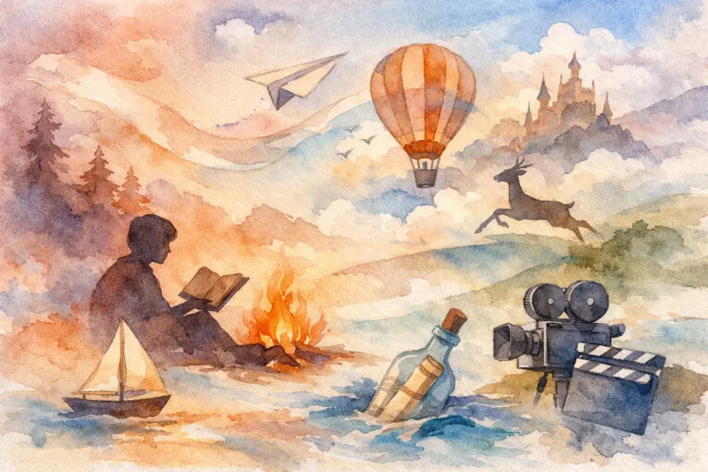
Story-led systems are replacing one-off aesthetics
A brand can no longer depend on a logo alone to create emotional connection. The stronger trend is toward story-led systems – identities built around a clear narrative that extends across packaging, websites, campaigns, and social content.
This is where many businesses either stand out or disappear. When the visuals, messaging, and user experience all express the same emotional idea, the brand starts to feel coherent. Customers may not describe that system in design terms, but they notice the result. It feels intentional. It feels trustworthy.
For example, a founder with a multicultural story, a craft-based process, or a mission rooted in community has more than a marketing angle. They have emotional material. The right brand system translates that into visual language. That could mean photography direction, icon style, motion cues, copy rhythm, or packaging structure. The goal is not to tell every part of the story at once. It is to create a recognizable emotional thread across every touchpoint.
Motion and interaction are becoming emotional tools
Static branding still matters, but digital brands increasingly live through movement. Subtle animation, hover states, micro-interactions, and transitions now shape emotional perception as much as layout and imagery.
Used well, motion can communicate confidence, clarity, and care. It can make a brand feel premium, playful, calm, or precise. A slow, intentional transition creates a different emotional effect than a fast, energetic one. The same is true for sound design in short-form content and product demos.
This does not mean every brand needs animation everywhere. Excess motion can distract from usability and weaken the message. It depends on the platform, the audience, and the role of the interaction. The best use of motion is supportive. It strengthens the brand’s feeling without demanding attention for itself.
Emotional branding is becoming more culturally aware
One of the most important shifts is that emotional design is no longer treated as universal. Brands are paying closer attention to how symbolism, color, imagery, and tone are interpreted across different communities and markets.
That matters for businesses serving diverse audiences or planning to scale beyond one local context. Emotional cues are powerful, but they are not neutral. A visual choice that reads as premium in one market may feel cold in another. A color associated with optimism in one culture may carry a different meaning elsewhere.
This is where intercultural design thinking becomes a competitive advantage. It helps a brand communicate with more accuracy and respect. Not by flattening personality, but by making expression more intentional. Emotional branding is strongest when it understands who is looking, not just what the brand wants to say.
What founders should take from these branding trends
The takeaway is not to copy what is trending on design feeds. Trends are useful because they reveal what audiences are responding to right now, but they are only valuable when filtered through strategy.
If you are building or refreshing a brand, start with the emotional outcome you want to create. Do you want people to feel reassured, energized, elevated, welcomed, intrigued, or understood? That answer should influence your visual system as much as your business goals do.
Then test the alignment. Does your logo express that feeling? Does your website support it? Does your packaging reinforce it? Does your social presence weaken it? Many brands struggle not because the design is poor, but because the emotional message shifts from touchpoint to touchpoint.
This is also where performance matters. Emotion without clarity can become style without conversion. A beautiful identity still needs to help people navigate, understand, remember, and act. The most effective brand work connects emotional resonance to business outcomes. Design that tells your story should also support visibility, trust, and growth.
For businesses that want to compete with more established players, this creates an opening. You do not need the biggest budget to build emotional distinction. You need sharper intent. A brand that knows what it wants people to feel – and builds every detail around that – often appears stronger than one with more resources but no emotional center.
The brands people remember are rarely the ones that look the most generic or say the most. They are the ones that make feeling part of the strategy, then express it with discipline. That is where branding starts to do more than decorate a business. It starts to move it forward.
“Turn Emotional Connection Into Competitive Advantage”
Create a brand experience that resonates deeply with your audience and remains memorable long after the first interaction.
Build a More Memorable Brand →- 9 Branding Trends for Small Business in 2026
 Explore branding trends for small business in 2026, from story-led identity to AI-aware design, and learn what builds trust, recall, and growth.
 - 9 Brand Storytelling Examples That Work
 Explore 9 brand storytelling examples that show how narrative, design, and strategy work together to build trust, attention, and growth.
 - Calgary Packaging Design for Products That Sell
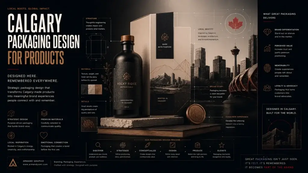 Calgary packaging design for products that builds shelf impact, brand trust, and sales through strategy, storytelling, and smart production choices.
 - Performance Marketing for Startups That Scales
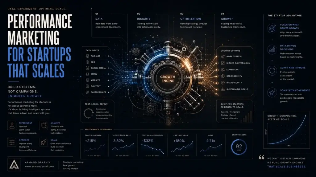 Performance marketing for startups works best when brand clarity meets data. Learn how to build channels, test faster, and scale with focus.
 - Landing Page Conversion Design That Works
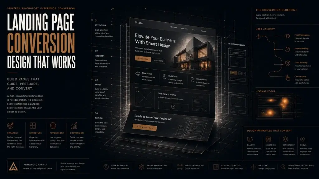 Landing page conversion design turns attention into action with clearer messaging, stronger visuals, and smarter user paths that sell.
 - Custom Packaging vs Stock Packaging
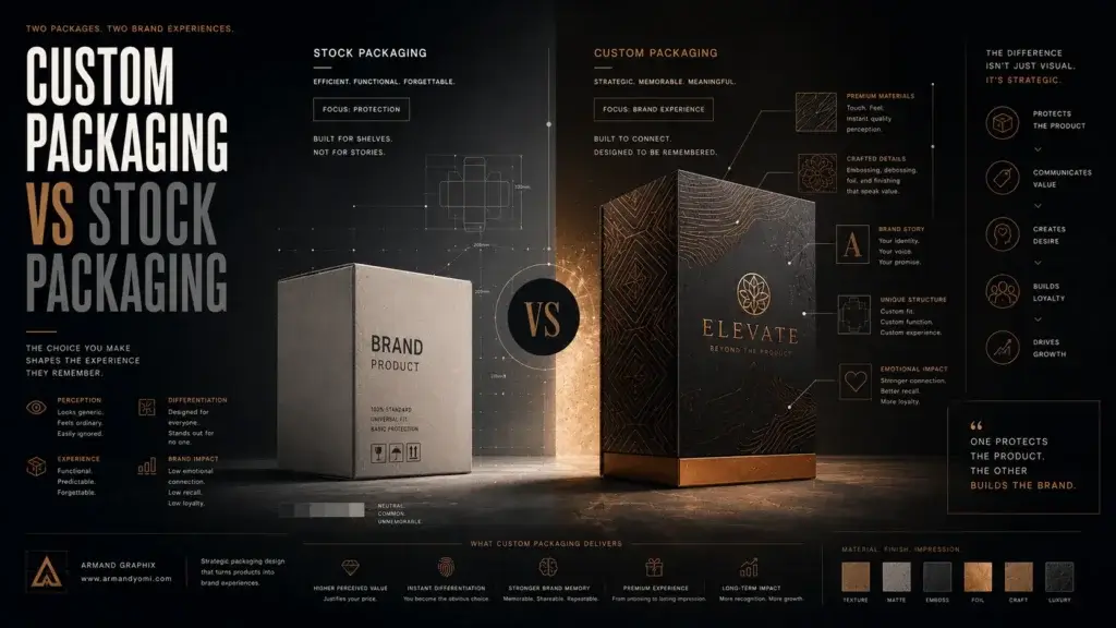 Custom packaging vs stock packaging affects cost, speed, branding, and growth. Learn which option fits your product, budget, and goals best.