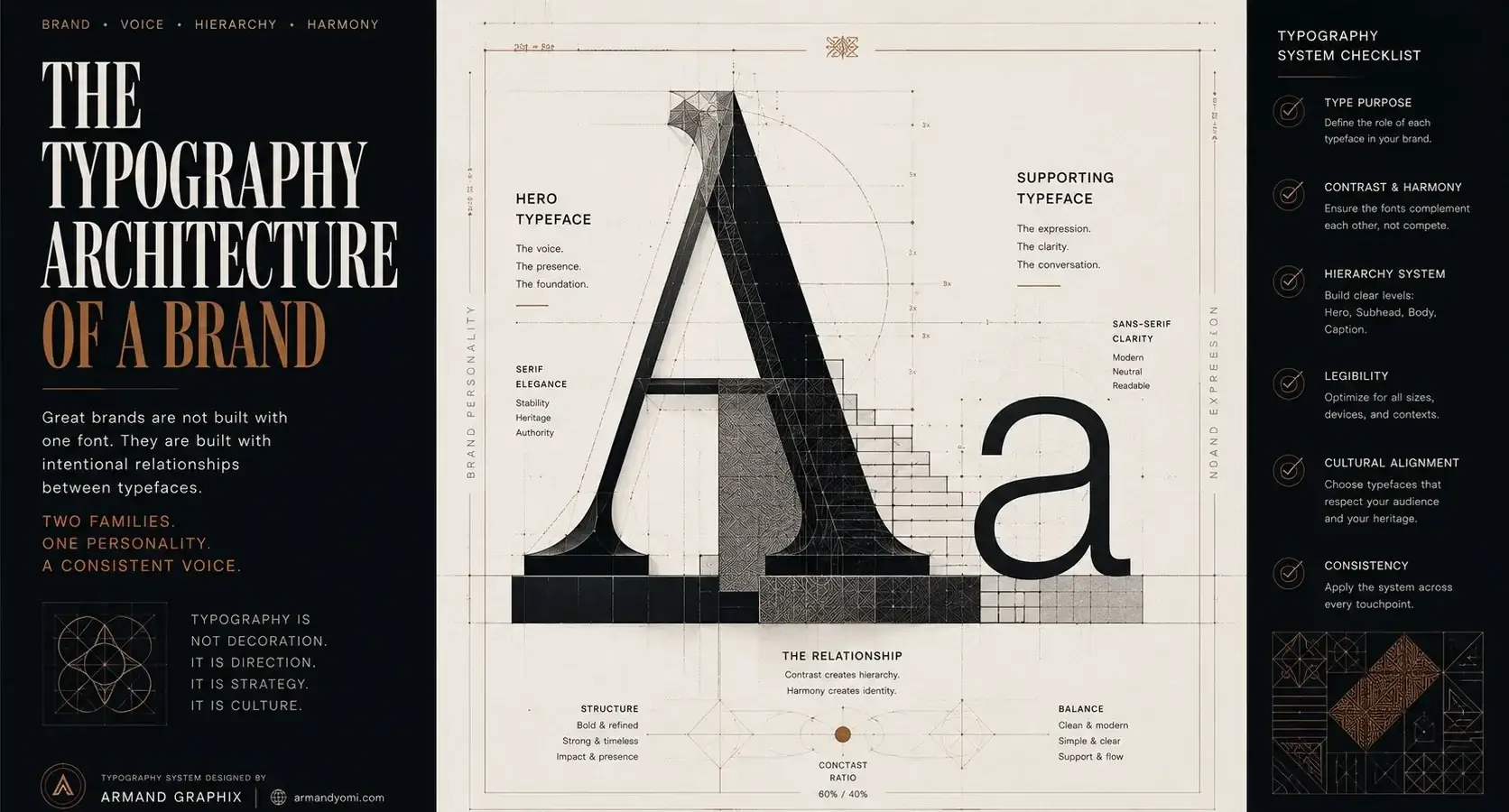
A brand can have the right logo, the right colors, and the right offer – then lose impact because the typography feels generic, awkward, or out of sync. That is why choosing the best font pairings for branding is not a finishing touch. It is a strategic decision that shapes how people read your story, judge your credibility, and remember your business.
Font pairing is where visual personality meets function. One typeface rarely does everything well. A display font may bring mood and distinction, while a cleaner supporting font handles body copy, packaging details, web pages, and social content with clarity. The goal is not to pick two beautiful fonts. The goal is to create a system that works across every place your brand appears.
The best pairing is not the trendiest one or the safest one. It is the one that makes your brand feel unmistakably like itself – clear, credible, and ready to be remembered.
“Choose Fonts That Build a Stronger Brand Identity”
Discover professional font combinations that create clarity, personality, and consistency across every brand touchpoint.
Explore Font Pairings →What makes the best font pairings for branding work
Strong pairings are built on contrast, not conflict. You want enough difference between fonts so each one has a role, but not so much that they feel like they belong to separate brands. Usually, that means pairing a more expressive headline font with a neutral or highly readable companion.
Scale matters too. A font that looks elegant in a logo may fall apart in product descriptions or mobile layouts. Spacing, x-height, weight options, and readability at small sizes all affect whether a pairing can support a real brand system instead of just a mood board.
There is also the matter of brand fit. A luxury skincare line, a tech startup, and a family restaurant should not all sound typographically the same. Typography carries cultural and emotional cues. Serif fonts can feel editorial, classic, or premium. Sans serifs can feel modern, clean, or efficient. Script and display fonts can add personality, but they need restraint.
10 best font pairings for branding
1. Playfair Display + Montserrat
This is a classic high-contrast pairing for brands that want polish with modern accessibility. Playfair Display brings elegance and editorial drama. Montserrat keeps everything grounded and readable.
It works especially well for fashion, beauty, hospitality, and personal brands that want a refined presence without feeling distant. The trade-off is that Playfair can feel overused if the rest of the brand lacks a distinct point of view. The pairing works best when supported by strong imagery and a clear visual direction.
2. Cormorant Garamond + Lato
Cormorant Garamond feels literary, expressive, and slightly more artistic than some mainstream luxury serifs. Lato adds warmth and usability without becoming visually loud.
This pairing suits boutique brands, consultants, creative studios, and premium service businesses. It suggests taste and depth. If your brand needs to look highly technical or performance-driven, though, this combination may lean too soft.
3. Bebas Neue + Open Sans
For brands that need impact fast, Bebas Neue delivers clear, condensed confidence. Open Sans supports it with easy reading across websites, presentations, and marketing materials.
This is a practical pairing for fitness brands, events, construction, food concepts, and startup campaigns that need strong headlines. Its strength is clarity. Its weakness is nuance. If your brand depends on subtlety or emotional warmth, this may feel too blunt unless balanced by color and photography.
4. Abril Fatface + Poppins
Abril Fatface has personality. It is bold, stylish, and memorable. Poppins is geometric, smooth, and contemporary, which helps organize the energy.
Together, they can give a brand strong shelf presence and a social-ready look. This pairing is effective for lifestyle products, beauty brands, creative founders, and marketing-led businesses. The caution is balance. Too much Abril Fatface can overwhelm layouts, so it is better used selectively in hero statements, packaging titles, or campaign graphics.
5. Libre Baskerville + Source Sans 3
This is one of the most dependable combinations for brands that want authority without stiffness. Libre Baskerville feels established and intelligent. Source Sans 3 is clean, versatile, and highly functional.
It is a smart choice for law firms, nonprofit organizations, educational brands, consultants, and health-related businesses. It communicates trust. It may not be the right pick if you are trying to look disruptive, youthful, or highly trend-driven.
6. DM Serif Display + Inter
DM Serif Display offers character without becoming ornate. Inter is one of the most useful digital-first sans serifs available, designed for excellent readability across screens.
This pairing works for modern brands that want warmth, clarity, and a premium edge. It is especially useful when your website and digital marketing are central to growth. If your brand identity needs a more handcrafted or luxurious tone, this pairing may feel a little restrained.
7. Raleway + Merriweather
Raleway brings a sleek, airy, upscale feel. Merriweather adds reading comfort and just enough traditional structure to make the system feel complete.
This combination fits architecture, interior design, wellness, and service brands that want a calm, thoughtful voice. It performs well in long-form brand content and editorial-style layouts. The downside is that Raleway can feel delicate at lighter weights, so it needs careful use in smaller digital applications.
8. Oswald + Nunito
Oswald is compact, assertive, and urban. Nunito softens the tone with rounded forms and easy readability. That contrast creates an approachable but confident brand voice.
This pairing suits food brands, community organizations, youth-focused businesses, and energetic startups. It feels contemporary without trying too hard. If your positioning is highly premium or corporate, it may not carry enough sophistication on its own.
9. Cinzel + Work Sans
Cinzel draws from classical Roman forms, which gives it heritage, ceremony, and visual drama. Work Sans keeps the system practical and modern.
This pairing is strong for cultural brands, luxury services, event branding, and businesses that want to signal legacy or prestige. It can be striking when used with restraint. Used too heavily, though, Cinzel may feel formal to the point of distance.
10. Fraunces + Manrope
Fraunces is full of personality. It has soft, expressive details that can shift from quirky to premium depending on how it is styled. Manrope is clean and contemporary, which gives the pairing structure.
This is a great option for founder-led brands, modern retail concepts, creative agencies, and businesses that want to look original without losing usability. It offers more distinction than many safe pairings. The trade-off is that it requires a stronger brand eye to use well.
How to choose the right pairing for your brand
Start with your positioning, not your personal taste. Ask what your brand needs to communicate in the first three seconds. Premium? Energetic? Established? Minimal? Human? Typography should support that answer.
Then think in systems. Your fonts need to work in a logo, on a website, in social graphics, in pitch decks, on signage, and maybe on packaging. A pairing that looks beautiful in one hero image but fails everywhere else is not a branding solution.
It also helps to define hierarchy early. Decide which font handles headlines, which handles body copy, and whether a third accent font is truly necessary. In most cases, two fonts are enough. Adding more can create visual noise unless the brand is highly editorial or expressive by design.
Common mistakes in font pairing for branding
One of the biggest mistakes is choosing two fonts that are too similar. If both are trying to play the same role, the brand ends up looking accidental rather than intentional. Another common issue is choosing contrast that is too extreme, where one font feels elegant and the other feels generic or unrelated.
Overdecorating is another problem. A highly stylized display font can be effective, but only when it has room to breathe. If every heading, caption, and callout is competing for attention, the brand loses clarity.
Licensing and accessibility are often overlooked as well. Some fonts are expensive to license across teams and platforms. Others look great visually but perform poorly in digital environments. Strategy matters here. Good branding is not just about appearance. It is about consistency, usability, and scale.
When custom direction matters more than popular pairings
Popular font combinations can be a strong starting point, but they are not always enough to build distinction. If your market is crowded, or your brand story is layered, you may need a more tailored typographic system. That could mean adjusting weights and spacing carefully, combining lesser-used typefaces, or developing a logo wordmark that introduces a more proprietary feel.
This is where branding becomes more than decoration. The right typography can frame your story, sharpen your positioning, and create recognition across every touchpoint. At Armand Graphix, that is the difference between design that simply looks good and design that tells your story while supporting growth.
The best pairing is not the trendiest one or the safest one. It is the one that makes your brand feel unmistakably like itself – clear, credible, and ready to be remembered.
“Your Brand Deserves More Than Random Font Choices”
Learn how strategic typography choices transform ordinary visuals into memorable brand experiences.
Find Your Perfect Font Match →- 9 Brand Storytelling Examples That Work
 Explore 9 brand storytelling examples that show how narrative, design, and strategy work together to build trust, attention, and growth.
 - Calgary Packaging Design for Products That Sell
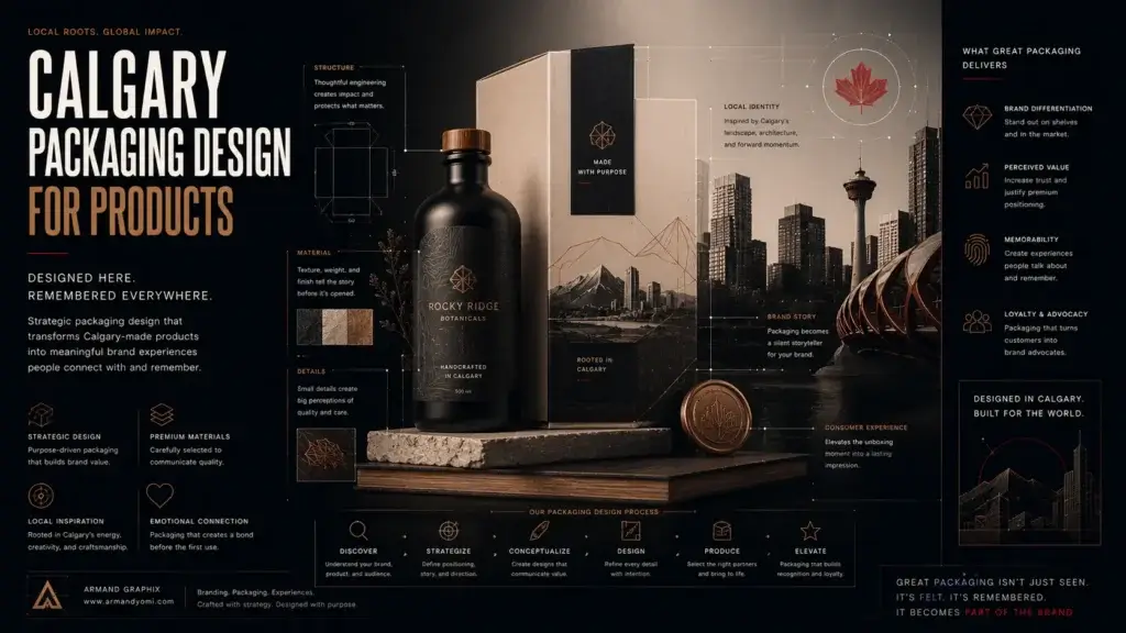 Calgary packaging design for products that builds shelf impact, brand trust, and sales through strategy, storytelling, and smart production choices.
 - Performance Marketing for Startups That Scales
 Performance marketing for startups works best when brand clarity meets data. Learn how to build channels, test faster, and scale with focus.
 - Landing Page Conversion Design That Works
 Landing page conversion design turns attention into action with clearer messaging, stronger visuals, and smarter user paths that sell.
 - Custom Packaging vs Stock Packaging
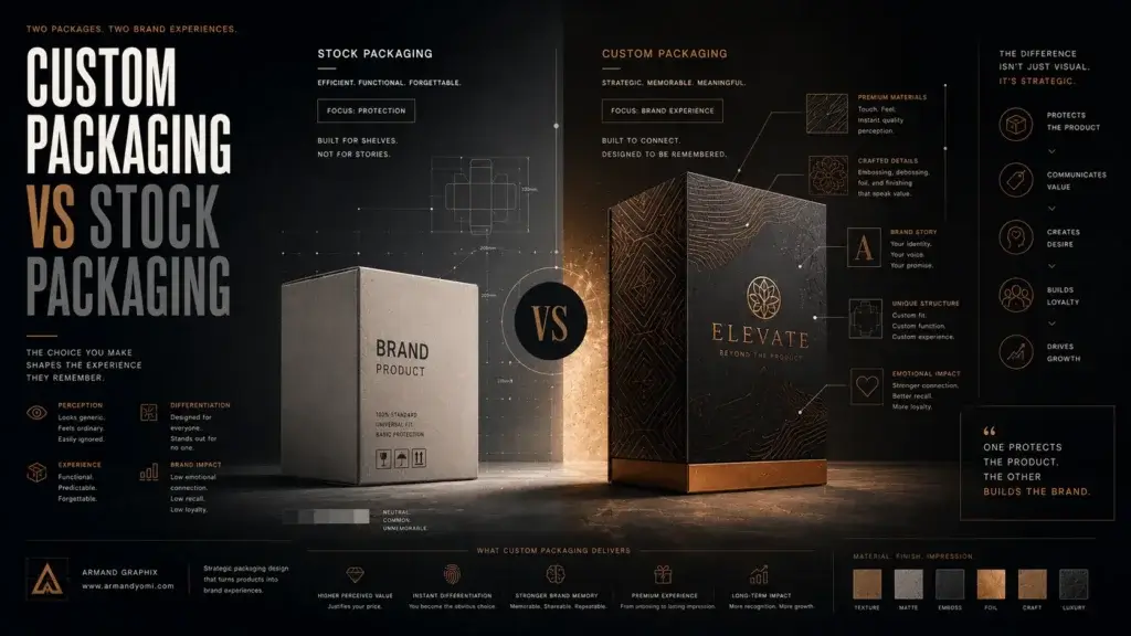 Custom packaging vs stock packaging affects cost, speed, branding, and growth. Learn which option fits your product, budget, and goals best.
 - How to Choose a Web Designer Calgary
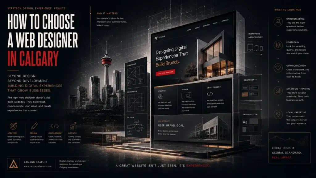 Need a web designer Calgary businesses can trust? Learn what to look for, what to avoid, and how to choose design that drives real growth.