A paid click is expensive. Wasting it on a page that feels generic, slow, or disconnected from the ad is even more expensive. Strong landing page design for ads is not just about making a page look polished. It is about aligning message, intent, and trust so the person who clicks feels they landed in exactly the right place.
That is where many campaigns break. The ad promises one thing, the page says something broader, and the visitor hesitates. Even a beautiful page can underperform if it asks people to think too hard, scroll too far, or guess what happens next.
A good landing page does more than collect leads. It sets the tone for the relationship that follows – and that first impression is part of your brand whether you treat it that way or not.
“Turn More Clicks Into Customers With Better Landing Page Design”
Discover the design principles that transform advertising traffic into meaningful business results.
Build a High-Converting Landing Page →What landing page design for ads actually needs to do
An ad landing page has a narrower job than a standard website page. It is not there to tell your whole brand story, showcase every service, or satisfy every audience segment at once. Its role is simpler and more demanding – continue the conversation started by the ad and move the visitor toward one clear action.
That means relevance comes before decoration. If someone clicks an ad for brand identity design, they should not land on a broad homepage talking equally about packaging, SEO, and social media management. A focused page tells them, immediately, that they are in the right place.
This is where strategy and design need to work together. The page should feel visually aligned with the brand, but it also needs a conversion structure. Great ad landing pages blend emotional resonance with direct response logic. They do not force a choice between beauty and performance.
Start with message match, not layout
Most conversion issues begin before design software is even opened. The first question is not where the button goes. The first question is whether the landing page continues the exact promise made in the ad.
If the ad offers a free consultation for a startup brand launch, the landing page headline should reinforce that offer in language that feels consistent. Not similar. Consistent. Visitors should not have to translate the message in their heads.
Message match reduces friction because it confirms intent. It tells people they clicked correctly. This sounds small, but it directly affects bounce rate, trust, and lead quality.
A strong page usually carries over three things from the ad: the offer, the audience, and the tone. If the ad speaks to founders, the page should not suddenly sound like it was written for enterprise procurement teams. If the ad feels premium, the page cannot look rushed. Design that tells your story only works when the story stays coherent from first impression to final click.
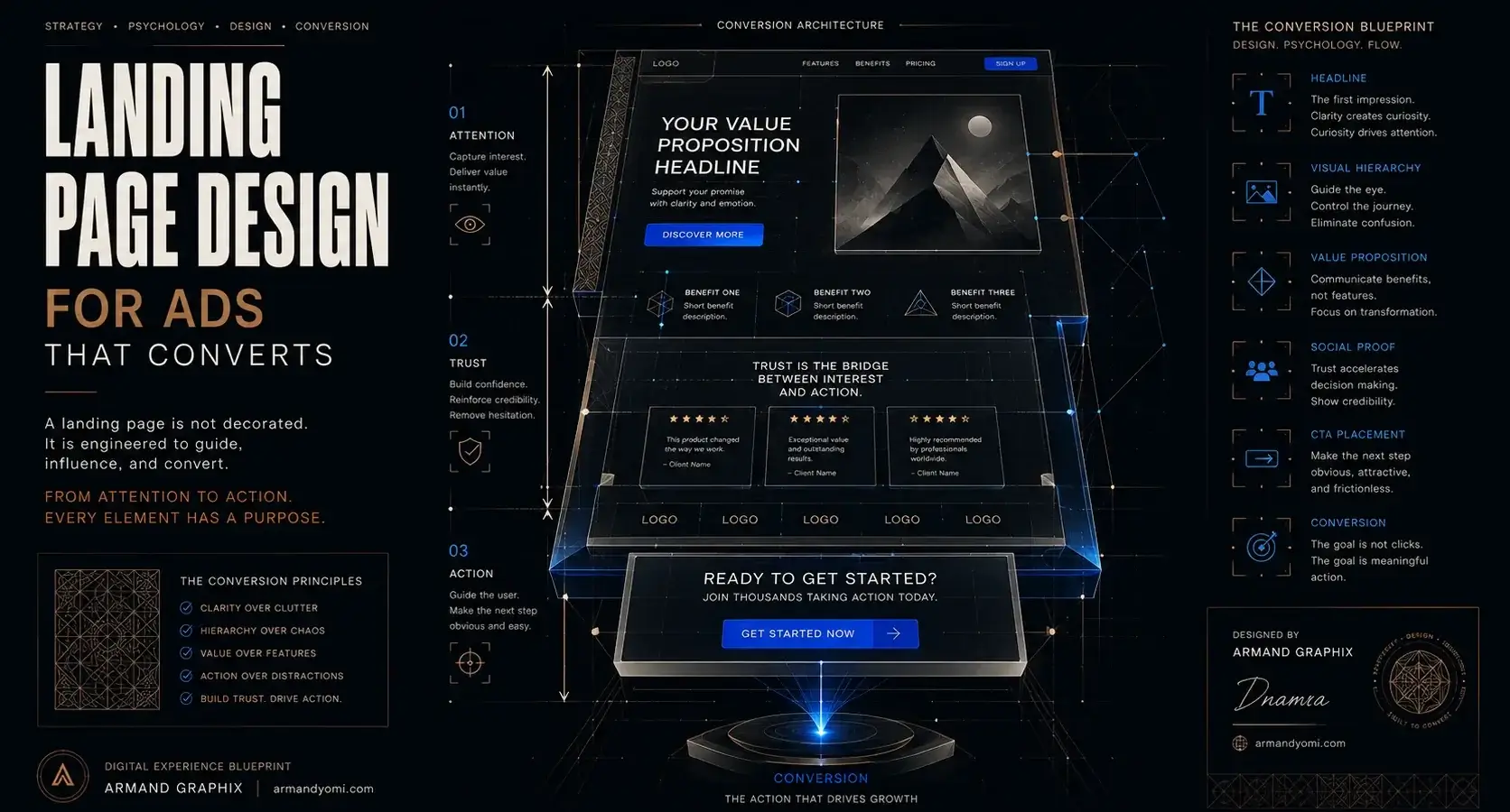
The anatomy of a high-performing ad landing page
The best landing pages are rarely complicated. They are disciplined.
The headline should state the value clearly, without sounding inflated. It needs to answer the visitor’s silent question: what is this page for, and why should I care? The subheading can add context, clarify the offer, or remove uncertainty.
Above the fold, the design should create momentum. Strong hierarchy, generous spacing, and one obvious call to action matter more than clever visual tricks. A visitor should know where to look in seconds.
Visuals should support belief, not fill space. That could mean product imagery, interface previews, brand applications, or selected portfolio work. Generic stock images tend to weaken credibility, especially for design-led businesses. People respond to proof they can interpret quickly.
Then comes supporting content. This might include a short explanation of the process, trust indicators, testimonials, notable results, or a concise comparison that explains why this offer is different. The key is sequencing. Do not ask for commitment before the page has earned enough trust.
Forms deserve special attention. Too many fields can damage conversion, but too few can lower lead quality. It depends on the campaign. A low-commitment offer like a download can ask for less. A higher-ticket service inquiry can ask for more if the value is established first.
Design choices that improve conversion
Good landing page design for ads often looks simple because the hard thinking is hidden. Every choice should reduce hesitation.
Clarity beats cleverness. A bold typographic system, clear color contrast, and a button that stands out are basic decisions, but they shape behavior. If the page is visually noisy, people lose focus. If everything shouts, nothing guides.
Whitespace is not empty. It creates emphasis. It helps key sections breathe and makes the page feel more premium and easier to scan. For brands that want to signal confidence, restraint often performs better than overcrowding.
Mobile design is another place where many pages quietly fail. A page may look strong on desktop and still lose conversions on phones due to oversized sections, weak hierarchy, sticky popups, or forms that feel frustrating. Since many ad clicks come from mobile traffic, this is not a secondary consideration.
Speed also shapes perception. Slow pages do not just hurt technical performance. They make the brand feel less credible. If the page takes too long to load, the user may never see the design you worked so hard on.
Why brand expression still matters on ad pages
Some marketers treat landing pages as stripped-down conversion machines with no room for brand character. That can work for certain low-cost, highly transactional offers. But for service businesses, premium products, and trust-heavy decisions, brand expression is part of conversion.
People are not only evaluating the offer. They are evaluating the business behind it. Is this credible? Is this thoughtful? Does this feel aligned with the level of quality I want?
That is why visual identity, tone of voice, typography, and image direction still matter. A page should feel focused, but not generic. When design and messaging reflect a brand with intention, visitors read that as professionalism.
For founders and small businesses competing against larger players, this is especially valuable. A well-crafted ad landing page can make a business feel established, clear, and confident without pretending to be something it is not.
Common mistakes that hurt ad performance
One of the most common problems is sending every campaign to the same page. Different ads target different intents, and the landing experience should reflect that. A search ad for “logo design for startups” should not lead to the same destination as a retargeting ad promoting a full brand strategy package.
Another issue is overexplaining. Brands sometimes try to justify every detail, include every feature, and answer every possible objection at once. The result is a page that feels heavy. Better pages edit aggressively. They give enough information to move the decision forward, then let the call to action do its job.
Weak calls to action are also common. “Submit” and “Learn More” are easy defaults, but they often lack momentum. The CTA should reflect the value of the next step, whether that is booking a consultation, requesting a quote, or downloading a resource.
Then there is credibility. If the page makes strong claims with no evidence, conversion suffers. Testimonials, relevant work samples, case outcomes, or even a concise explanation of your process can reduce doubt.
Testing what actually works
No landing page is perfect on launch. The goal is not to guess your way into ideal performance. It is to build from a strong strategic foundation, then refine based on behavior.
Start with the biggest levers first: headline, offer framing, primary CTA, hero visual, and form length. These usually have more impact than minor stylistic tweaks.
Testing should stay connected to intent. A shorter page is not always better. A more detailed page is not always better either. If the offer is simple, brevity can win. If the service requires trust and explanation, added depth may improve qualified conversions.
This is where many brands benefit from a designer who understands performance marketing. Strategy that grows your brand requires more than aesthetics. It requires reading the page as both a visual system and a sales environment.
Building pages that respect the click
Every ad click represents interest, attention, and budget. The landing page should honor all three. It should feel specific, intentional, and easy to act on.
The strongest pages do not chase conversion through pressure. They create clarity. They remove friction. They help the right visitor say yes with confidence.
If your ad performance looks good on the platform but weak after the click, the issue may not be your targeting or your copy. It may be the page itself. Fix that, and the campaign often starts making more sense.
A good landing page does more than collect leads. It sets the tone for the relationship that follows – and that first impression is part of your brand whether you treat it that way or not.
“Your Landing Page Is Your Digital Salesperson”
Learn how strategic design, psychology, and user experience work together to increase conversions.
Create a Conversion Strategy →- 9 Branding Trends for Small Business in 2026
 Explore branding trends for small business in 2026, from story-led identity to AI-aware design, and learn what builds trust, recall, and growth.
 - 9 Brand Storytelling Examples That Work
 Explore 9 brand storytelling examples that show how narrative, design, and strategy work together to build trust, attention, and growth.
 - Calgary Packaging Design for Products That Sell
 Calgary packaging design for products that builds shelf impact, brand trust, and sales through strategy, storytelling, and smart production choices.
 - Performance Marketing for Startups That Scales
 Performance marketing for startups works best when brand clarity meets data. Learn how to build channels, test faster, and scale with focus.
 - Landing Page Conversion Design That Works
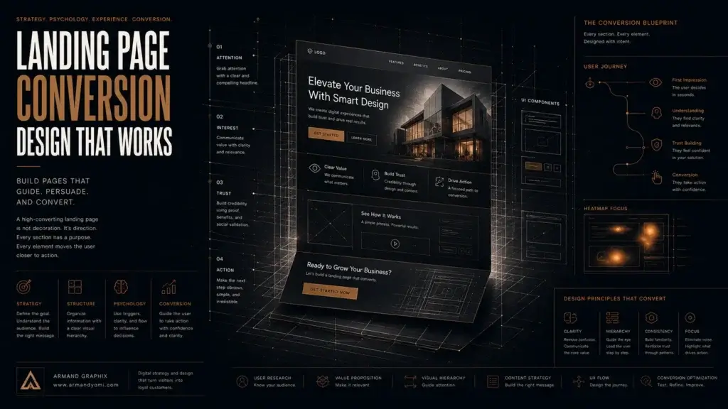 Landing page conversion design turns attention into action with clearer messaging, stronger visuals, and smarter user paths that sell.
 - Custom Packaging vs Stock Packaging
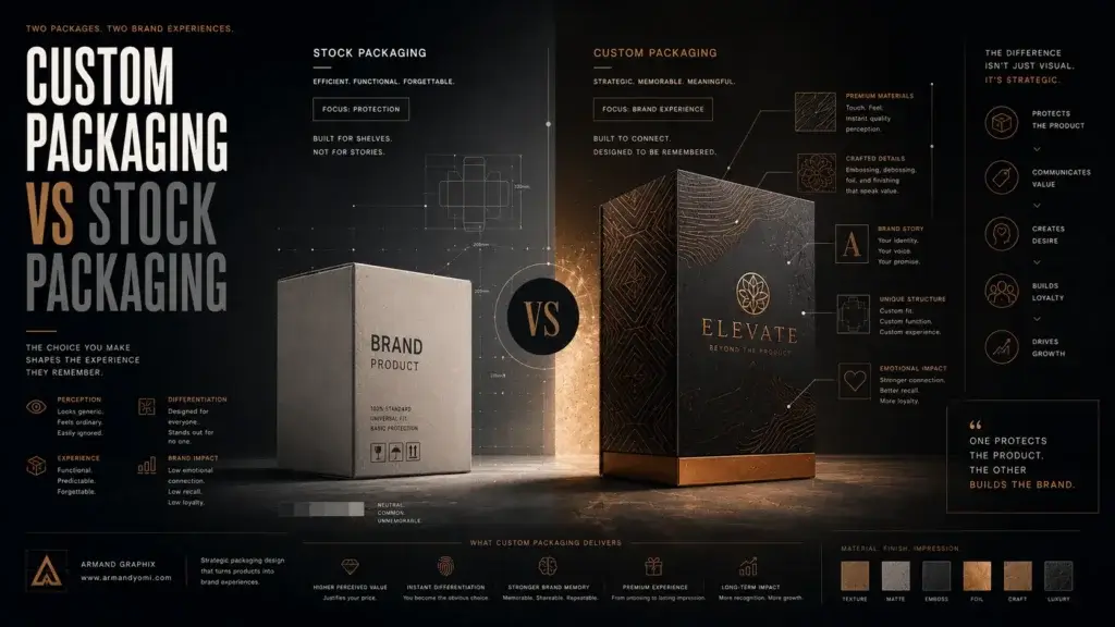 Custom packaging vs stock packaging affects cost, speed, branding, and growth. Learn which option fits your product, budget, and goals best.