A product can be excellent and still lose the sale in three seconds. That is usually the moment when someone scans a shelf, scrolls a product page, or opens a shipment and decides whether the brand feels worth their money. If you are asking what makes packaging look premium, the answer is not one expensive finish or one fashionable color. Premium packaging is the result of deliberate design choices that signal care, clarity, and value before the product is even touched.
For founders and growing brands, that distinction matters. Packaging is not decoration. It is positioning. It tells people whether your brand belongs in the bargain bin, the mid-market middle, or the category’s more elevated tier. The strongest packaging does this quietly. It does not beg for attention. It earns it.
“Make Your Packaging Feel More Valuable”
Discover the design principles that transform ordinary packaging into a premium brand experience customers remember.
Create Premium Packaging →What makes packaging look premium at first glance
Premium perception begins with restraint. Many brands assume that more detail, more shine, or more messaging will create a luxury effect. In practice, the opposite is often true. Packaging looks more expensive when every element feels intentional and nothing feels crowded.
That starts with hierarchy. The customer should know what the product is, who it is from, and why it matters in a single glance. When the front panel is overloaded with claims, badges, patterns, and competing type styles, the package starts to feel cheaper, even if the production cost was high. Premium design leaves room to breathe.
Scale also shapes perception. A small logo is not always more luxurious, and a large logo is not always mass market. What matters is proportion. Premium brands tend to understand visual confidence. They do not force every element to shout. They give the most important message space and allow supporting information to step back.
Material choice sets the tone before the design does
If the packaging feels flimsy in the hand, no amount of elegant typography will fully rescue it. Material quality is one of the clearest signals of value because people judge it instantly through touch, weight, and rigidity.
A thicker paperboard, a soft-touch coating, a well-made rigid box, or a label stock with subtle texture can create a stronger premium impression than flashy embellishments. The key is alignment. A skincare product may benefit from tactile paper and a clean carton. A gourmet food brand may need a sturdy container with a label that feels artisanal but still refined. A tech accessory might require a more minimal, engineered feel.
There is a trade-off here. Better materials usually cost more, affect shipping weight, and may limit production flexibility. Premium does not mean choosing the most expensive substrate available. It means selecting materials that support the brand story and price point without creating a mismatch. If the product is accessible but polished, the packaging should feel elevated, not artificially extravagant.
Typography is one of the biggest premium signals
Typography is where many packaging systems either gain authority or lose it. A premium package usually uses fewer typefaces, better spacing, and a more disciplined layout. The type does not just communicate information. It communicates confidence.
Well-chosen typography can make a simple package feel considered and distinctive. Poor typography can make an expensive package look generic. Letter spacing that is too tight, type that is too small to read, inconsistent font pairings, or decorative scripts used without purpose all weaken the impression.
Premium brands often rely on typography to carry emotional tone. A serif may suggest heritage and refinement. A clean sans serif may feel modern and precise. Custom lettering or wordmarks can create a sense of uniqueness that off-the-shelf fonts rarely achieve on their own. The right choice depends on the audience and category, but the principle stays the same: typography should feel edited, not improvised.
Color is not about being muted. It is about being controlled.
People often associate premium packaging with black, white, beige, or dark jewel tones. Those palettes can work, but premium does not come from a specific color family. It comes from control.
A premium color system usually feels intentional, balanced, and brand-specific. It avoids the random, over-saturated combinations that make packaging look noisy or disposable. Sometimes one bold color used with precision feels more premium than a neutral palette trying too hard to look expensive.
Contrast plays a major role. If text disappears into the background, the package feels unresolved. If every surface is competing for attention, it feels chaotic. Premium packaging tends to use color with discipline, allowing one dominant tone, one supporting tone, and a clear reading experience.
This is also where cultural awareness matters. Colors carry different associations across markets and audiences. A palette that feels ceremonial, natural, clinical, or indulgent in one context may read very differently in another. Strong packaging design considers those nuances, especially for brands with cross-cultural audiences or broader market ambitions.
Structure and form create a stronger premium experience
Packaging is not just a flat graphic exercise. The way it opens, closes, stacks, pours, protects, or reveals the product shapes how premium it feels.
A well-designed structure can make even minimal graphics feel elevated. Think of a box with a precise magnetic close, a bottle with balanced proportions, or an insert that holds the product cleanly in place. These details create an experience of care. They tell the customer the brand thought beyond the label.
Good structure also removes friction. If opening the package is confusing, messy, or awkward, the premium impression disappears quickly. Ease matters. So does consistency. The structural design should support the product category and customer expectations. A premium candle package, for example, often succeeds through proportion, stability, and reveal. A premium supplement package may lean more heavily on usability, trust, and shelf clarity.
Finishes matter, but they are not the whole story
Foil, embossing, debossing, spot UV, soft-touch lamination, and specialty coatings can all add premium character. They can also be overused.
The best finishes create contrast and focus. A subtle embossed logo on uncoated stock can feel far more sophisticated than covering the entire package in metallic effects. Premium design uses finishes with intention, usually to emphasize one or two key brand elements.
This is where many brands overspend without improving perception. If the design underneath is weak, premium finishing only highlights the problem. Customers may notice the effect, but they will not necessarily perceive the brand as more refined. Finish should support the concept, not replace it.
What makes packaging look premium in retail and online
Packaging has to perform in two environments now: in person and on screen. A package might feel beautiful in hand but fail as a thumbnail. Or it may photograph well and disappoint in person. Premium brands design for both.
In retail, premium packaging stands out through clarity, proportion, and material presence. Online, it needs a strong silhouette, readable branding, and visual distinction at small sizes. This is why shape, contrast, and front-panel hierarchy matter so much. The package has to communicate value before texture can do its job.
Founders sometimes underestimate how much ecommerce changes packaging decisions. If most first impressions happen on Instagram, marketplaces, or product pages, then premium perception begins with digital legibility. The best packaging systems are photogenic because they are structurally and visually disciplined, not because they are overloaded with effects.
Consistency is what makes a brand feel expensive
One premium package can attract attention. A consistent packaging system builds trust. When every SKU, size, and variation feels connected, the brand appears more established and more credible.
Consistency does not mean sameness. It means shared logic. Typography, spacing, color behavior, icon style, material choices, and information architecture should feel like they belong to one brand family. This is especially important for startups and smaller businesses trying to compete with more established players. Cohesion can make a young brand feel mature.
This is where strategy becomes visible. Great packaging is not just attractive on one product. It scales. It adapts. It still works when you add a new scent, flavor, format, or market extension. That is one reason premium packaging often feels calm. It was designed as a system, not a one-off.
The real test of premium packaging
The real question is not whether the package looks expensive to you. It is whether it makes the right customer believe the product is worth the price. That depends on category norms, audience expectations, and brand story.
A premium organic food brand may need warmth, honesty, and tactile simplicity. A premium beauty brand may need precision, elegance, and a stronger ritual feel. A premium wellness brand may need a balance of trust and aspiration. Each one can look premium for different reasons.
That is why strong packaging design sits at the intersection of aesthetics and strategy. At Armand Graphix, that intersection matters because design should do more than look polished. It should tell your story and support growth.
If you want your packaging to feel premium, start by editing before adding. Tighten the message. Refine the typography. Choose materials that fit the promise. Build a structure that respects the user experience. Premium is rarely louder. It is usually clearer, sharper, and more intentional.
“Premium Packaging Starts With Strategic Design”
Learn how materials, typography, layout, and storytelling work together to elevate your product perception.
Explore Packaging Principles →- 9 Brand Storytelling Examples That Work
 Explore 9 brand storytelling examples that show how narrative, design, and strategy work together to build trust, attention, and growth.
 - Calgary Packaging Design for Products That Sell
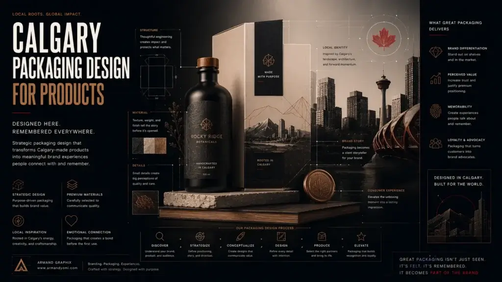 Calgary packaging design for products that builds shelf impact, brand trust, and sales through strategy, storytelling, and smart production choices.
 - Performance Marketing for Startups That Scales
 Performance marketing for startups works best when brand clarity meets data. Learn how to build channels, test faster, and scale with focus.
 - Landing Page Conversion Design That Works
 Landing page conversion design turns attention into action with clearer messaging, stronger visuals, and smarter user paths that sell.
 - Custom Packaging vs Stock Packaging
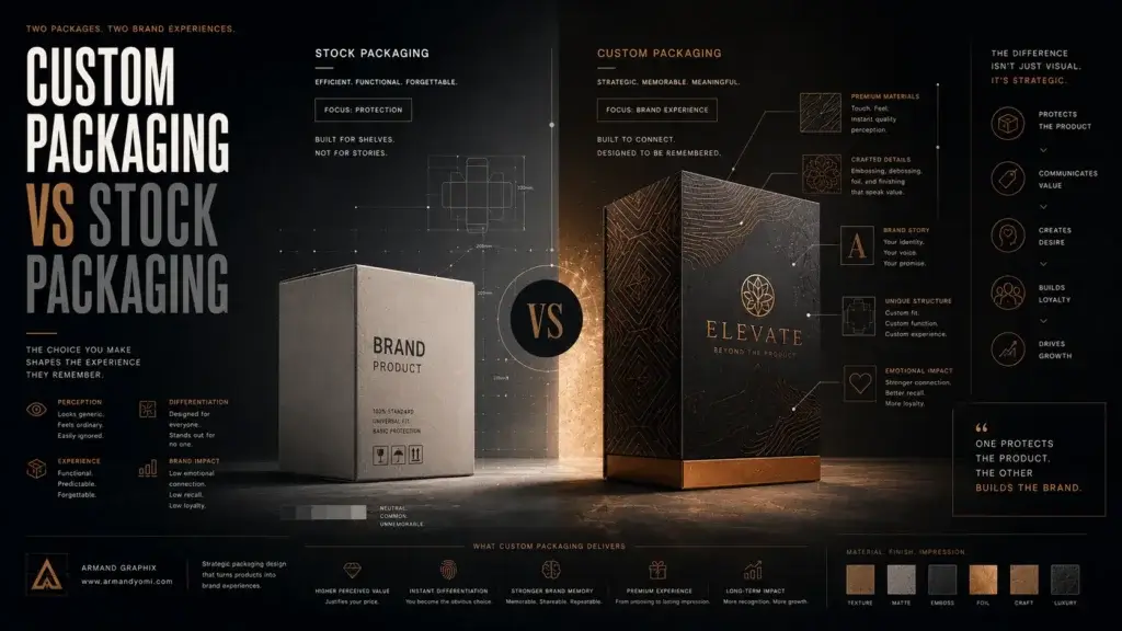 Custom packaging vs stock packaging affects cost, speed, branding, and growth. Learn which option fits your product, budget, and goals best.
 - How to Choose a Web Designer Calgary
 Need a web designer Calgary businesses can trust? Learn what to look for, what to avoid, and how to choose design that drives real growth.