Most startups do not have a branding problem. They have a clarity problem.
Founders often come in asking for a logo when what they really need is a sharper way to be recognized, remembered, and trusted. That is where brand identity for startups becomes more than a visual exercise. It becomes a business tool. If your brand looks polished but says nothing distinct, it will not carry you very far. If it communicates the right story, even a young company can feel credible from day one.
What brand identity for startups really means
Brand identity is the visible and verbal expression of your business. It includes your logo, typography, color system, imagery, messaging, tone of voice, and the small design decisions that shape how people experience your company. For startups, those choices do heavy lifting. You usually do not have years of reputation behind you, so your identity has to signal trust fast.
That does not mean looking expensive for the sake of it. It means looking intentional. A founder-led SaaS product, a beauty startup entering retail, and a local service brand all need different signals. One may need precision and clarity. Another may need shelf appeal and emotional pull. Another may need credibility and approachability. Good identity work is not about following trends. It is about aligning perception with the value you actually offer.
This is where many early-stage brands get stuck. They copy the visual language of bigger competitors and end up blending in. Or they choose something expressive but disconnected from the audience they want to attract. A strong identity sits in the middle. It is distinctive enough to be memorable and strategic enough to support growth.
“Can your brand survive growth ?”
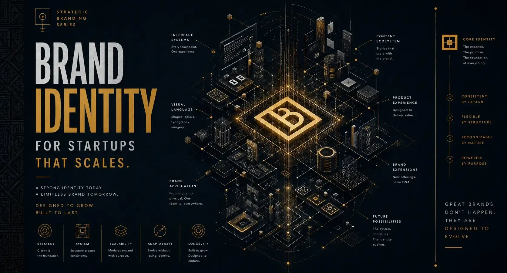
Build an identity system designed for scale.
Create a Scalable Brand →Why early-stage brands cannot afford to fake clarity
At startup stage, every touchpoint matters more. Your website has less time to persuade. Your pitch deck has less room for confusion. Your packaging, social presence, or launch campaign may be the first proof that you are serious.
People read design quickly. Before they understand your offer in full, they make assumptions based on how you present it. Is this brand modern or dated? Premium or budget? Thoughtful or improvised? Built for them or for everyone? Those judgments happen fast, and they influence whether someone keeps reading, clicks away, or starts to trust you.
The trade-off is real. If you rush your identity, you may launch faster, but you often pay for it later with inconsistent materials, weak recall, and unclear positioning. If you overbuild too early, you risk spending money on assets that no longer fit once your product, market, or audience sharpens. The goal is not to create a giant brand system before you have traction. The goal is to build a focused identity with enough structure to grow.
Start with strategy, not decoration
The most effective startup identities begin with a few uncomfortable questions. What do you want to be known for? Who are you trying to attract first? What should people feel when they encounter your brand? Why should they choose you over the safer, more established option?
If those answers are vague, the design will be vague too.
This is why the strongest brand work is rooted in positioning before aesthetics. Your identity should reflect your market reality, not just your personal taste. A founder may love minimalist black-and-white branding, but if the target audience responds better to warmth, energy, and accessibility, personal preference should not lead the system.
Strategic clarity also helps you make better creative decisions later. Typography is not just style. It affects tone. Color is not just decoration. It shapes emotion and recognition. Language is not filler. It tells people whether your brand sounds expert, human, ambitious, premium, playful, or all over the place.
The core pieces that matter most
Not every startup needs a massive brand package at launch, but every startup does need coherence. In practice, that usually means a clear logo system, a defined type palette, a disciplined color system, a voice that sounds like one brand instead of five different moods, and visual rules for digital and print use.
Your logo matters, but not as much as many founders think. A great logo cannot rescue weak positioning. What it can do is anchor recognition and work across your key applications. It should scale well, feel relevant to your market, and avoid looking generic. The problem with many startup logos is not that they are ugly. It is that they are forgettable.
Typography is often the hidden strength of a brand identity. The right type choices can make a startup feel editorial, technical, elegant, energetic, or grounded without overexplaining anything. The same goes for color. A smart color system creates consistency across your site, pitch materials, social content, packaging, and campaigns. It should be flexible enough for different formats but recognizable enough that people begin to associate it with you.
Messaging is where visual identity either gains power or loses it. If your design says premium but your copy sounds generic, people feel the disconnect. If your visuals feel bold but your messaging is timid, the brand loses force. Identity works best when what people see and what they read tell the same story.
Identity should fit the stage of the business
A pre-launch startup does not need the same branding depth as a company preparing for retail expansion or investor visibility. That sounds obvious, but many founders either underinvest or overcomplicate based on the wrong benchmark.
If you are early, focus on the essentials that create a strong first impression and a repeatable presence. You need enough system to show up professionally across your website, social channels, sales materials, and launch assets. That usually gives you more value than spending months refining edge-case applications you may not use.
If you already have traction, the conversation changes. At that stage, branding often needs to solve for consistency across channels, team use, customer recognition, and stronger differentiation. Packaging, event branding, web design, and paid campaign creative begin to matter more because the brand is no longer just being introduced. It is being scaled.
That is why identity should never be isolated from growth. Design that tells your story is only half the work. Strategy that grows your brand has to be built into how that story appears in the market.
Common mistakes that weaken startup branding
The first mistake is designing for yourself instead of your audience. Founders are close to the business, which can be a strength, but it also creates blind spots. What feels exciting internally may read as confusing externally.
The second is inconsistency. A strong website paired with weak social graphics, inconsistent typography, and off-brand presentations makes the company look less mature than it is. Startups do not need perfect execution everywhere, but they do need recognizable standards.
The third is confusing trendiness with distinction. Trend-led branding can create quick appeal, but it ages fast and often makes smaller brands look interchangeable. Distinctive identity comes from clarity, point of view, and disciplined use, not from copying what is popular in your category this quarter.
The fourth is separating branding from marketing. If your identity looks good but performs poorly in search, paid campaigns, or social content, something is disconnected. Your brand has to function in the real conditions where customers find you.
How to know your startup identity is working
A strong identity creates recognition, but recognition is only one signal. The deeper test is whether the brand makes decisions easier. Does it help you create content faster? Does it improve consistency across touchpoints? Does it make your offer easier to understand? Does it attract the kind of client or customer you actually want?
You will also see it in conversation. People begin describing your brand in the language you intended. They call it refined, bold, approachable, premium, fresh, or trustworthy without needing much prompting. That means the identity is carrying meaning, not just decoration.
For startups with sales cycles or investor conversations, the payoff is often practical. Better presentation supports better perception. Better perception opens better opportunities. That does not mean branding replaces product quality or market fit. It means it gives those strengths a clearer stage.
Build for recognition now, flexibility later
The smartest startup brands do not try to look like they have done everything already. They look clear, credible, and ready for the next step. That is enough.
A well-built identity should give you room to evolve without forcing a total reset every time the business grows. That takes restraint. It takes creative confidence. And it takes strategy strong enough to hold together across visuals, messaging, and market execution.
For founders building something meaningful, brand identity is not the finishing touch. It is part of how the business earns attention and trust in the first place. Build it with intention, and your brand will not just look better. It will communicate better, compete better, and give your growth a stronger shape from the start.
“Strong startups scale faster with clear identities.”
Let’s build a brand system designed for long-term growth.
Start Your Branding Project →- WordPress Versus Custom Websites for Growing Brands
 WordPress versus custom websites: compare cost, speed, control, SEO, and growth to choose a site that supports your brand and business goals clearly.
 - What Does Brand Strategy Include for Growth?
 What does brand strategy include? Learn the research, positioning, identity, messaging, and marketing choices that turn a business into a distinct brand.
 - Packaging Design Guide for Retail Brands
 A packaging design guide for retail brands: build shelf impact, meet production realities, and turn a first glance into a confident purchase decision.
 - Multicultural Branding Trends 2026 for Modern Brands
 Multicultural branding trends 2026 will reward brands that pair cultural intelligence, inclusive design, and local relevance with measurable, real growth.
 - Custom Logo vs Template: What Fits Your Brand?
 Custom logo vs template: compare cost, speed, ownership, and brand impact to choose an identity that builds your launch, growth, and reputation today.
 - What Is a Visual Identity? Design That Builds Trust
 What is a visual identity? Learn how logos, color, typography, and systems create recognition, trust, and stronger brand growth for ambitious businesses.