A customer may encounter your brand for two seconds on a search result, social post, package, or storefront. Before they read your offer, they make a judgment about its quality and relevance. So, what is a visual identity? It is the intentional design system that gives your brand a recognizable face, a consistent voice in visual form, and a stronger chance of being remembered.
A visual identity is not decoration added after the business strategy is done. It is how strategy becomes visible. It translates your positioning, personality, values, and audience insight into visual choices people can recognize across every meaningful touchpoint.
What Is a Visual Identity, Exactly?
A visual identity is the collection of graphic elements that represent a brand. It includes the logo, color palette, typography, imagery, iconography, layouts, and supporting design details that work together as one coherent system.
The word system matters. A logo on its own is a mark. A visual identity gives that mark a world to live in. It establishes how a brand looks on a website, in a pitch deck, on product packaging, across social media, at an event, and in the small everyday moments where trust is formed.
For a founder, this distinction can change the scope of a branding project. If you only need a logo for a temporary initiative, a standalone mark may be enough. If you are building a company that needs to look credible, distinct, and consistent as it grows, you need an identity designed for real-world use.
The Difference Between a Brand and Visual Identity
Your brand is the total impression people carry after interacting with your business. It includes what you stand for, how you communicate, the experience you deliver, your reputation, and the emotional response you create.
Your visual identity is one powerful part of that larger brand. It cannot compensate for weak service, unclear positioning, or inconsistent customer experience. But when those foundations are sound, it makes them easier to understand and remember.
Think of a brand as a story and visual identity as the art direction that makes the story instantly recognizable. The same story can feel premium, playful, technical, community-focused, or culturally rooted depending on the visual language used to tell it. That is why design decisions should begin with purpose, not personal taste.
What a Strong Visual Identity Includes
The exact ingredients depend on the business, its audience, and where the identity needs to work. A retail product brand has different needs than a consulting firm or a local restaurant. Still, most effective visual identity systems bring together several core elements:
- Logo system: A primary logo, plus alternate versions, icons, and responsive variations for different spaces and sizes.
- Color palette: Primary and secondary colors with clear guidance for contrast, hierarchy, mood, and accessibility.
- Typography: Typefaces and rules for headlines, body copy, calls to action, and digital readability.
- Imagery and graphic language: Photography direction, illustration style, textures, patterns, icons, shapes, or motion principles that make the brand feel unmistakably its own.
- Layout principles: Repeatable rules for spacing, composition, and hierarchy across web pages, presentations, advertising, and print.
These parts should not compete for attention. They should reinforce the same idea. A refined serif typeface, muted colors, and editorial photography may support a luxury hospitality brand. The same choices could make a youth-focused fitness brand feel distant or slow. Good identity design is not about following what looks current. It is about making the intended perception clear.
Why Visual Identity Matters for Growth
Recognition is the most obvious benefit. When your business uses a consistent visual language, customers can identify your content before they have read every word. That familiarity reduces friction. Over time, it can make a small business feel more established, especially when competing in crowded categories.
Credibility is equally important. A fragmented logo, inconsistent fonts, improvised social graphics, and outdated website styling can create doubt, even when the business itself is excellent. People often use visual signals to assess whether a company is prepared, professional, and worth their attention. This is particularly true when they have little other information to work with.
A clear visual identity also improves execution. Instead of reinventing every Instagram post, sales presentation, campaign, or event sign, your team has a framework for making decisions. That saves time while protecting quality. For businesses investing in SEO, paid media, or social campaigns, consistent creative helps marketing activity compound rather than feel like a string of disconnected promotions.
There is a commercial side to distinctiveness, too. If your visuals look interchangeable with every competitor, your price, convenience, or ad spend may have to work harder. A recognizable identity gives people something specific to associate with your business beyond the transaction.
Visual Identity Starts With Strategy, Not a Mood Board
Many businesses begin by collecting logos, colors, and websites they like. References are useful, but they are not a strategy. What appeals to you personally may not communicate the right message to your audience or differentiate you in your category.
A stronger process begins with questions: Who are we trying to reach? What problem do we solve? What should someone feel when they encounter us? What do competitors all look and sound like? Where will this identity appear first, and where must it scale next?
The answers create design criteria. A startup seeking investor confidence may need an identity that communicates clarity and momentum. A consumer brand entering retail may need shelf impact and packaging flexibility. A multicultural organization may need visual choices that communicate across audiences without flattening the cultural context that makes its story meaningful.
This is where thoughtful creative direction adds value. The goal is not to make every brand look expensive or minimal. The goal is to make the right audience feel that this brand understands them and has something credible to offer.
Consistency Does Not Mean Repetition
A common concern is that brand guidelines will make every piece of content look the same. Done poorly, that can happen. Done well, a visual identity creates consistency without becoming rigid.
Your logo does not need to sit in the same place in every layout. Your color palette does not need to use every color at once. Your social media graphics should not become templates with new words dropped into them each week. Instead, the identity should provide recognizable ingredients and enough flexibility to adapt them to the message, format, and audience.
For example, a campaign may use a bolder crop of your photography or a more expressive color combination than a formal proposal. Both can still feel like the same brand if the typography, composition, tone, and visual cues are connected. The best systems are disciplined, not restrictive.
Common Mistakes That Weaken an Identity
The first mistake is treating the logo as the entire project. A logo is essential, but without type, color, image direction, and application rules, it rarely creates a consistent brand experience.
The second is designing for trends alone. Trend-aware work can feel fresh, but trends move quickly. If every choice is borrowed from a popular aesthetic, your identity may age fast or blend into the market. Timelessness does not mean avoiding contemporary design. It means grounding visual choices in a brand truth that will still matter after the trend shifts.
Another mistake is ignoring implementation. An identity that looks impressive in a presentation but fails in a small social avatar, a mobile website, a bilingual layout, or affordable print production is not fully resolved. Practical constraints should inform the design early, not appear as an afterthought.
Finally, businesses sometimes launch an identity and then use it inconsistently. A brand guide is only valuable if it informs daily work. Give internal teams and external partners clear, usable direction. The more often customers encounter the same visual signals, the more meaning those signals can carry.
When Is It Time to Refresh Your Visual Identity?
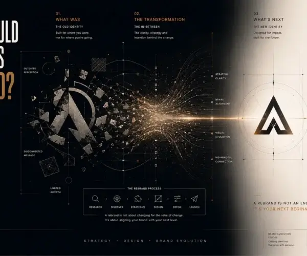
A refresh is worth considering when your business has outgrown its original audience, offer, or level of ambition. Perhaps your company began as a side project and now serves larger clients. Perhaps your packaging no longer competes at retail. Perhaps the website and marketing materials no longer reflect the quality of the work you deliver.
Not every update requires a full rebrand. If your name, positioning, and recognition are strong, refining the logo, typography, or digital application may be enough. A more substantial change makes sense when the current identity actively creates confusion, limits expansion, or represents a version of the business you have left behind.
The right decision depends on what needs to change and what equity is worth protecting. A strategic audit can separate surface-level frustration from a genuine identity problem.
A visual identity should make your next move easier. Whether you are launching in Calgary, entering a new market, preparing for retail, or simply raising the standard of your brand presence, invest in a system that can carry your story with confidence. Design that tells your story becomes more valuable when it is built to grow with it.