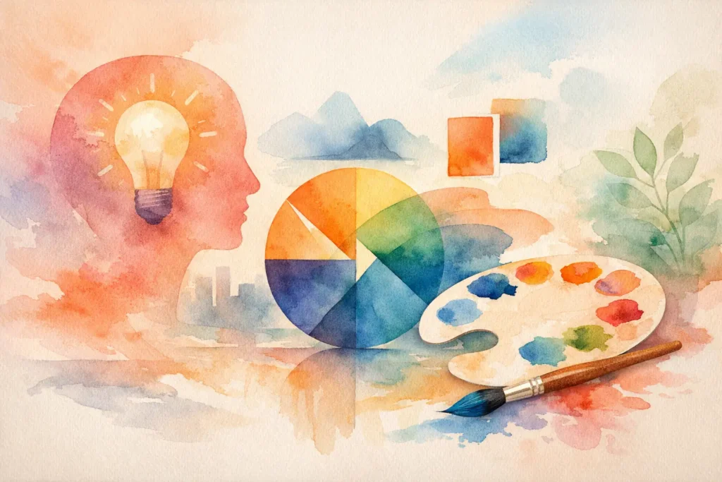
A logo can be beautifully drawn and still feel forgettable. Most of the time, the issue is not the symbol. It is the type. Typography and logo design work together to tell people whether your brand is refined, bold, youthful, premium, playful, or built for trust before a single sentence is read.
That first impression is not cosmetic. It affects recognition, credibility, and conversion. For founders launching a new business or teams refreshing an aging identity, type is often where the real brand personality becomes visible.
“Memorable logos are rarely accidental.”
They combine typography, psychology, proportion, and visual consistency into a recognizable system people trust over time.
See Branding Case Studies →Why typography and logo design matter so much
Typography is not decoration placed beside a mark. It is one of the strongest carriers of brand meaning. The weight of a letter, the spacing between characters, the curve of a terminal, and the rhythm of a wordmark all shape how a brand is perceived.
In logo design, those details matter because logos operate under pressure. They need to work on a website header, a product label, a social profile, a pitch deck, event signage, and sometimes a tiny mobile screen. A type choice that looks elegant in a large presentation can collapse at small sizes. A trendy font can feel current for six months and dated for the next three years.
Strong brands understand this. They do not ask whether a typeface is nice. They ask whether it aligns with the story, the market position, and the environments where the logo needs to perform.
What typography communicates in a logo
Every type decision sends a signal. Serif logos often suggest heritage, authority, or editorial sophistication. Sans serif logos can feel modern, clean, and direct. Script logos can create intimacy, personality, or luxury, but they can also become hard to read. Display fonts can be memorable, though they usually demand restraint because too much personality can reduce flexibility.
This is where strategy matters. A law firm, a fashion label, a coffee brand, and a tech startup may all want to look premium, but premium does not look the same in every category. One brand may need restraint and clarity. Another may need expressive character. Typography helps define that distinction.
The best logo systems are not built around personal taste alone. They are shaped by audience expectations, competitive context, and the emotional tone the brand wants to own.
Typography and logo design are about fit, not formulas
There is no universal best font for logos. There is only the right fit for a specific brand.
A geometric sans serif can feel efficient and contemporary, which may work well for a digital service company. The same font might feel too cold for a handmade skincare brand that needs softness and warmth. A high-contrast serif may communicate luxury beautifully for packaging, yet feel overly formal for a community-focused nonprofit.
This is why thoughtful identity work starts with positioning. Before choosing type, you need clarity on who the brand is for, what it promises, and how it should feel in the market. Without that foundation, logo typography becomes guesswork.
At Armand Graphix, that strategic layer matters because design that tells your story should also support how people discover, trust, and remember your brand. A logo is not just a visual asset. It is a business signal.
The difference between a font and a logo wordmark
One of the most common misconceptions is that selecting a font is the same as designing a logo. It is not.
A font is a starting point. A strong wordmark usually involves refinement. That can mean adjusting kerning, customizing letterforms, modifying proportions, softening corners, sharpening cuts, or introducing subtle details that make the identity distinct. Even small adjustments can shift a logo from generic to ownable.
This is especially important in crowded markets. If five brands in your category are using similar off-the-shelf typefaces, your logo may look professional but still fail to stand apart. Customization creates memorability without forcing unnecessary complexity.
That said, not every brand needs a fully custom type solution. Sometimes a carefully chosen typeface with precise spacing and disciplined usage is exactly the right move. It depends on budget, scale, and brand ambition.
What makes logo typography work in the real world
Great logo typography is not only expressive. It is usable.
Legibility comes first. If people cannot read your brand name quickly, the design is working against recognition. Distinction comes next. Your logo should not blend into the category so completely that it disappears. Then comes adaptability. Can the type hold up across print, digital, packaging, social media, and signage? Can it still feel like the same brand when used in a stacked lockup, a horizontal logo, or an icon pairing?
These practical questions often reveal trade-offs. Highly decorative typography may create a strong first impression but fail on small screens. Ultra-minimal logos may reproduce beautifully across platforms but risk feeling too generic if they lack character. The goal is not perfection in one setting. The goal is strong performance across many.
Common mistakes in typography and logo design
A lot of weak brand identities come from rushing the type decision. The first mistake is following trends too closely. What looks fresh on design feeds can become stale fast, especially when dozens of businesses adopt the same visual cues.
The second mistake is choosing type based only on personal preference. Founders often gravitate toward fonts they find stylish, but style without strategic fit creates disconnect. If the logo says boutique luxury while the business sells affordable, accessible services, the brand message becomes confused.
The third mistake is ignoring spacing. Kerning issues can make even a good typeface feel amateur. Poor spacing affects polish, readability, and trust. It is a small detail with outsized impact.
The fourth mistake is treating the logo as separate from the broader identity. Typography should connect with the website, packaging, presentations, and social graphics. When the logo type says one thing and the rest of the brand says another, consistency breaks.
How to choose the right direction
Start with brand character. Should the identity feel established or disruptive, warm or technical, elevated or accessible? Those are typography questions as much as messaging questions.
Then study context. Look at competitors, but do not imitate them. You want enough familiarity to feel credible in your space and enough differentiation to be remembered. This is where intercultural awareness can also shape better outcomes. Brands speaking to diverse audiences often need typography that feels inclusive, clear, and flexible across touchpoints.
Next, test the logo where it will actually live. A type treatment that feels impressive in isolation can weaken when placed on packaging, embroidered apparel, or mobile interfaces. Seeing the logo in use often changes the decision.
Finally, think beyond launch. Will this typography still support your brand if you expand services, enter new markets, or raise your price point? Good logo design should create room for growth.
When to use custom lettering, type modification, or a simple typeface
If your brand competes in a crowded premium space, custom lettering can create a strong edge. It signals craft and gives the identity a unique voice. This approach works well when the logo itself needs to carry a lot of distinction.
If you want a balance between uniqueness and efficiency, modifying an existing typeface is often the smartest path. It preserves clarity while adding enough individuality to avoid looking generic.
If your brand system is broad and content-heavy, a simpler type treatment may serve you better. In these cases, consistency, clarity, and scalability can matter more than highly expressive detail. The right answer depends on the role the logo needs to play inside the larger brand system.
Why this matters for growth, not just aesthetics
Typography influences perception at speed. That affects whether someone pauses on your packaging, trusts your website, remembers your name, or feels confident enough to reach out. Those moments shape business results.
For startups, strong logo typography can help create credibility faster. For established businesses, it can modernize perception without losing equity. For founder-led brands, it can translate personality into a more polished and scalable identity.
That is why typography and logo design should never be treated as surface-level styling. It is one of the clearest places where design and strategy meet. When the type is right, the brand feels more intentional. More confident. More ready for the market it wants to win.
The strongest logos do not just look good on launch day. They keep telling the right story as your brand grows.
“Strong logo design is not only about aesthetics. It is about creating a visual signature capable of surviving trends, platforms, and time.”
At Armand Graphix Studio, we craft typography-driven brand identities designed for recognition, emotional impact, and long-term consistency.
Book a Creative Consultation →- What Is a Visual Identity? Design That Builds Trust
 What is a visual identity? Learn how logos, color, typography, and systems create recognition, trust, and stronger brand growth for ambitious businesses.
 - Graphic Design Services Calgary Businesses Need
 Graphic design services Calgary businesses choose should unite brand story, visual distinction, and marketing goals to build credibility and lasting growth
 - Brand Storytelling for Entrepreneurs That Builds Trust
 Brand storytelling for entrepreneurs turns strategy into connection. Learn how to shape a narrative that earns trust, distinction, and measurable growth.
 - Brand Launch Campaign Checklist That Builds Momentum
 Use this brand launch campaign checklist to align your identity, launch message, channels, and measurement before your first public impression matters.
 - Best Marketing Channels for Launches That Land
 Find the best marketing channels for launches, from email and search to social and partnerships, then build a focused plan that earns attention and action.
 - The Complete Guide to Brand Messaging That Works
 This complete guide to brand messaging helps founders build a clear voice, sharper positioning, and consistent content that earns attention and trust daily.