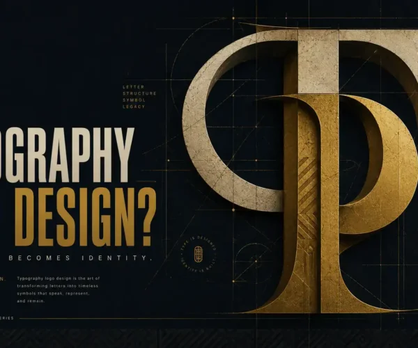
A serif can make a young brand feel established. A geometric sans serif can make a legacy business feel newly relevant. But the best fonts for brand identity are not simply the ones that look good in a logo mockup. They are the typefaces that make your story recognizable, your message easy to absorb, and your brand consistent wherever customers meet it.
For founders, font selection is often treated as a finishing touch. In practice, it is one of the earliest strategic decisions in a visual identity. Typography sets the pace of a website, changes the perceived value of packaging, and shapes whether a social post feels considered or improvised. The right choice gives your brand a voice before anyone reads a word.
Start With the Brand Story, Not the Font List
A typeface carries cultural and emotional associations. High-contrast serifs can suggest editorial confidence, heritage, luxury, or craft. Clean grotesk sans serifs often feel direct, modern, and efficient. Rounded letterforms can bring warmth and accessibility. Condensed display fonts create energy and impact, but can quickly become difficult to use at smaller sizes.
None of these associations are fixed rules. Context changes everything. A refined serif may make a boutique hotel feel timeless, while the same font may make a tech startup appear slower or less approachable than intended. The first question is not, “What font is trending?” It is, “What should people feel when they encounter this brand?”
Define a few strategic traits before looking at type specimens. Is the brand calm or expressive? Premium or practical? Local and familiar, or globally ambitious? Is its audience seeking reassurance, inspiration, speed, or expertise? These decisions narrow the field and prevent typography from becoming a matter of personal preference alone.
For a brand with a multicultural audience, this thinking becomes even more valuable. Certain visual conventions can mean different things across markets. The goal is not to flatten the brand into something neutral. It is to create a voice that is distinctive while remaining clear, respectful, and legible to the people it wants to reach.
What Makes a Font Right for a Brand Identity?
A font can be beautiful and still be the wrong business decision. Strong identity typography needs to work beyond the logo, across digital content, printed materials, packaging, presentations, email, advertising, and future campaigns.
Personality without gimmicks
Display fonts are designed to be noticed. That makes them useful for logos, campaign headlines, and packaging moments. It also makes them risky as the main voice of a growing company. If a typeface is memorable only because it is unusual, it can date the identity quickly or compete with the message it is supposed to carry.
Look for personality in details that can hold up over time: the shape of an a, the rhythm of the curves, the width of the letters, and the relationship between thick and thin strokes. The strongest typography often feels obvious after the fact. It reflects the brand so naturally that customers remember the business, not just the font.
Readability at real-world sizes
A font must perform in the environments where your audience actually sees it. A restaurant menu, a skincare label, a mobile checkout page, and a trade-show banner all create different reading conditions.
Test potential typefaces in sentences, not only in a brand name. View them at 12 to 16 pixels on a phone screen. Print them small. Try a dense paragraph, an all-caps heading, a price point, and a call to action. Pay attention to letters that can be confused, such as I, l, and 1, or O and 0. If a customer has to work to read it, the design is asking too much from them.
A complete type family
The best fonts for brand identity usually come with enough range to build a system. At minimum, look for regular, medium, bold, and italic weights. More developed families may include condensed widths, extended widths, optical sizes, small caps, tabular figures, and broad language support.
You may not need every option on day one. Still, a flexible family protects the brand as it grows. A business that begins with a simple website may later need a pitch deck, retail packaging, event signage, and paid social campaigns. A limited font can force awkward workarounds just when consistency matters most.
Licensing that matches the plan
Font licensing is not a technical footnote. It is part of brand ownership. A desktop license may cover design files and print output but not a website, mobile app, digital ads, or editable templates shared with a team. Free fonts can be excellent, but their permissions still need to be reviewed carefully.
Before committing, confirm how the font will be used, how many users need access, and whether webfont or application rights are required. A well-chosen font with the wrong license can become an expensive interruption during a launch or rebrand.
Reliable Font Directions for Different Brand Personalities
There is no universal best font, but there are useful directions to consider. The names below are starting points for exploration, not shortcuts around strategy.
For editorial, premium, and story-led brands, consider expressive serifs such as Canela, Cormorant Garamond, Fraunces, or Playfair Display. These can bring confidence and sophistication to beauty, hospitality, fashion, wellness, and professional services. Their trade-off is that some styles need careful sizing and spacing to remain readable online.
For modern, confident, and versatile brands, typefaces such as Inter, Neue Haas Grotesk, Helvetica Now, Avenir Next, and Manrope offer a clear sans serif foundation. They are especially effective for digital-first companies and service businesses that need information to feel organized. Because this category is widely used, distinctiveness often comes from art direction, hierarchy, color, and a complementary display face.
For warm, human, and community-focused brands, look at humanist sans serifs such as Frutiger, Source Sans, Work Sans, or Nunito Sans. Their open forms can feel approachable without becoming childish. They work well for education, health, nonprofit, food, and customer-centered services where trust and clarity lead the conversation.
For bold, energetic, and culture-forward brands, a condensed or characterful display face can create a strong signature. Druk, Bebas Neue, DIN Condensed, and Oswald can deliver impact in headlines, event graphics, and social campaigns. Pair them with a highly readable text font. Using a condensed display font for every sentence usually weakens its effect.
Build a Font System, Not Just a Font Pair
A brand identity does not need five typefaces to feel sophisticated. In many cases, one flexible family is enough. In others, a primary display face and a functional text face create a useful contrast. The key is assigning clear roles.
Your display typeface should carry the emotional weight in headlines, campaign statements, and key branded moments. Your text typeface should make longer information easy to read in body copy, forms, captions, and navigation. A third utility style may be justified for data, labels, or technical material, but only if it solves a real communication problem.
Avoid pairing fonts that have nearly the same personality. Two neutral sans serifs can look accidental rather than intentional. Contrast can come from serif versus sans serif, narrow versus wide, or expressive versus restrained. It should feel designed, not decorative.
Hierarchy matters as much as the font choice itself. Establish rules for headline sizes, subheads, body copy, buttons, captions, and spacing. Define when all caps are appropriate and when they are not. Specify tracking for large headlines if the letterforms need room to breathe. These details turn typography into a repeatable brand asset rather than a series of one-off design decisions.
Test Typography Where the Brand Will Live
Before finalizing a font direction, create a small set of realistic applications. A homepage hero, a mobile page, an Instagram post, a business card, a package label, and a presentation slide will reveal more than a single logo board ever can.
Ask practical questions. Does the headline retain its impact on a phone? Can a customer scan the service list quickly? Does the font support the names, languages, currencies, and symbols the brand uses? Does the pairing leave enough room for photography, illustration, or product information?
This testing stage also exposes a common mistake: choosing typography only for the launch. Brand identity is a working system. It has to support the quiet, repetitive work of marketing as well as the high-visibility moments of a campaign.
At Armand Graphix, typography is treated as a strategic layer of the brand story, not an isolated aesthetic choice. The aim is to create a visual voice with emotional presence and commercial discipline – one that looks distinctive, communicates clearly, and has room to grow.
The right font will not carry a weak brand strategy. But when the message is clear, the audience is understood, and the system is built with intention, typography gives every touchpoint a recognizable point of view. Choose the typeface that helps your brand speak with clarity now, then make sure it can keep speaking as the business becomes bigger, bolder, and more visible.