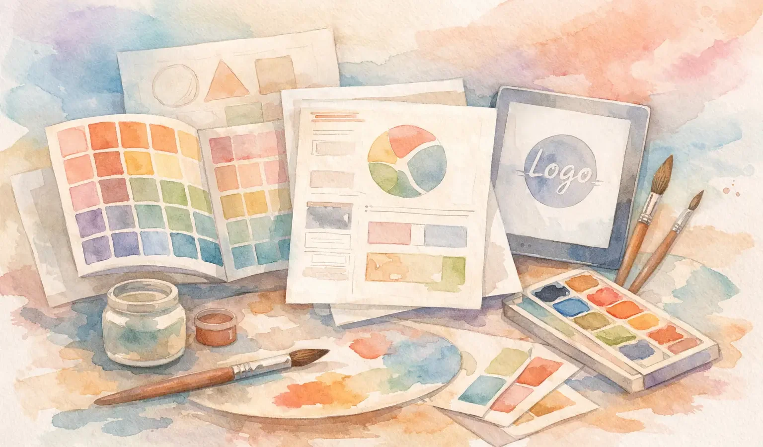
A beautiful brand can still fall apart in execution. The logo looks different on every deck, social posts sound like they came from three companies, and packaging feels disconnected from the website. That is usually not a creativity problem. It is a system problem. If you are figuring out how to structure brand guidelines, the goal is not to make a thicker PDF. It is to make your brand easier to recognize, easier to apply, and harder to dilute.
Strong guidelines sit at the intersection of design and decision-making. They protect consistency, but they should also preserve the character of the brand. If the document is too vague, people improvise. If it is too rigid, the brand loses flexibility. The right structure gives teams clarity without flattening the identity.
Why structure matters more than length
Many businesses assume comprehensive means effective. It does not. A 90-page brand book that no one uses has less value than a 15-page guide that people can actually follow.
The real question is not how much to include. It is what people need in order to make good brand decisions across real situations – presentations, websites, social media, ads, packaging, email campaigns, signage, and partnerships. A well-structured guide anticipates those moments.
That is especially important for growing brands. Once more people touch the brand – designers, marketers, copywriters, sales teams, printers, freelancers, developers – inconsistency spreads quickly. Structure creates alignment before confusion becomes expensive.
How to structure brand guidelines from the top down
The clearest way to build brand guidelines is from foundation to application. Start with the brand’s core identity, then move into visual rules, then verbal expression, then channel-specific execution. This sequence matters because design choices should reflect strategy, not the other way around.
A brand guide that jumps straight into logo clear space without explaining the brand’s positioning often feels disconnected. People follow the rules, but they do not understand the reasoning. When they face a new use case, they are more likely to guess.
1. Start with brand fundamentals
Open with the elements that define the brand at its core. This usually includes the brand purpose, mission, vision, values, audience, positioning, and personality. You do not need pages of corporate language. You need clear statements that explain who the brand is, who it serves, and what makes it distinct.
This section gives context to every choice that follows. If your brand is positioned as premium but approachable, that should influence typography, photography, copy tone, and even motion design. If your audience spans multiple cultural contexts, your visual language and messaging need enough sensitivity and flexibility to translate well.
Keep this section sharp. A few strong paragraphs often do more than a page full of buzzwords.
2. Define the logo system
Your logo section should do more than display the main mark. It should explain the full system: primary logo, secondary logo, icon or symbol, wordmark, and any responsive or stacked versions.
Show when each version should be used. Then set practical rules around clear space, minimum size, alignment, approved color variations, and unacceptable uses. Distorted logos, low-contrast placements, and random recoloring are common brand killers, so show those mistakes visually when possible.
This is where specificity helps. Teams need to know what is allowed, but they also need to understand what to do when space is tight, formats are vertical, or production limitations affect reproduction.
3. Build a clear color hierarchy
Color is one of the fastest ways people recognize a brand, yet it is often documented poorly. Do not just list swatches. Structure your color section by function.
Identify primary colors first, then secondary or supporting colors, then accent colors if the system uses them. Include usage guidance. Which colors dominate the brand? Which are reserved for calls to action, backgrounds, highlights, or campaigns? That hierarchy matters more than the palette alone.
If the brand works across print and digital, include the necessary color values for both environments. A brand that appears rich and intentional on screen can look flat in print if those conversions are not considered early.
4. Establish typography rules that people can actually follow
Typography guidelines should cover more than font names. They should explain the role of each typeface in the system.
Define your headline font, body font, and any display or accent typography. Then show how they work together. Include weights, hierarchy, spacing preferences, and examples of scale. If the brand uses a distinctive typographic voice, say how expressive it can be and where restraint is required.
This is one of the most overlooked parts of how to structure brand guidelines. Teams often receive font files without understanding cadence, rhythm, or hierarchy. The result is technically correct but visually inconsistent work.
5. Document imagery and graphic style
A brand is rarely expressed through logo and color alone. Photography, illustration, icons, textures, patterns, and layout principles often do just as much to create recognition.
This section should answer practical creative questions. Are images candid or polished? Are subjects centered or asymmetrical? Is the mood aspirational, documentary, editorial, playful, refined? If illustrations are used, what line quality, level of detail, and color treatment fit the brand?
The same goes for graphic devices. If the brand uses shapes, borders, motion principles, or compositional patterns, document them. Otherwise, every designer will invent their own interpretation and the system will start drifting.
Add the voice behind the visuals
A strong identity is not only seen. It is heard. That is why verbal guidelines deserve their own section, not a side note.
6. Define tone of voice with contrast
Instead of describing tone with vague adjectives alone, clarify what the brand sounds like and what it does not sound like. For example, a brand might be confident but not arrogant, polished but not stiff, creative but not chaotic. That contrast gives people range without confusion.
Support this with examples. Show how the brand writes a headline, a product description, a social caption, a call to action, or a customer email. Voice becomes far easier to maintain when people can see it in use.
This section is especially valuable for businesses that combine storytelling with performance marketing. Messaging has to feel on-brand, but it also has to convert. The best guidelines recognize both needs.
7. Include key messaging pillars
If your brand repeatedly communicates certain ideas – craftsmanship, innovation, accessibility, sustainability, heritage, cultural relevance, measurable growth – define them as messaging pillars.
This keeps content aligned across campaigns and channels. It also prevents the common problem of sounding different every time the brand speaks. A business may evolve its offers, but the strategic themes should remain recognizable.
Show how the brand works in real environments
This is where many guideline documents either become useful or stay theoretical.
8. Create application examples
Once the system is defined, show it in context. Mockups and live-use examples help people understand how the rules translate into actual materials.
That might include website headers, social templates, pitch decks, business cards, packaging, event signage, ad creative, email design, or presentation slides. Not every brand needs every example. A direct-to-consumer product brand needs packaging guidance. A service business may need proposals, landing pages, and social ad examples more urgently.
This is where trade-offs matter. If you are creating a lean startup brand guide, prioritize the channels the business uses most right now. You can expand later. Trying to document every possible touchpoint too early often slows the brand down.
9. Add rules for digital consistency
For modern brands, digital execution deserves special attention. Include guidance for web UI elements, button styles, spacing logic, image ratios, social media treatments, and motion if motion is part of the identity.
This does not mean your brand guide needs to become a full design system. But there should be enough direction that marketing and design teams do not reinterpret the brand every time they launch a campaign.
For brands focused on growth, this section bridges creative identity with performance. Consistency improves recognition, and recognition supports stronger results over time.
Keep the document usable
Knowing how to structure brand guidelines is also about usability. If the guide is hard to scan, buried in jargon, or disconnected from day-to-day workflows, adoption will drop.
Group related content together. Use clear section titles. Show examples beside rules. Write for the people who will use the document, not for the boardroom alone. A founder, freelance designer, social media manager, and packaging printer should all be able to find what they need quickly.
It also helps to separate core rules from flexible recommendations. Some things are non-negotiable, like logo misuse or primary color integrity. Other things can be adapted depending on campaign goals, platform constraints, or audience context. That distinction keeps the system disciplined without making it brittle.
What to avoid when structuring brand guidelines
The most common mistake is treating guidelines like a design archive instead of an operating tool. The second is overexplaining obvious things while skipping real decision points.
Do not fill the document with decorative pages and leave out usage logic. Do not define tone of voice in three adjectives and assume writers will interpret them the same way. Do not present a palette without hierarchy, or typography without examples, or layout principles without applications.
And do not confuse consistency with sameness. A good brand system allows variation while maintaining identity. That is what makes it durable.
The best brand guidelines feel like direction, not restriction
If your brand guide is structured well, it does more than protect visual consistency. It helps your team make smarter creative choices, faster. It gives your brand a recognizable rhythm across touchpoints while leaving enough room for evolution.
That is the standard worth aiming for: design that tells your story, and strategy that grows your brand, with guidelines strong enough to hold both.