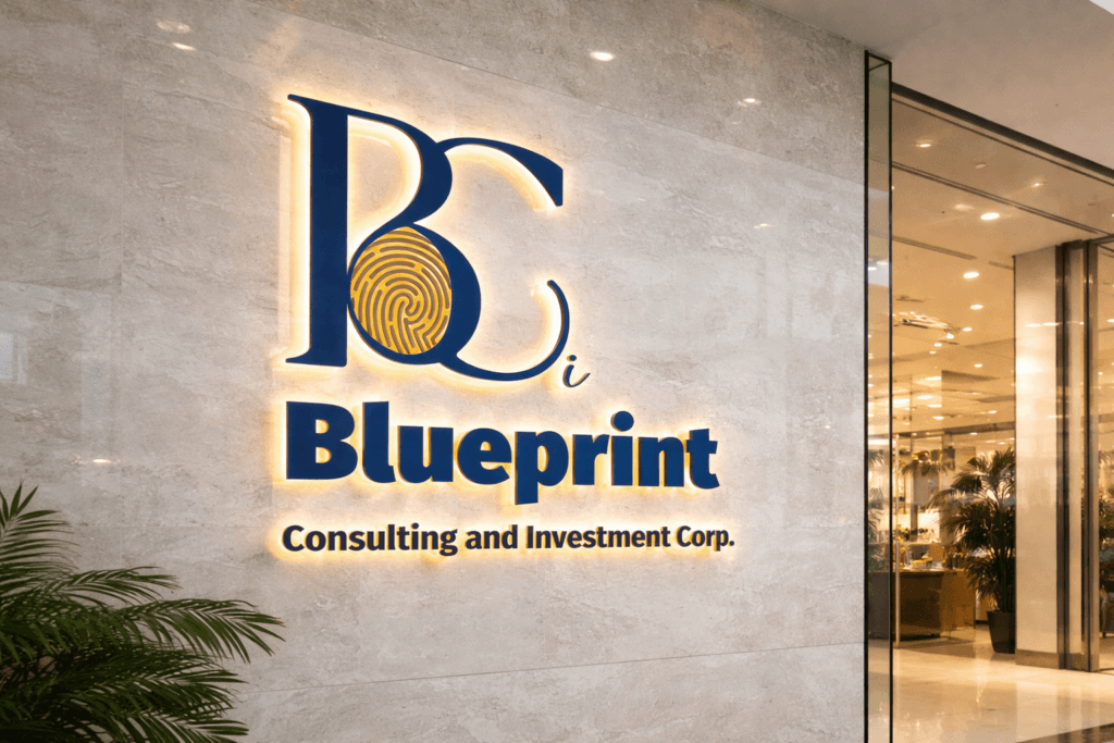
A strategic logotype has been developed in order to position the brand within a premium consulting and investment space.
Thus, a strong and recognizable identity is established, while a sense of trust is visually communicated.
As a result, the brand is perceived as both modern and authoritative.
Creative Concept
A symbolic approach has been adopted.
Indeed, a fingerprint element is integrated in order to represent uniqueness, identity, and human-centered strategy.
Thus, a balance is created between corporate rigor and individuality.
Moreover, the initials are emphasized to reinforce memorability and brand recall.
Art Direction and Color Strategy
A dual color system has been defined.
On one hand, a deep blue tone is used to convey trust, stability, and expertise.
On the other hand, a gold palette is introduced to express value, prestige, and financial growth.
Therefore, a premium perception is reinforced, while visual contrast enhances readability and impact.
Typography and Structure
A refined typographic system has been selected.
Thus, a combination of serif elegance and modern clarity is achieved.
In addition, a clear hierarchy is established so that the brand name and descriptor remain highly legible.
Consequently, the logotype performs effectively across multiple formats and scales.
Design Objective
A high-end corporate positioning is targeted.
Indeed, the identity must immediately inspire confidence and credibility.
For this reason, every element is carefully balanced to ensure consistency and clarity.
Finally, a flexible system is created so that the brand can evolve across various communication platforms.
Conclusion
A distinctive and strategic logotype has been designed.
Thus, a strong visual identity is achieved, while brand differentiation is clearly established.
In summary, this project demonstrates how symbolic design and structured branding can elevate a consulting and investment company into a premium market position.